picture #4
Leave a reply
Rahel Lehar
Russeck gallery visit
12/16/18
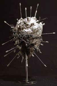
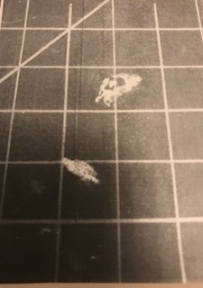
Damien Hirst “The Silver Heart” 2005
The art piece is obvious because it is clearly distinguished from a solid black background. The heart has repetition because it repeats having needles placed continuously all over it. It is achromatic because it lacks hue and saturation. The heart has shadow from the bottom and highlight from the top. It is high key because the values are more lighter.
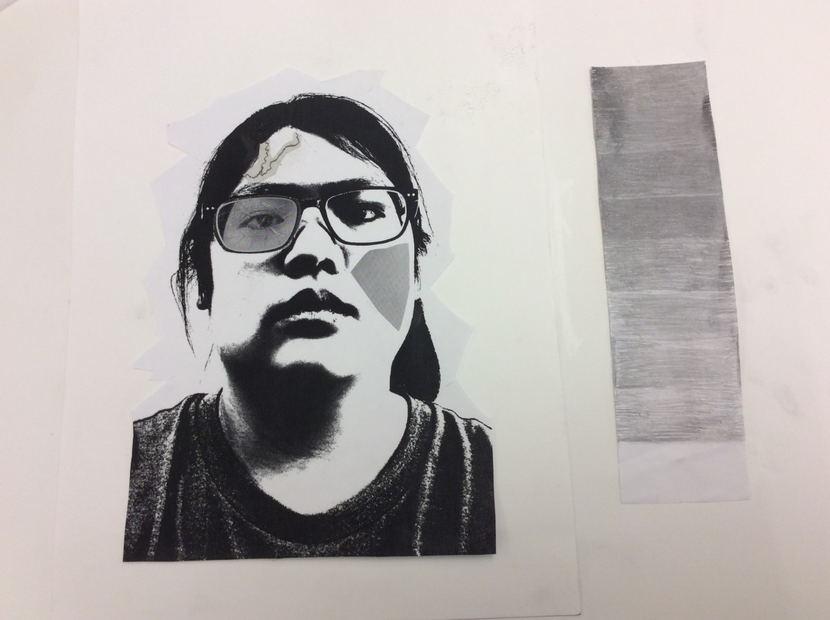
Both the silver heart and selfiemotion have values that are predominantly lighter. They both have shadow coming from the bottom and light forming at the top. They are both achromatic because they lack hue and saturation. The heart has the same angry mood as project 3. They only have grayscale.
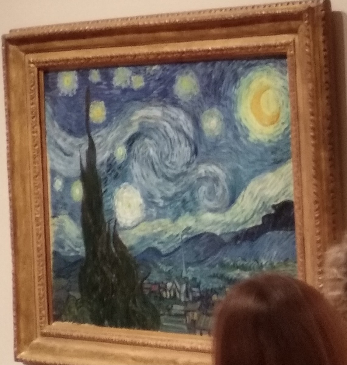
I visited the Museum of Metropolitan Art. Unbeknownst to me, there were a couple of famous paintings, including The Starry Night by Vincent Van Gogh. This piece in particular reminded me of the Project 1 – Lost and Found. Although not impressionistic, I found my art to be reminiscent of some of the details in Van Gogh’s painting.
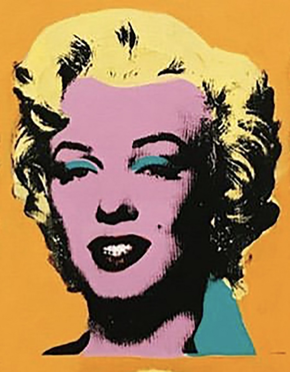
Andy Warhol Screen Print on Canvas
Date Visited 12/17/18
The artwork I chose was from the Whitney Museum of Marilyn Monroe by Andy Warhol. It was a small portion of an all over print. I picked this piece because I found it very similar to our Project 4 assignment. He used color to define certain areas of interest as we did, he used color to also add texture and rhythm in the piece. It was interesting how he used scale to make this an even more powerful work of art.
In Dunkley’s piece, Back to Nature, there are all sorts of organic shapes rather than geometric shapes, just like in my Project 1, Obvious and Ambiguous piece. There also seems to be a balance between the positive and negative space. In my piece it only consists of two colors, white and black. In Dunkley’s piece, there are more than two or three colors, there’s a whole variety, there’s also a bit of symmetry. There are barely any lines but instead i can make out a focal point.

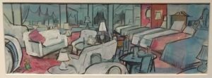
The picture on the right was a image took at the Museum of the City of New York. The photo I took was a piece of illustration drawn by Don Freeman for his famous work on the popular children’s book, A Pocket for Corduroy. The image shows a room full of chairs and bed with blue and red being the primary colors being used. The elements I find in common with this art and my design is they both are using 2 primary colors blue and a near reddish color. Some differences I see is my background is red orange and his art has a mostly blue background. Also his artwork has lost of objects in work but mine doesn’t.
 The imagination project was a very challenging to accomplish. A very complex assignment, with an extra request of myself to think out of the box. I was kind frustrated to obtain the main goal. Yet, I believe I did it.
The OpenLab is an open-source, digital platform designed to support teaching and learning at City Tech (New York City College of Technology), and to promote student and faculty engagement in the intellectual and social life of the college community.