Author Archives: Natalie Soto-Bernal

Museum Visit-Natalie Soto


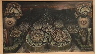
John Dunkley, Back to Nature, Mixed media on plywood, 1939

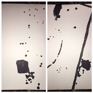
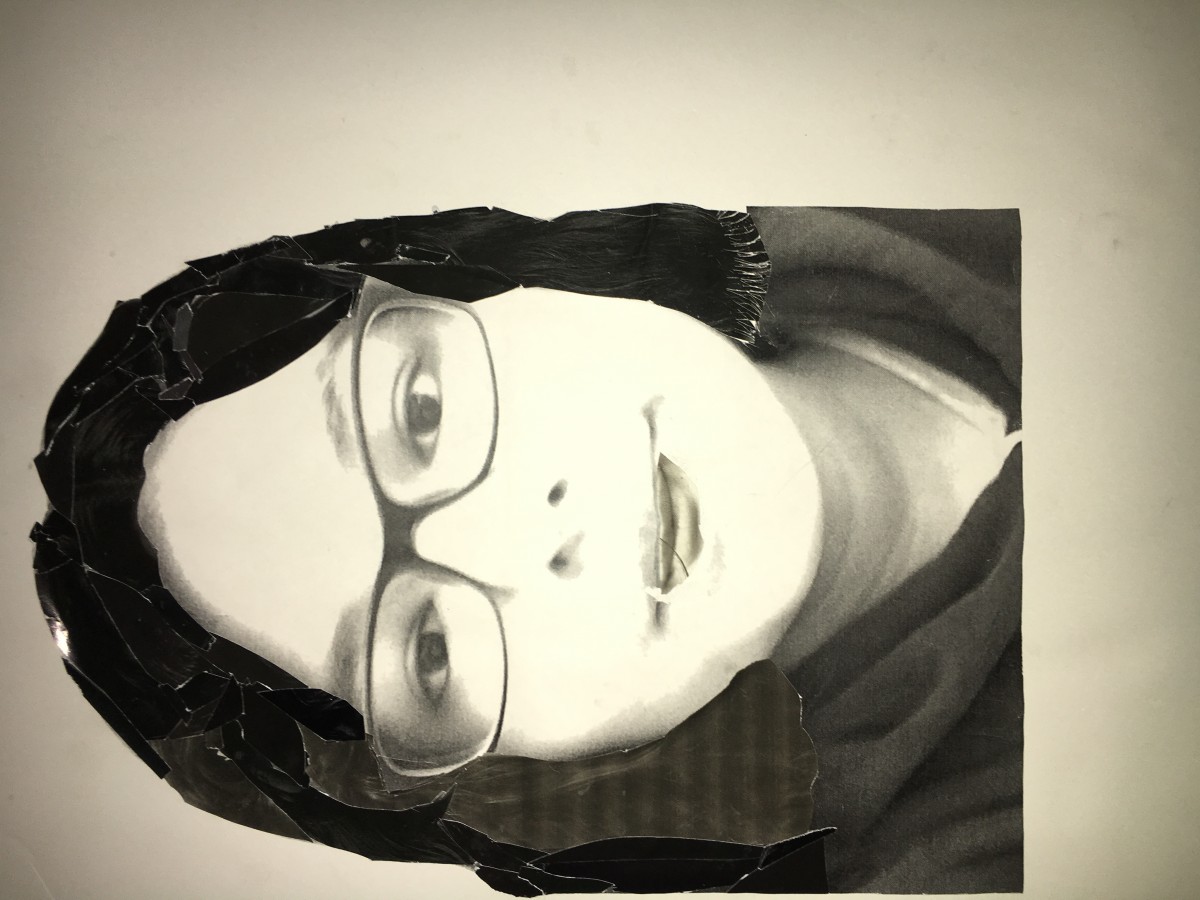
Project 1. Lost and Found

In Dunkley’s piece, Back to Nature, there are all sorts of organic shapes rather than geometric shapes, just like in my Project 1, Obvious and Ambiguous piece. There also seems to be a balance between the positive and negative space. In my piece it only consists of two colors, white and black. In Dunkley’s piece, there are more than two or three colors, there’s a whole variety, there’s also a bit of symmetry. There are barely any lines but instead i can make out a focal point.

ColorYourSelfie-5-Deliver

This is my final piece for Project 4 – Color Your Selfie. Being able to use Photoshop for this project was pretty cool. For the most part I enjoyed working with all sorts of colors and applying it my selfie. Overall I’m just glad that it came out pretty neat and not all crooked and sloppy. This project wasn’t so bad.

ColorYourSelfie-3-Develop

My favorite color is green. Apparently the color green symbolizes growth, harmony, freshness, and fertility. I chose the color green because something about it stood out to me unlike the other colors, and because it reminded me of so many things, such as nature, reptiles, food and so much more. The color green does bring back memories but I’m not sure if it matches my personality.

Selfiemotion-Phase 5-Collage

The mood I chose was happiness. I believe that this time I did make my focal point a bit more clearer than the last time. Just as how i made both my mood and movement, though i could have made it a lot more clearer. I should have emphasized my focal point a lot more, for the viewer to get a better understanding about it, and cropped out my hoodie. My gray scale also looks dull, I should have taken more time in planning and it could have looked a whole lot different. For the next project I’ll know to take my time and carefully putting more effort for when it came to crafting.

Texture & Pattern – 5. Delivery.

Throughout the course of this project I learned just how much of a difference both lines and typefaces can make. I could have avoided all the unnecessary spaces in between the lines and used more than one typeface. The board itself was way too big and next time I’ll definitely try and be more care with the studio tack. By taking my time and carefully planning out each step carefully it could really make a difference, which is what I’ll do for the next project.

Texture & Pattern – 4

The original photographs were so unalike in many ways. Whether it  was the amount of lines, the type of rhythm, flow and movement.  When it came to sketching up spaces using lines only, it wasn’t so bad, but when it came to sketching typefaces, not so much. Lines and typefaces are two different terms yet they both helped when it came to trying to achieve the same contrast. Trying to avoid flying hairs and blank open spaces was also a bit difficult.