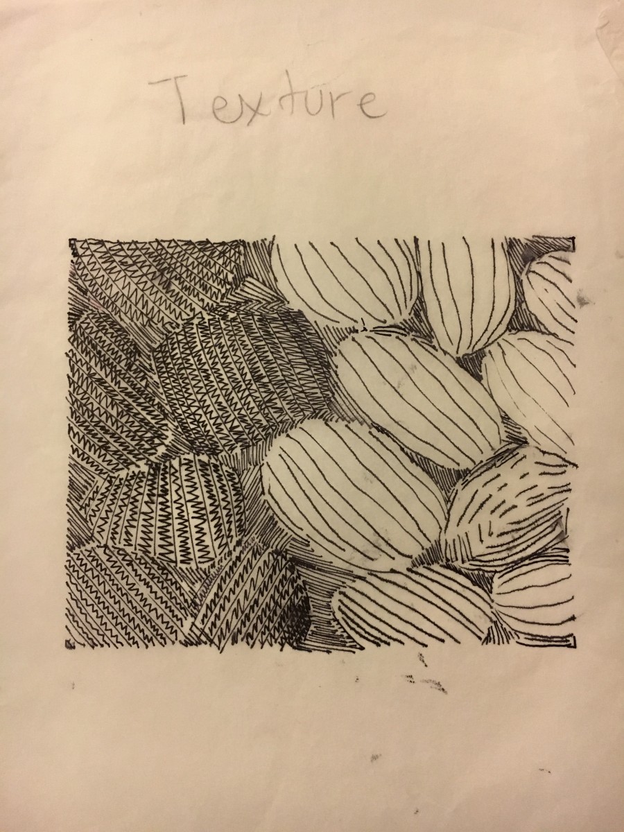
The mood of my Texture image was peaceful, the texture was smooth and its contrast created a great tone. My patter image was very geometric and its flow repeated, it had harsh contrast.
Final version
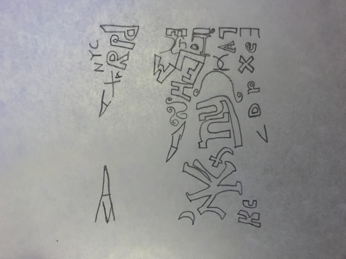
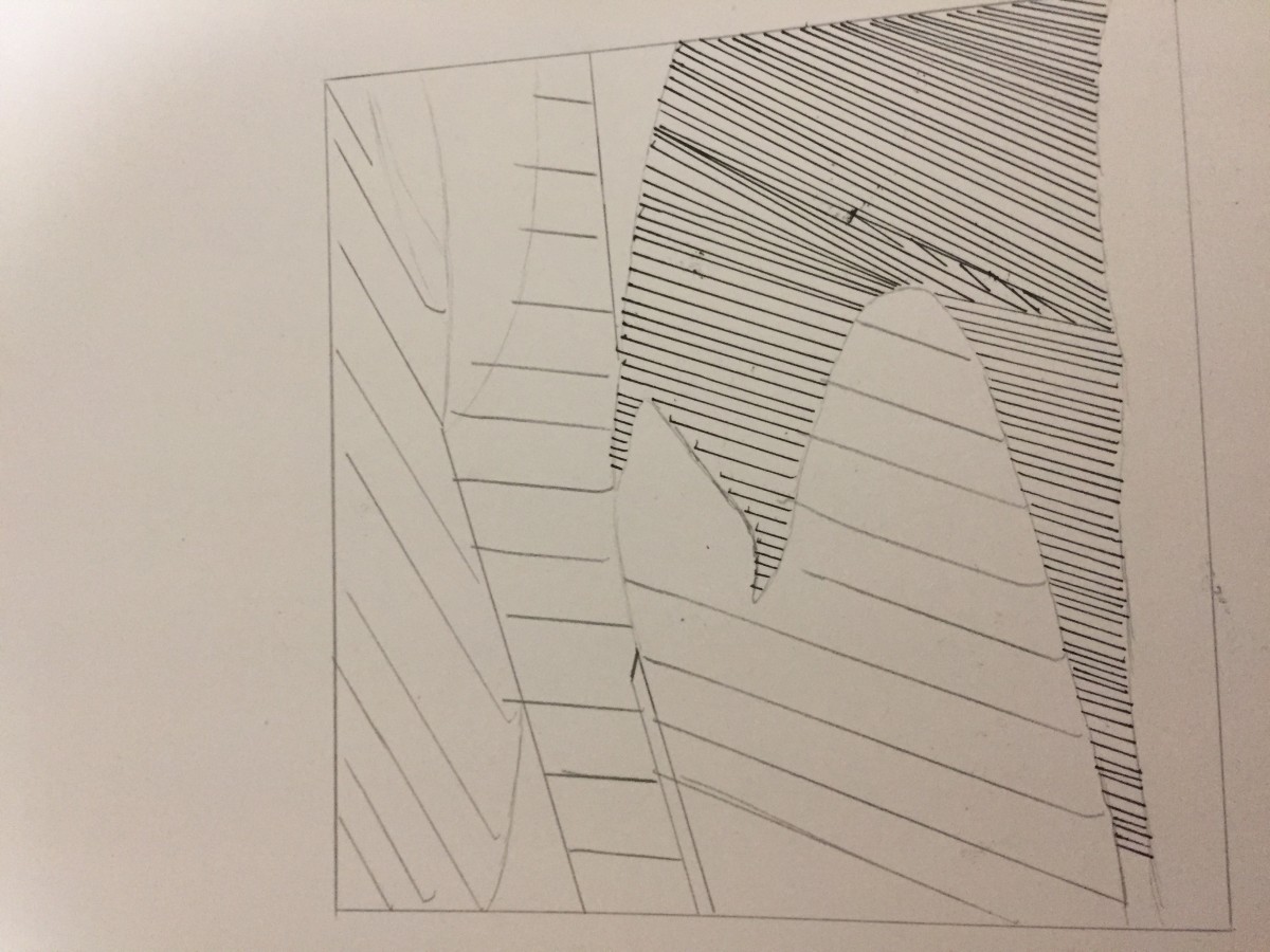
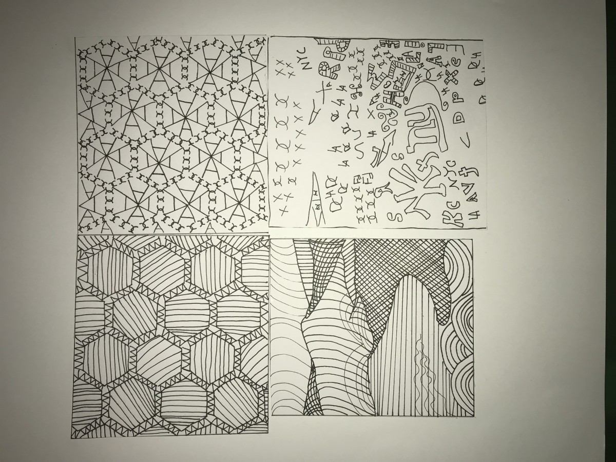
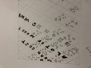
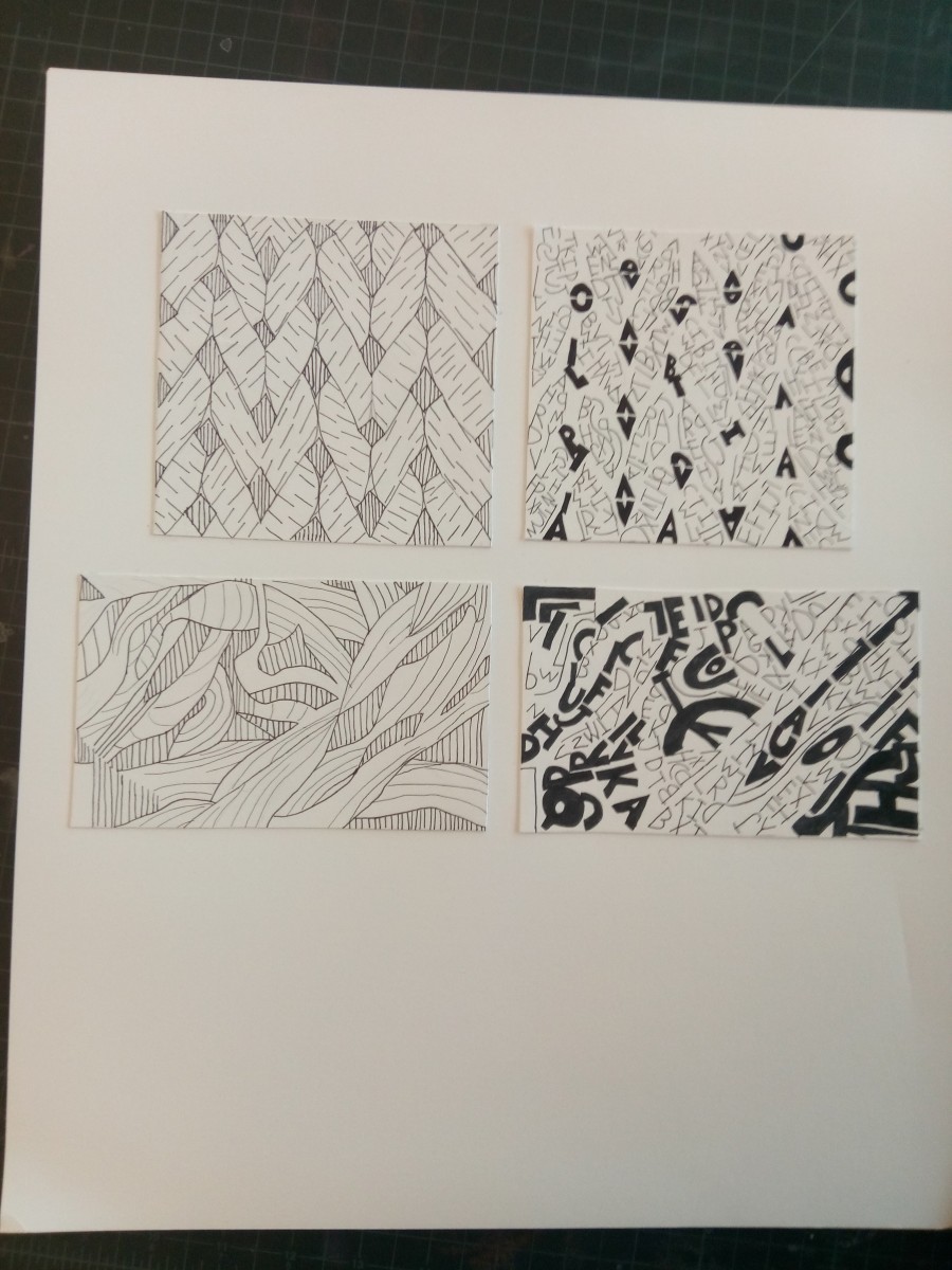
Type Sketches
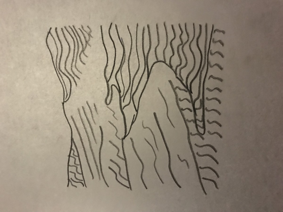
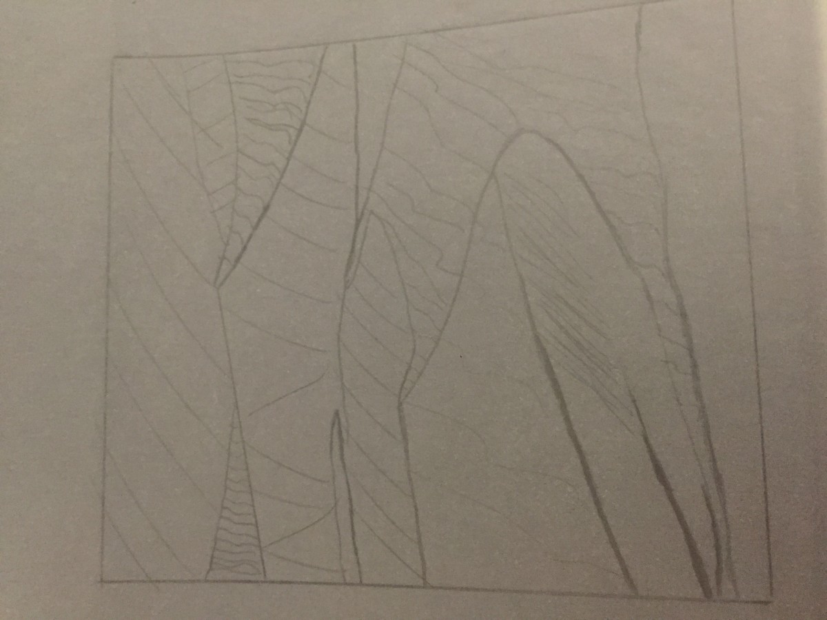
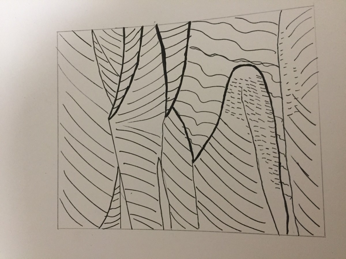
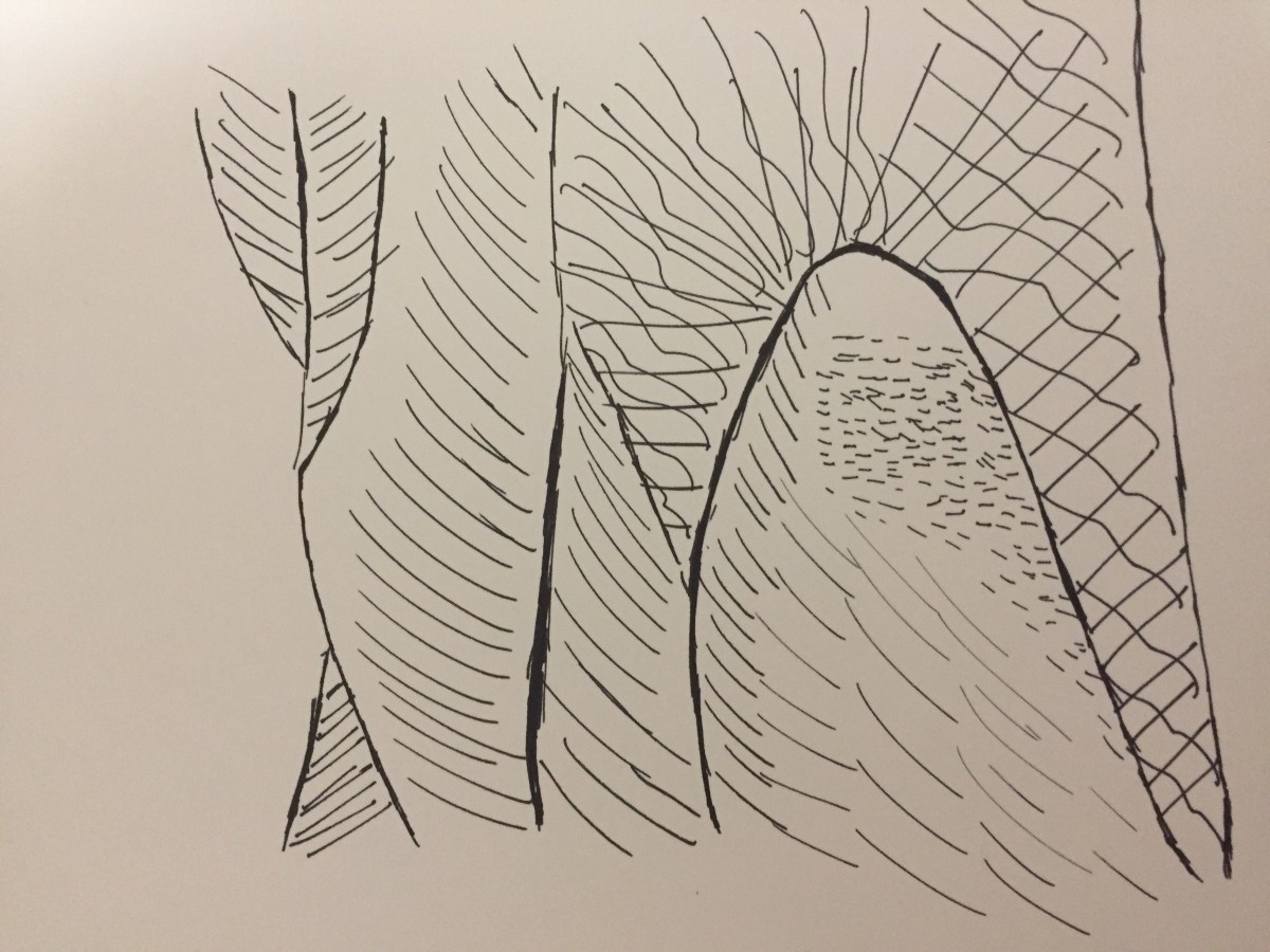
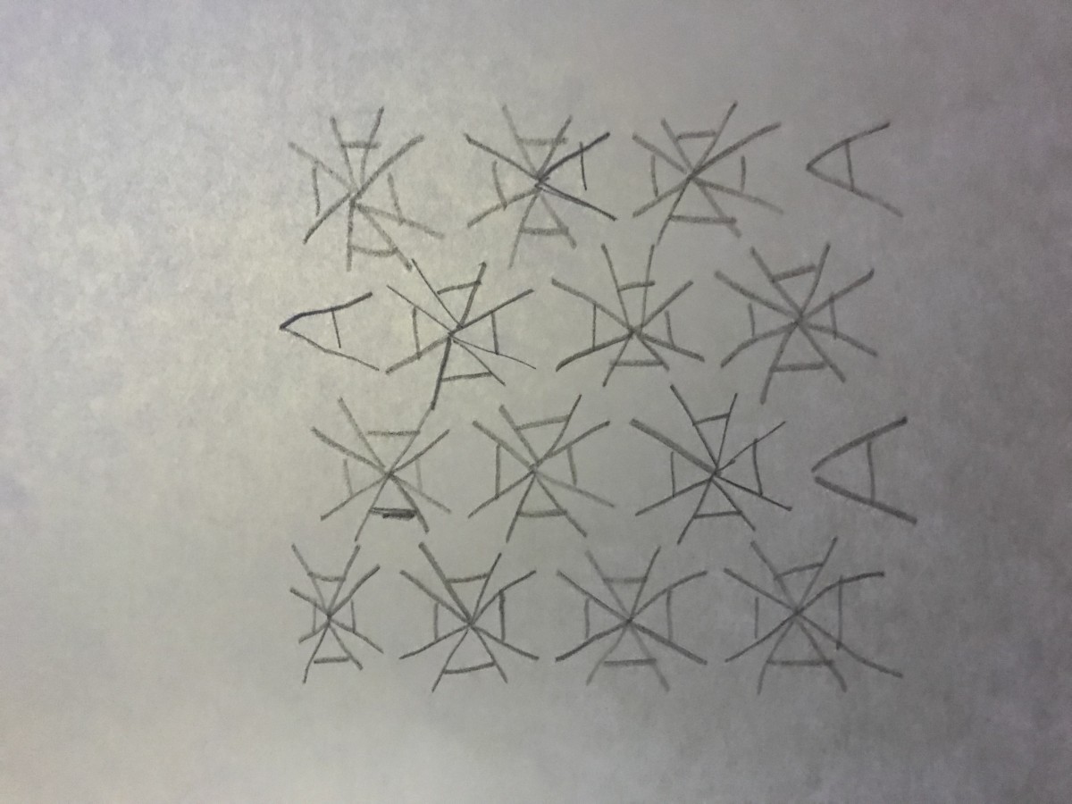
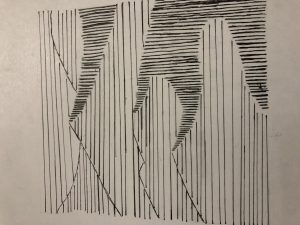
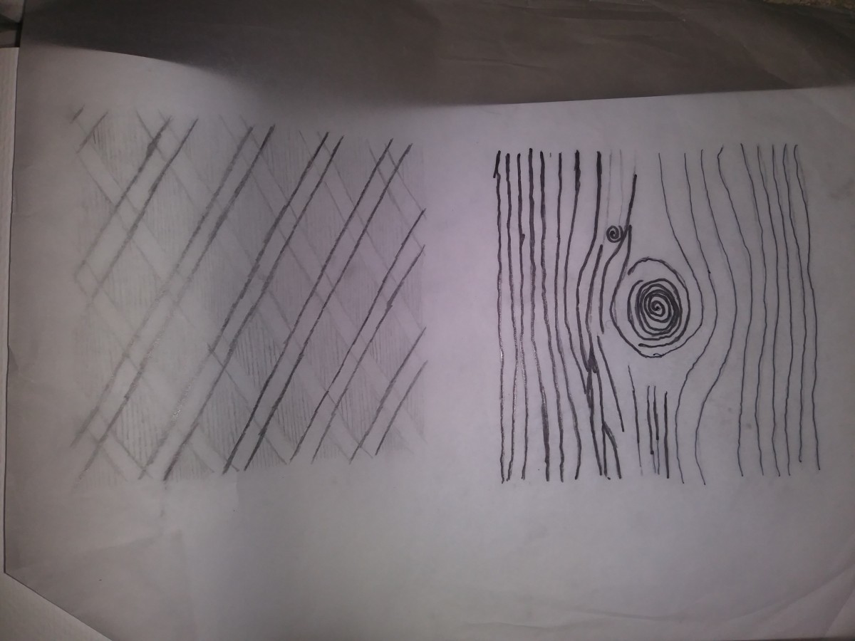
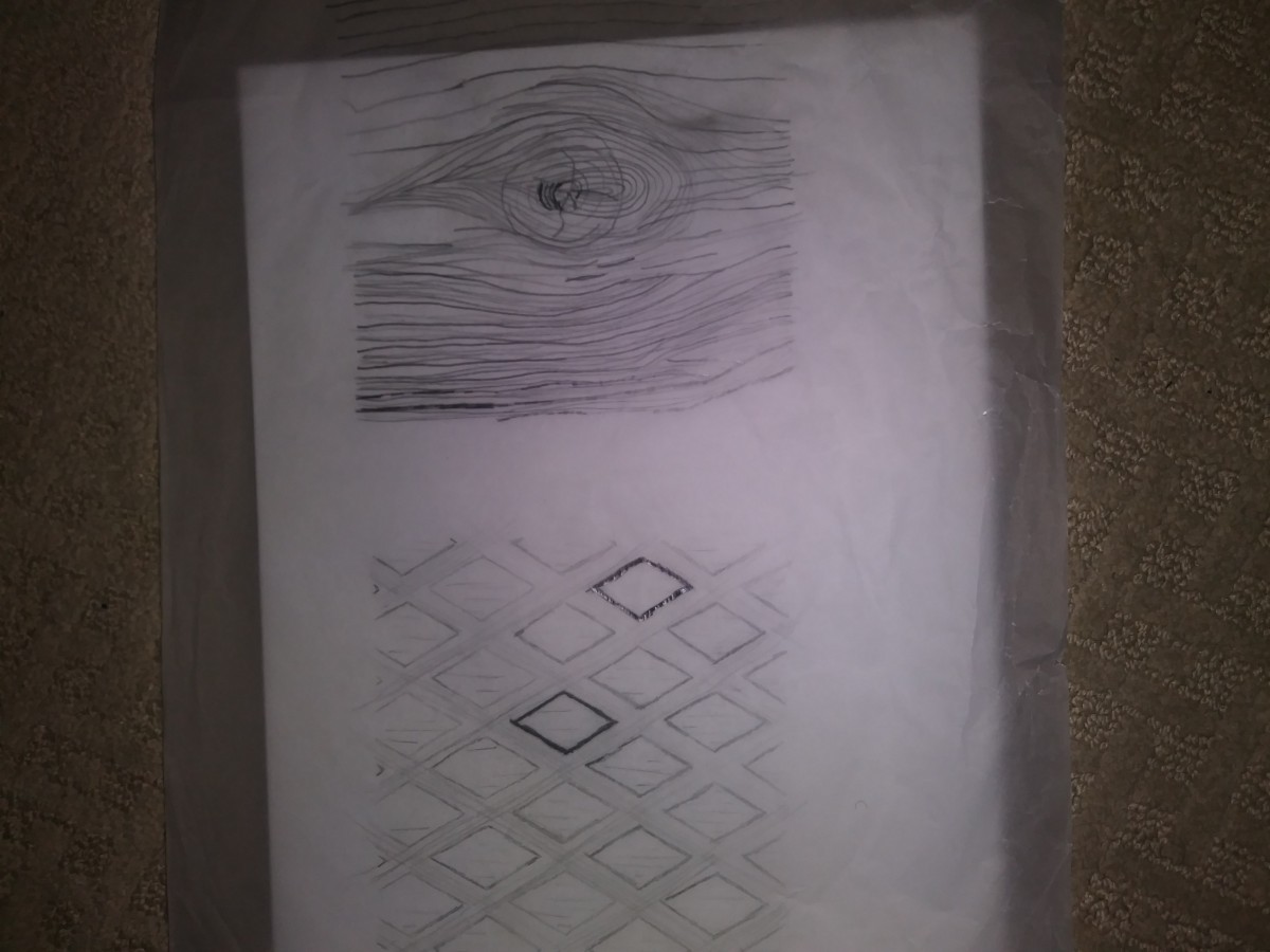
Line sketches
The mood of my Texture image was peaceful, the texture was smooth and its contrast created a great tone. My patter image was very geometric and its flow repeated, it had harsh contrast.
Final version
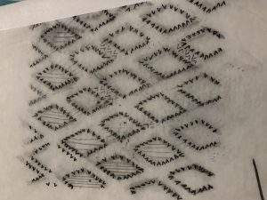
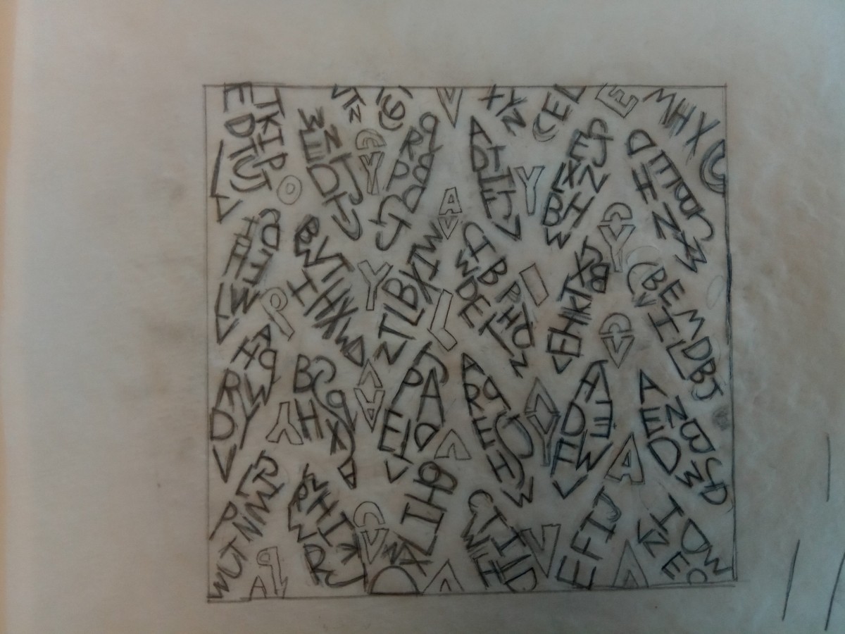
Type Sketches
Line sketches

Throughout the course of this project I learned just how much of a difference both lines and typefaces can make. I could have avoided all the unnecessary spaces in between the lines and used more than one typeface. The board itself was way too big and next time I’ll definitely try and be more care with the studio tack. By taking my time and carefully planning out each step carefully it could really make a difference, which is what I’ll do for the next project.
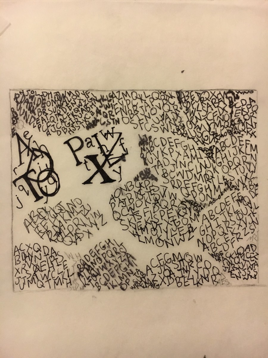

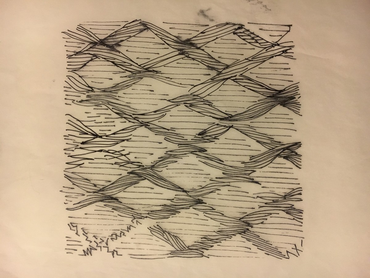
The original photographs were so unalike in many ways. Whether it was the amount of lines, the type of rhythm, flow and movement. When it came to sketching up spaces using lines only, it wasn’t so bad, but when it came to sketching typefaces, not so much. Lines and typefaces are two different terms yet they both helped when it came to trying to achieve the same contrast. Trying to avoid flying hairs and blank open spaces was also a bit difficult.
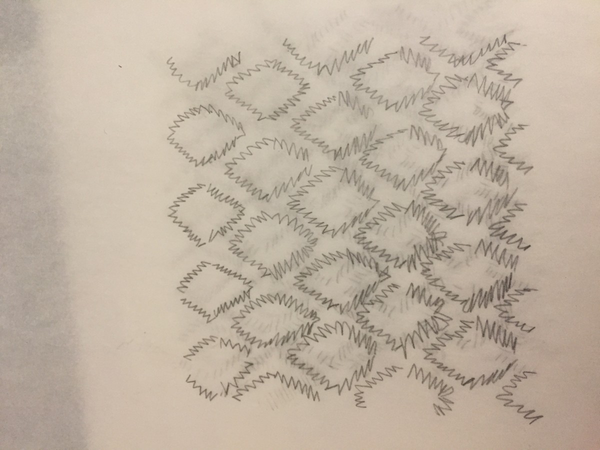
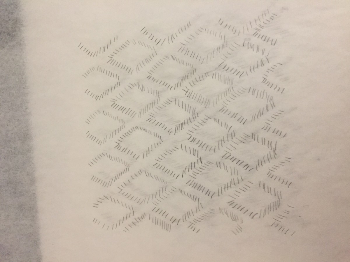
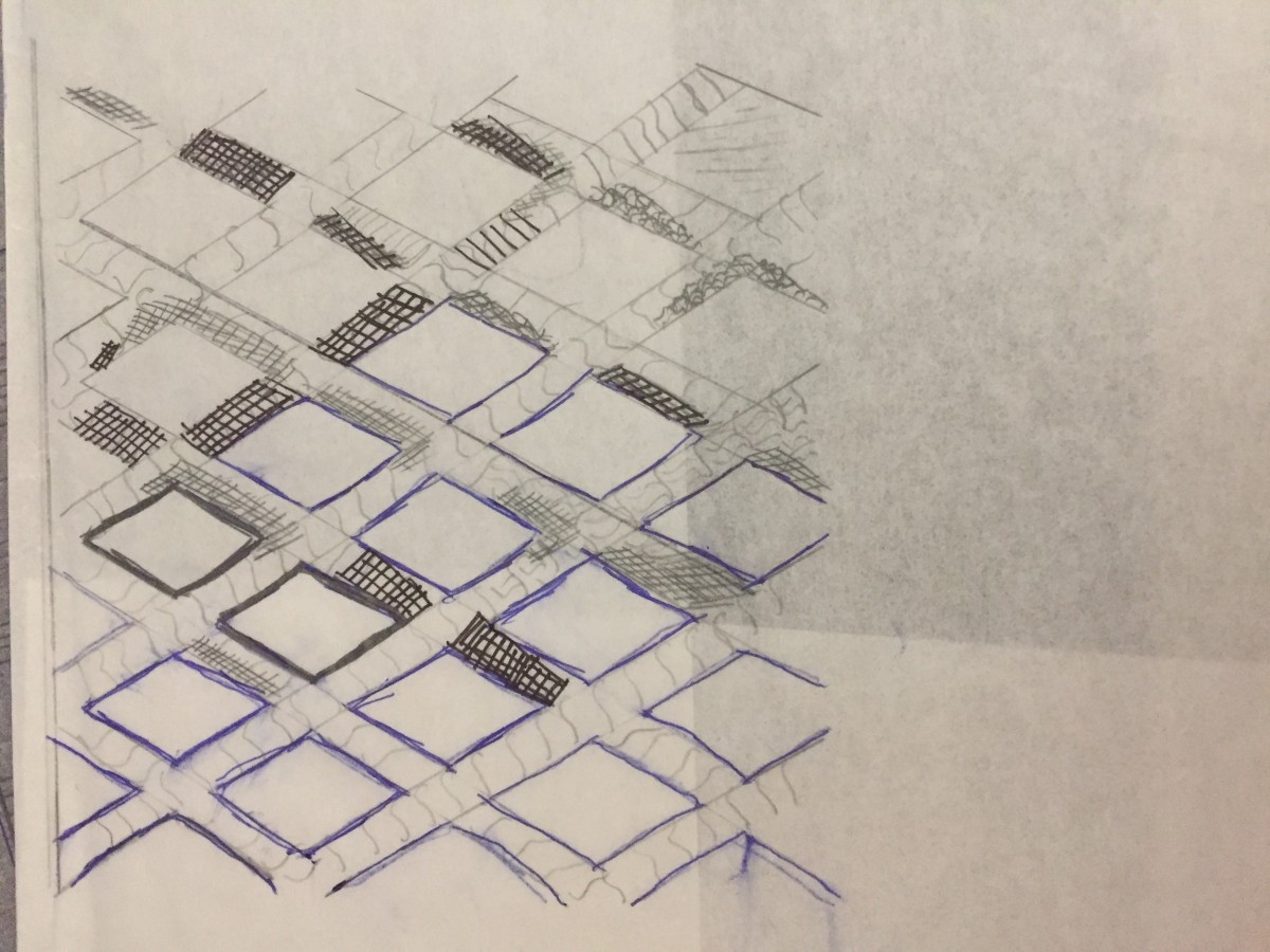
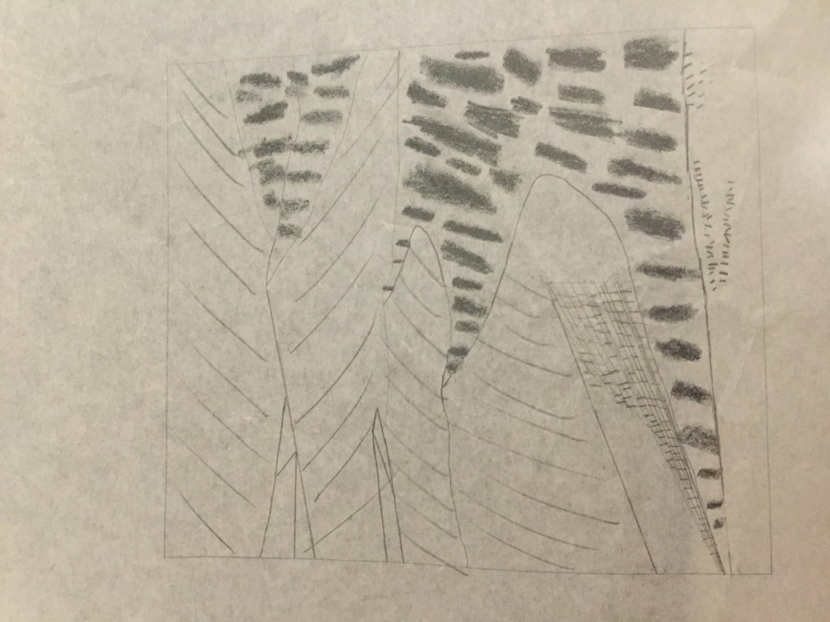
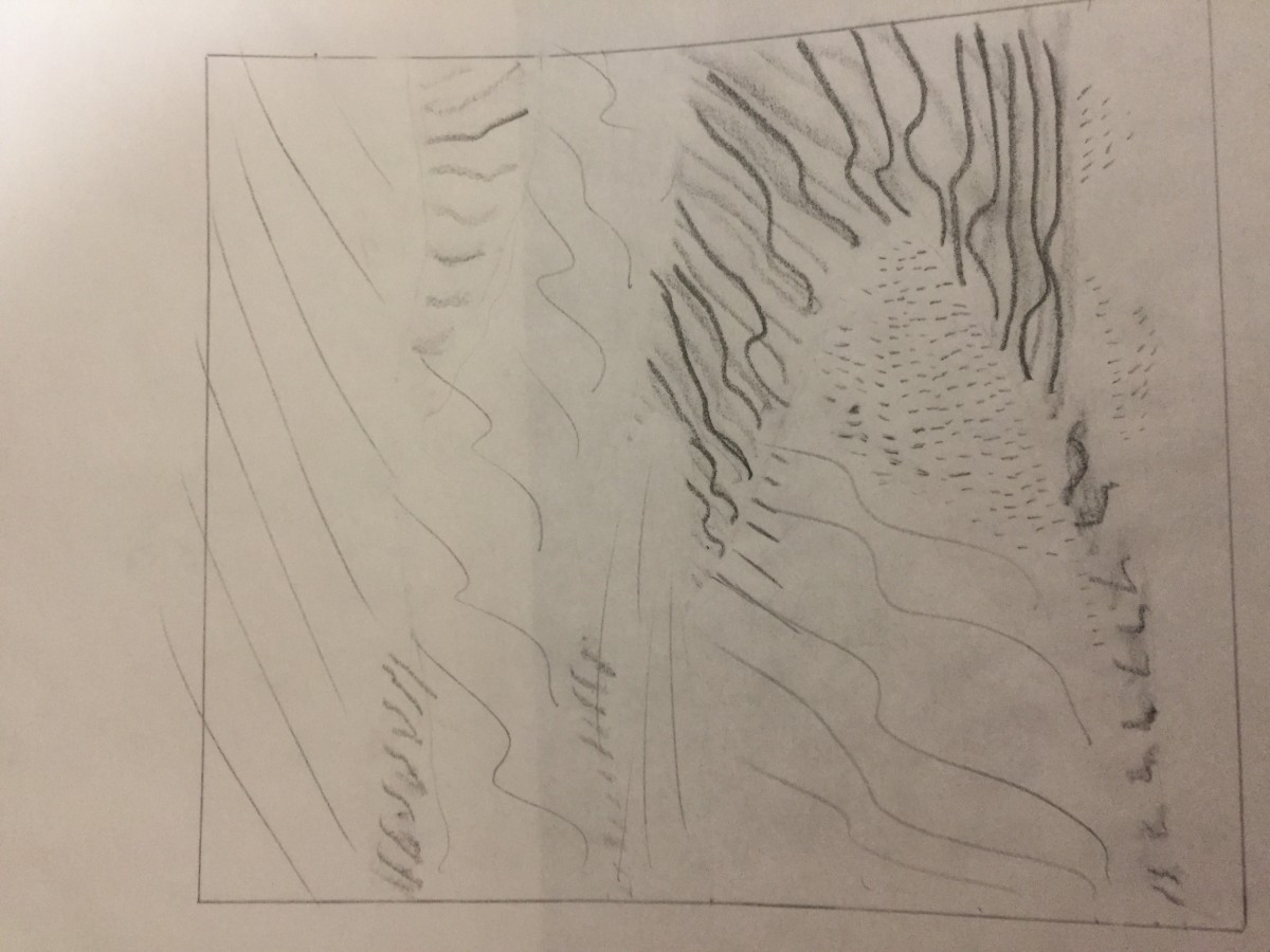
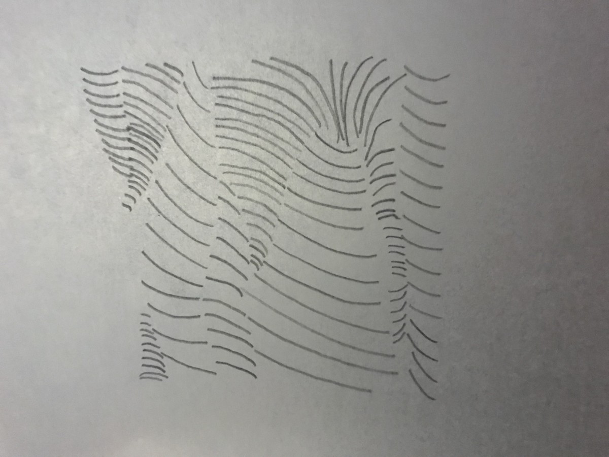
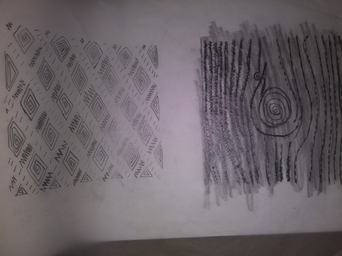
These are my sketches oh the pattern(fence) and the texture (desert). In these sketches i tried not to use contour lines and tried to get the background and foreground using lines and type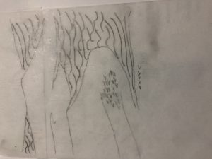


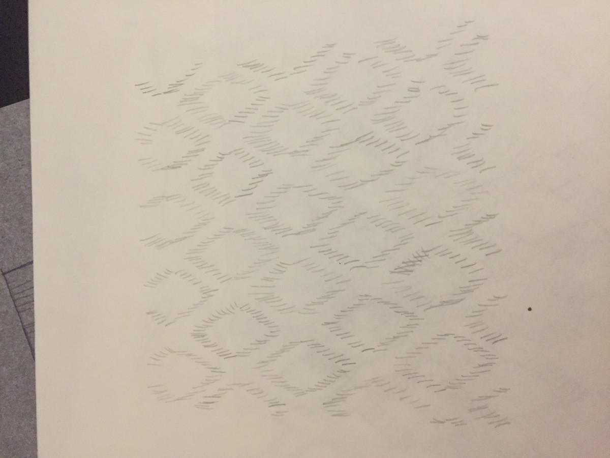
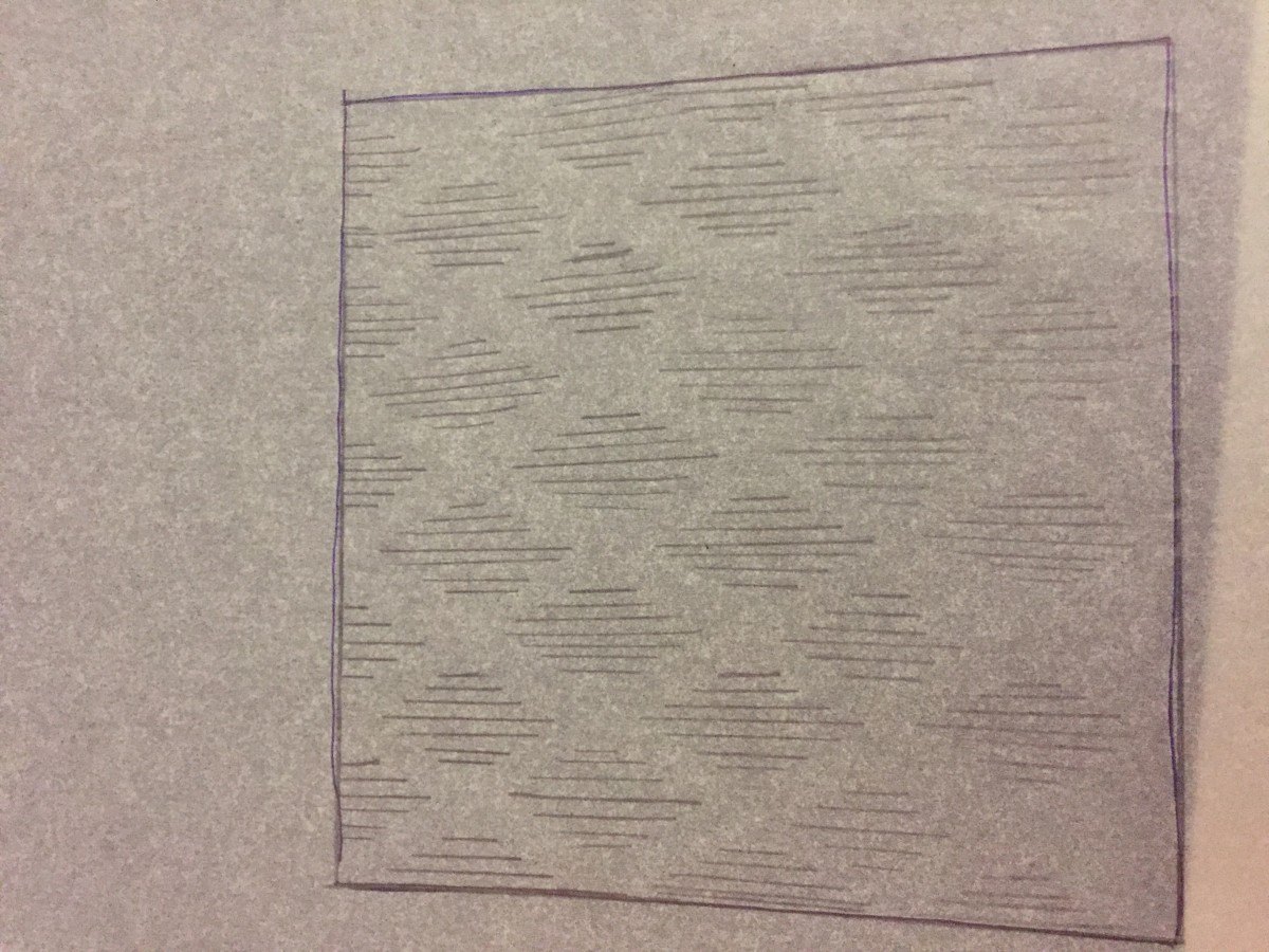
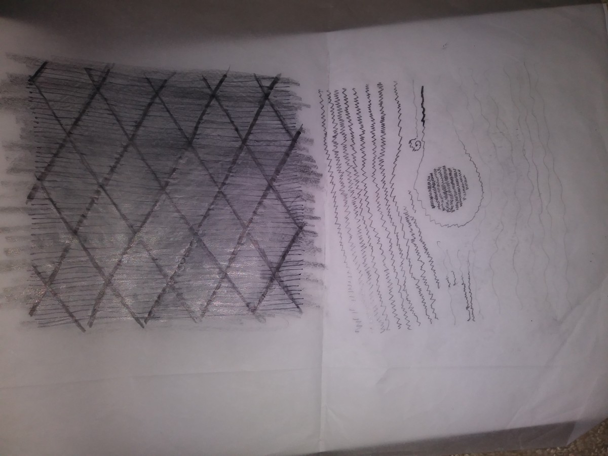
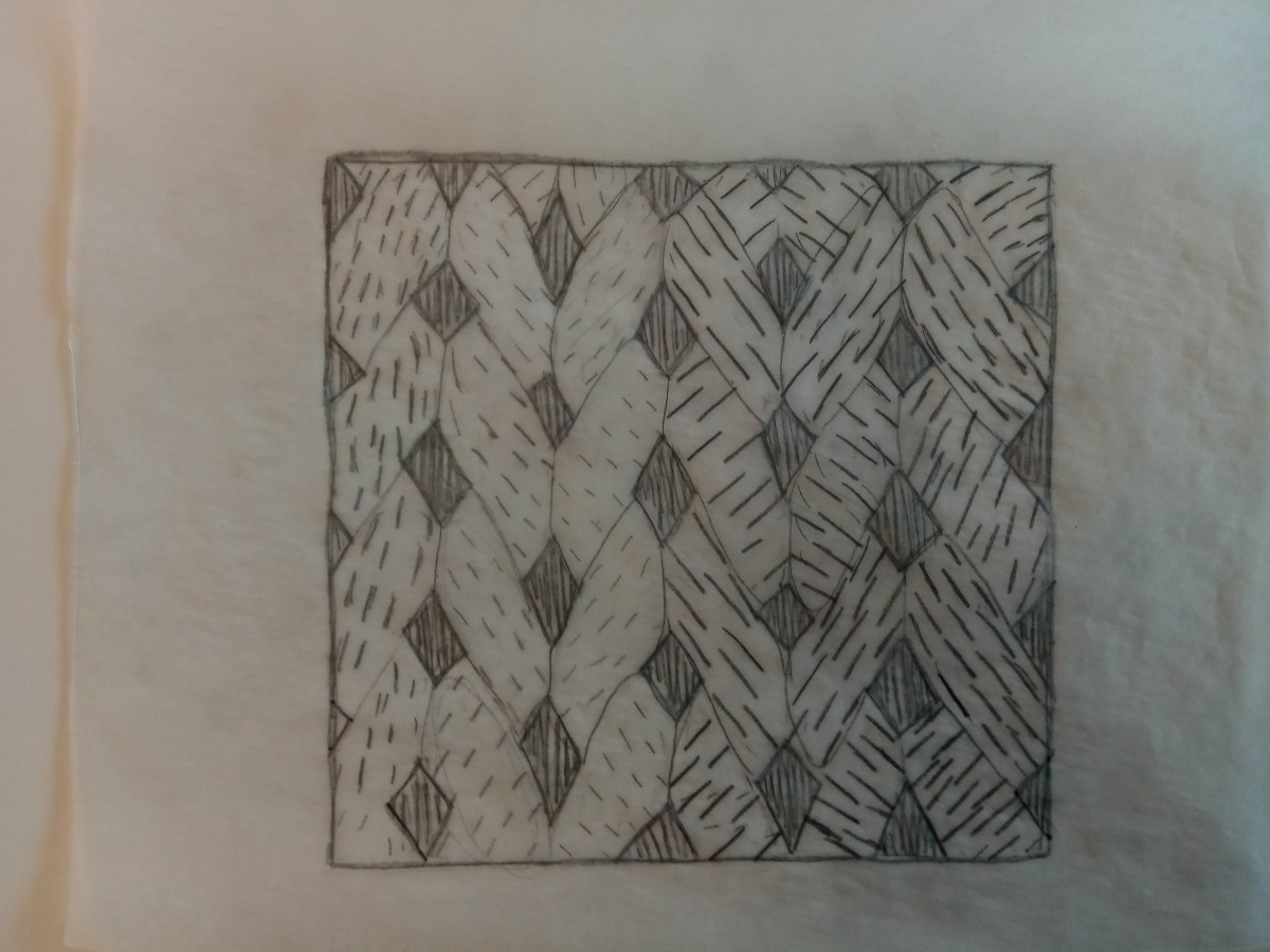
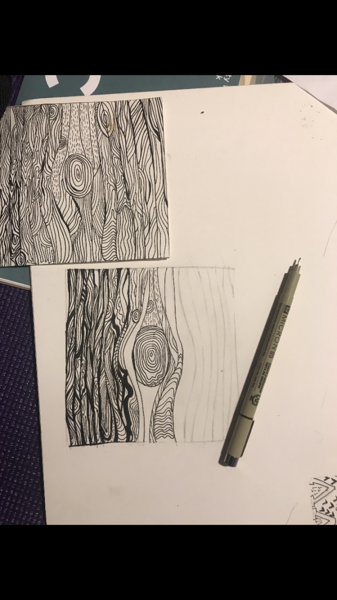 Final draft for texture sketch
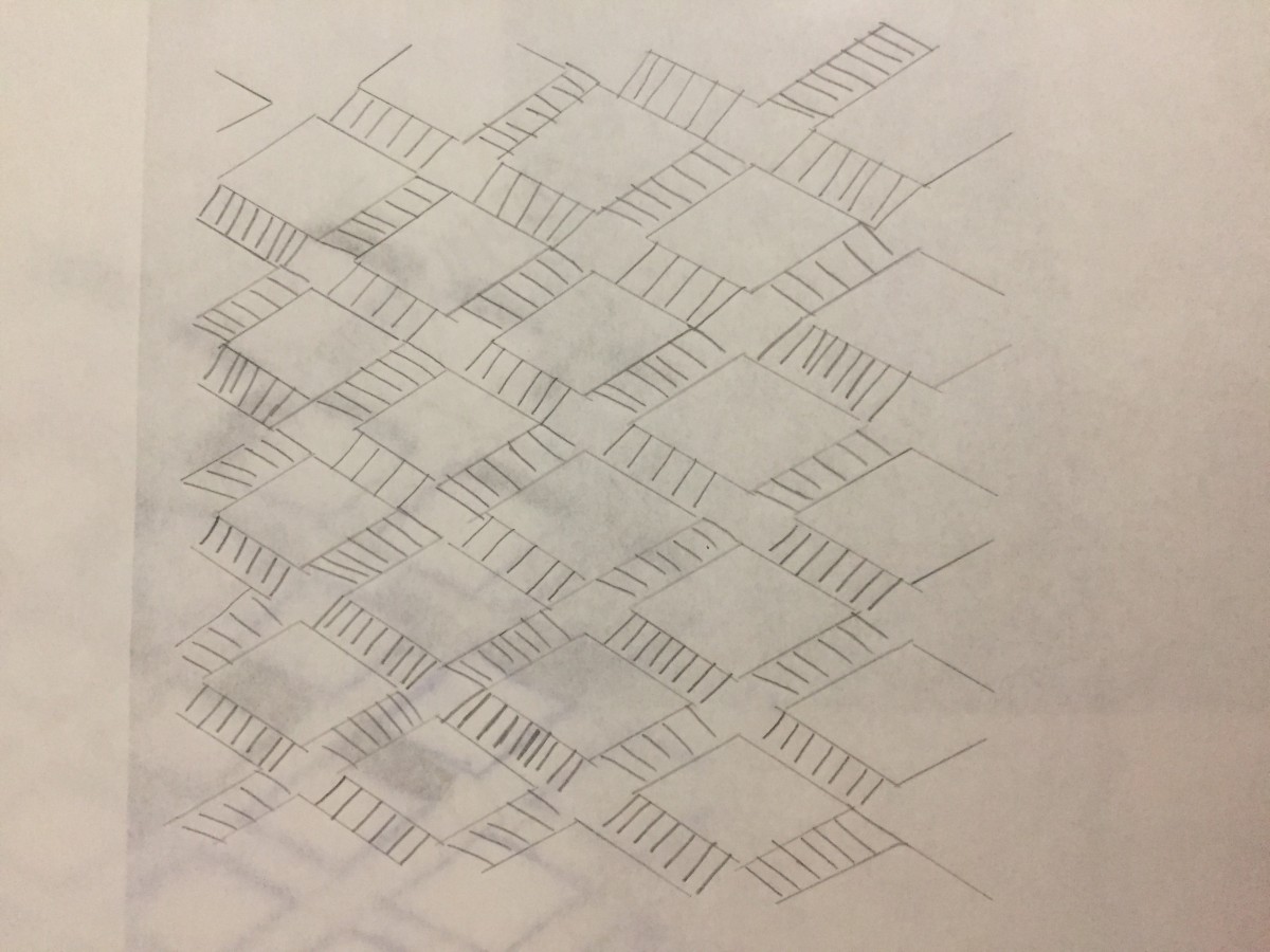
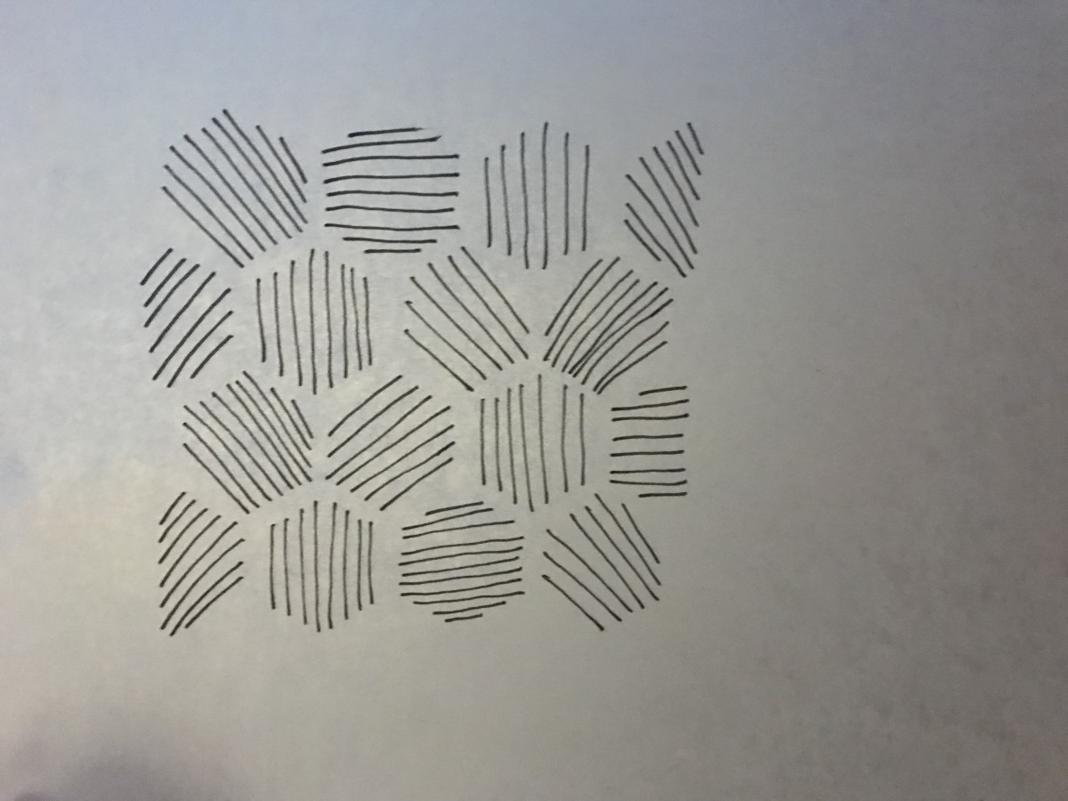
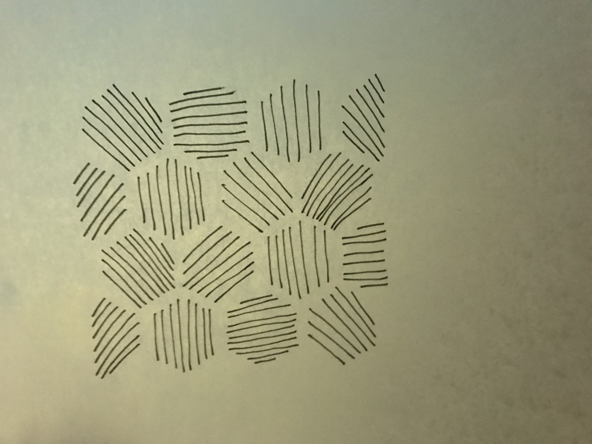
 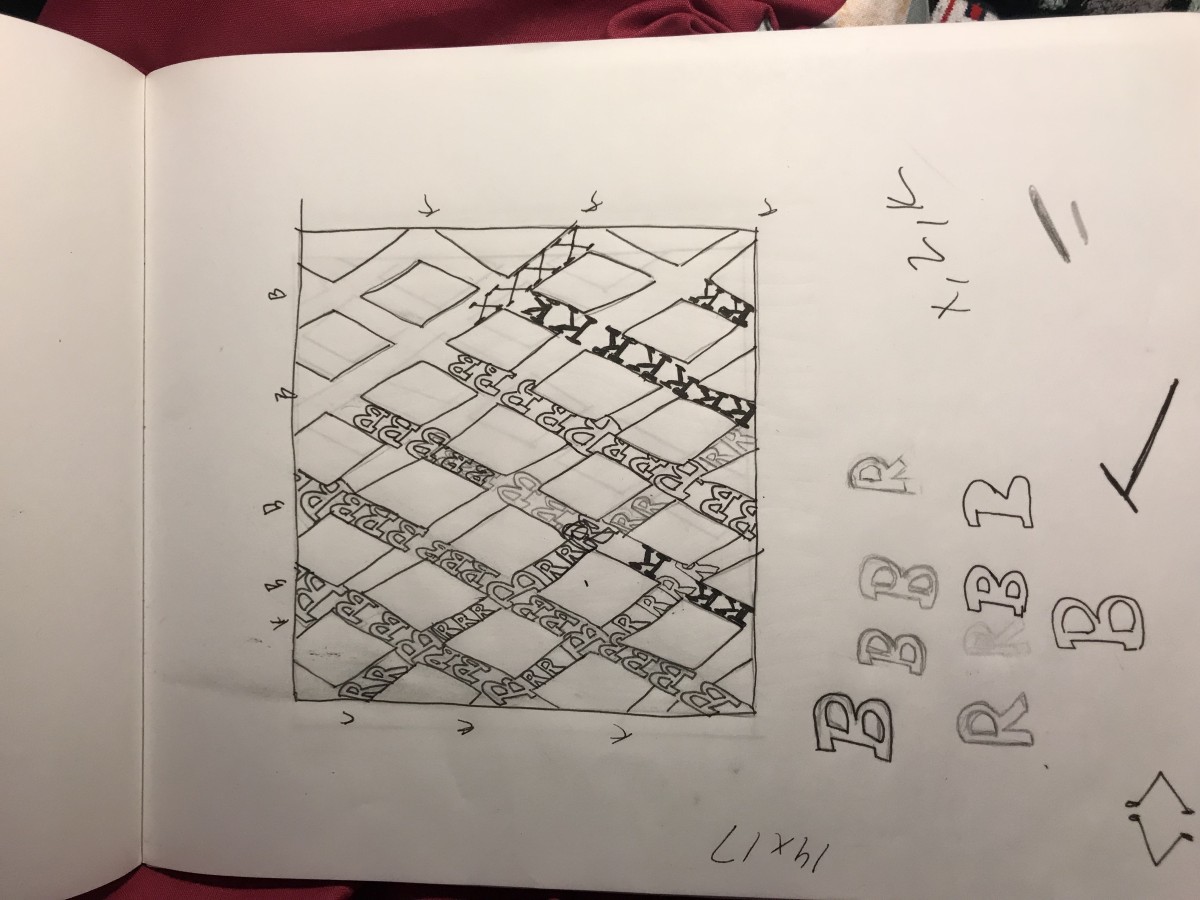 This was just a sketch of what i was planning on doing with the Type pattern.
 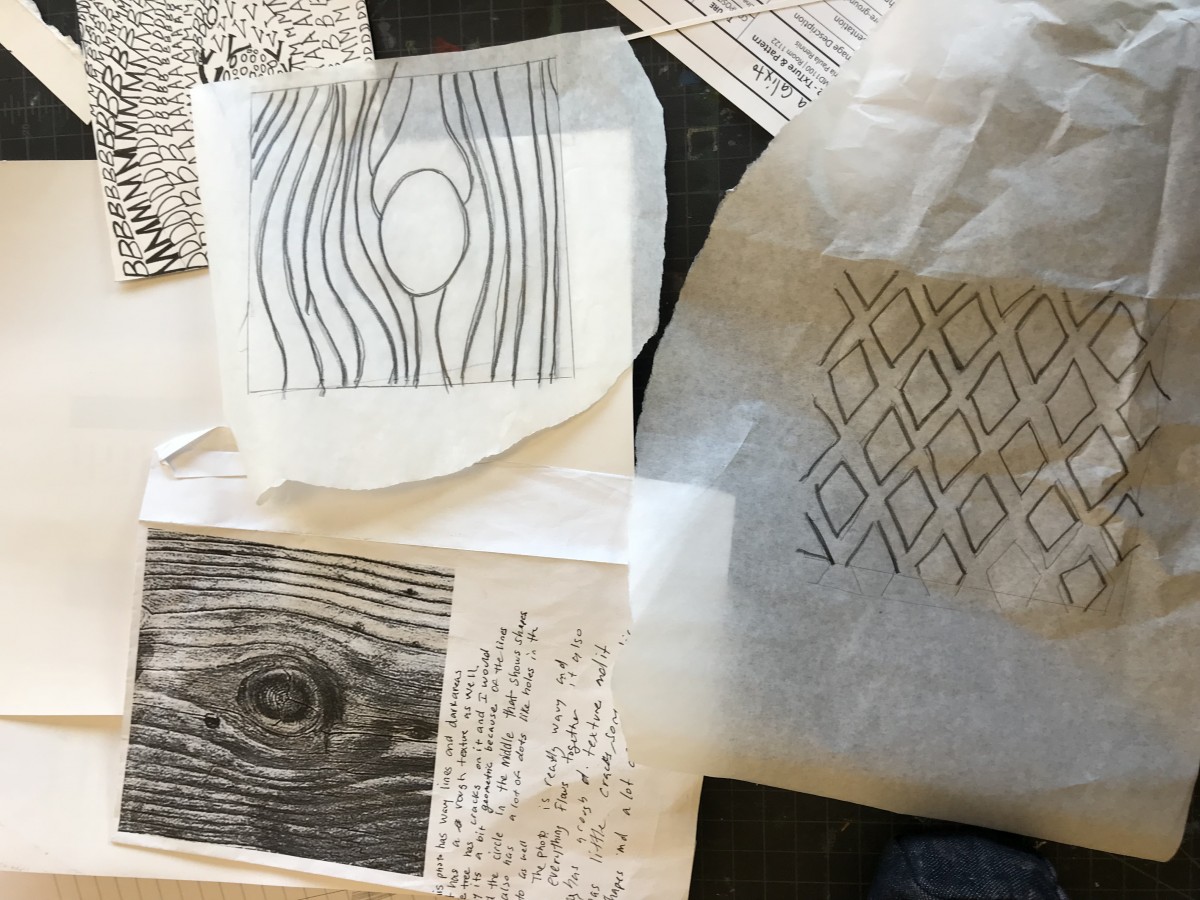 I used tracing paper to move the sketches onto Bristol
 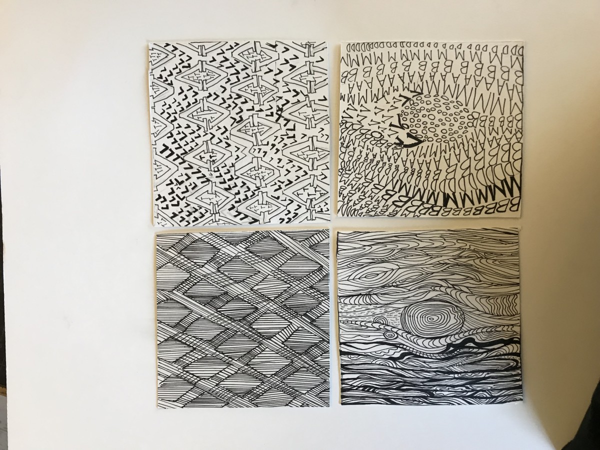 Final project


By the end of this project, I think that I was able to learn multiple things. One main thing, at least, to me is that I was able to a take an image and convert it, in 2 new unique ways. One way was with all of lines, while the other was using letters to create the image. I think that the letters version were more interesting because I was able to see what letters I can “see” in a non-letter image.


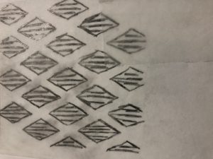
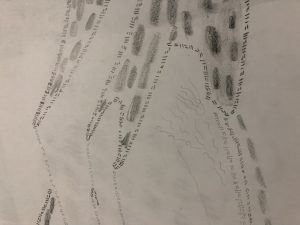
The first two pictures are sketches of my pattern image, which was yarn. My other 2 are my sketches for my texture image, which was noodles.
The OpenLab is an open-source, digital platform designed to support teaching and learning at City Tech (New York City College of Technology), and to promote student and faculty engagement in the intellectual and social life of the college community.