Author Archives: Amy Lai Pan

Museum Visit – Amy

I visited the Museum of Metropolitan Art. Unbeknownst to me, there were a couple of famous paintings, including The Starry Night by Vincent Van Gogh. This piece in particular reminded me of the Project 1 – Lost and Found. Although not impressionistic, I found my art to be reminiscent of some of the details in Van Gogh’s painting.


imagiNATION-Deliver

The primary focuses of project 5 were research and discovery. I decided to search around my apartment to find the starting points of my compositions. As I live in a fairly old complex, finding the starting points were relatively simple, but creating a typeface based on that proved to be a bit more of a challenge. I haven’t used chalk as a medium before, so it was difficult to translate what I initially sketched on paper to the wall(s) of my apartment. Overall, I think it was a fun project to do, as it can test one’s imagination.


ColorYourSelfie-3-Develop

My favorite color (Blue-green) has cultural associations tied to youth, fertility, calm, strength and peace. I chose this color because it reminded me of a game I used to play; Starcraft. In that game the players get to choose a team color and I would always choose Teal (almost like another version of turquoise). Blue-green is a color that reminds me of Teal, so I chose it simply for the nostalgia.

ColorYourSelfie-ComplComp
ColorYourSelfie-TriadComp
ColorYourSelfie-AnComp

ColorYourSelfie-5-Deliver

In project four, I learned how to add colors in a highly contrasted black and white image on Photoshop. From removing white spaces to erasing/cleaning up the images, I familiarized myself with the program and filled the selfies to their respective colors, all the while learning how to operate another Adobe program. 

I think for this project I could have made better highlights to the selfies. Instead of adding the entire block of color, I should have simply cut out whatever I was highlighting into said color (ex: purple glasses).

Selfiemotion-Phase 5-Deliver

The mood I’ve chosen for this project is “Surprise”. I decided to have the focal point(s) be the eyes, with the darker outlines highlighting them. Additional details like the raised eyebrows and gaping mouth were added to emphasize the emotion.

To me, a surprised emotion usually involves something that blows your mind away, so I added bits and pieces of my own head doing just that. I placed it in an upwards movement to recreate that scattered and blown-up metaphor, all the while using the eyebrows to guide viewers toward that same motion.

In this project I learned the importance of expressing emotion in a visual context without it being so obvious (ex: emojis). I think the concept of the mind blowing up was translated well enough, with other visual cues (eyes and mouth) giving hints as to what expression is being made. I think the unsuccessful part of this project was how little of the grey scale was in this piece. Yes I added pieces that built up towards the darker ends of the scale, but a majority of the work is dominated by the lighter end of the scale (ex: the face), whereas the darkest part of the scale is in the hair. This, I feel, leaves plenty of negative space surrounding the picture.

TxTure & Pattern-5, delivery

Final sketches were developed and defined furthered with ink and transferred onto bristol. Backgrounds were added for the line and type pattern.

Thoughts on this project:

While the process of thinking up backgrounds for the pattern picture nearly drove me crazy, the feedback from class was incredibly helpful in overcoming thischallenge. I learned to not follow the traditional contours of pictures, that what we see isn’t really a “line” but a defined aspect that had been enforced by a background.

As for the technical aspect of this project, I could have definitely scaled my pieces much better and ahead of time. Not all the pieces are exactly 5×5 inches, as I made the mistake of not checking the dimensions before inking everything. For the next project I hope to remember that small, yet vital detail.

TxTure & Pattern-4, develop in ink


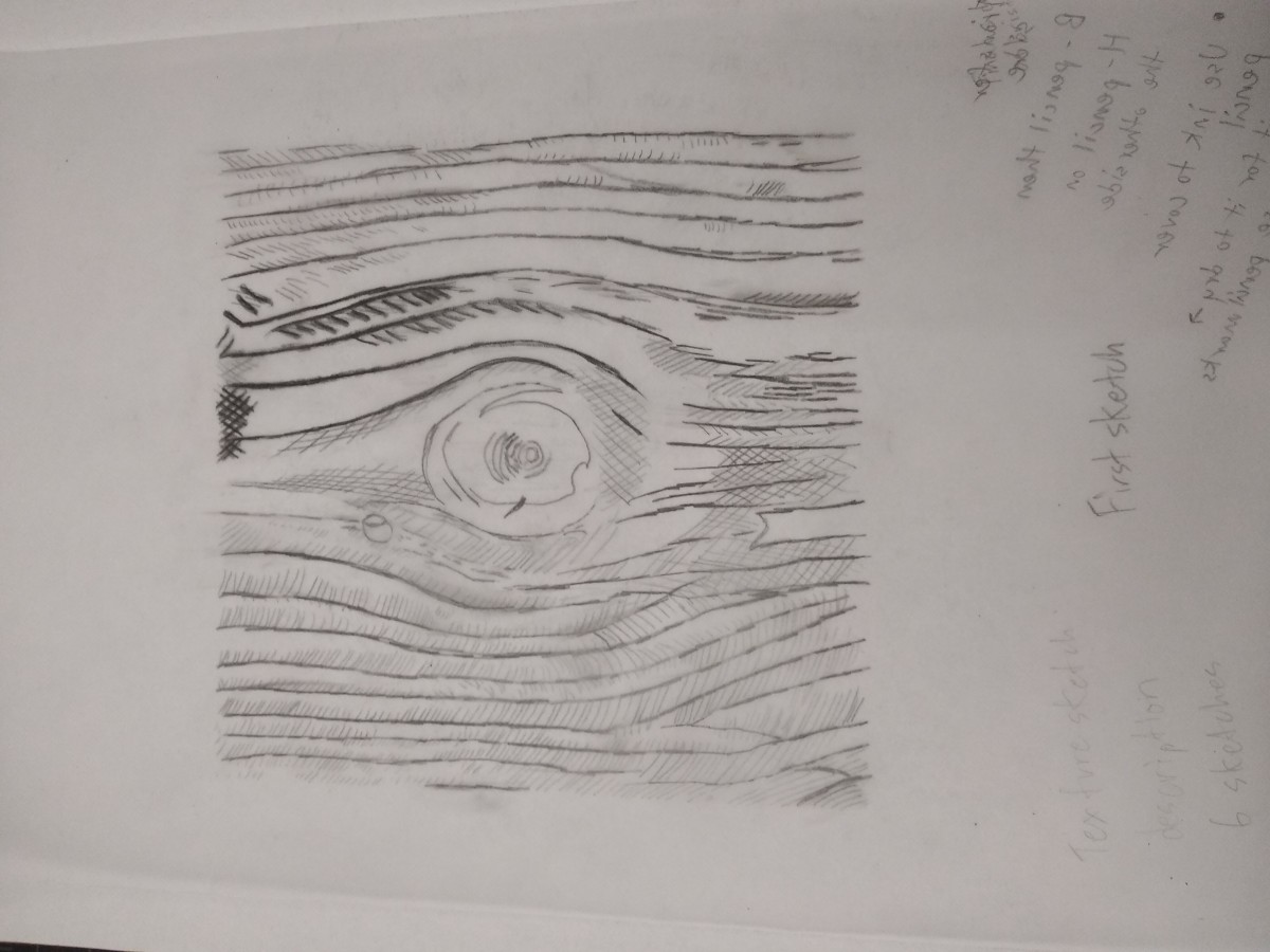
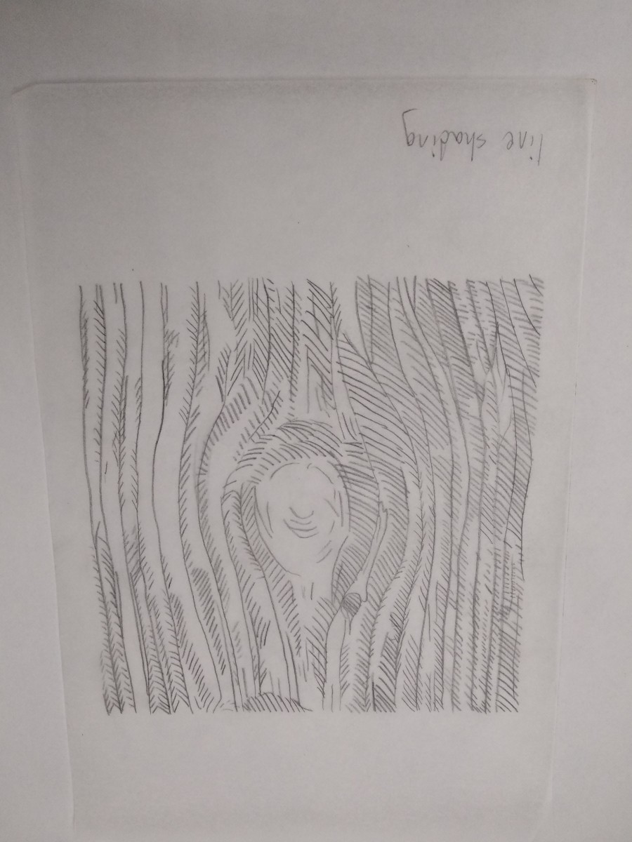
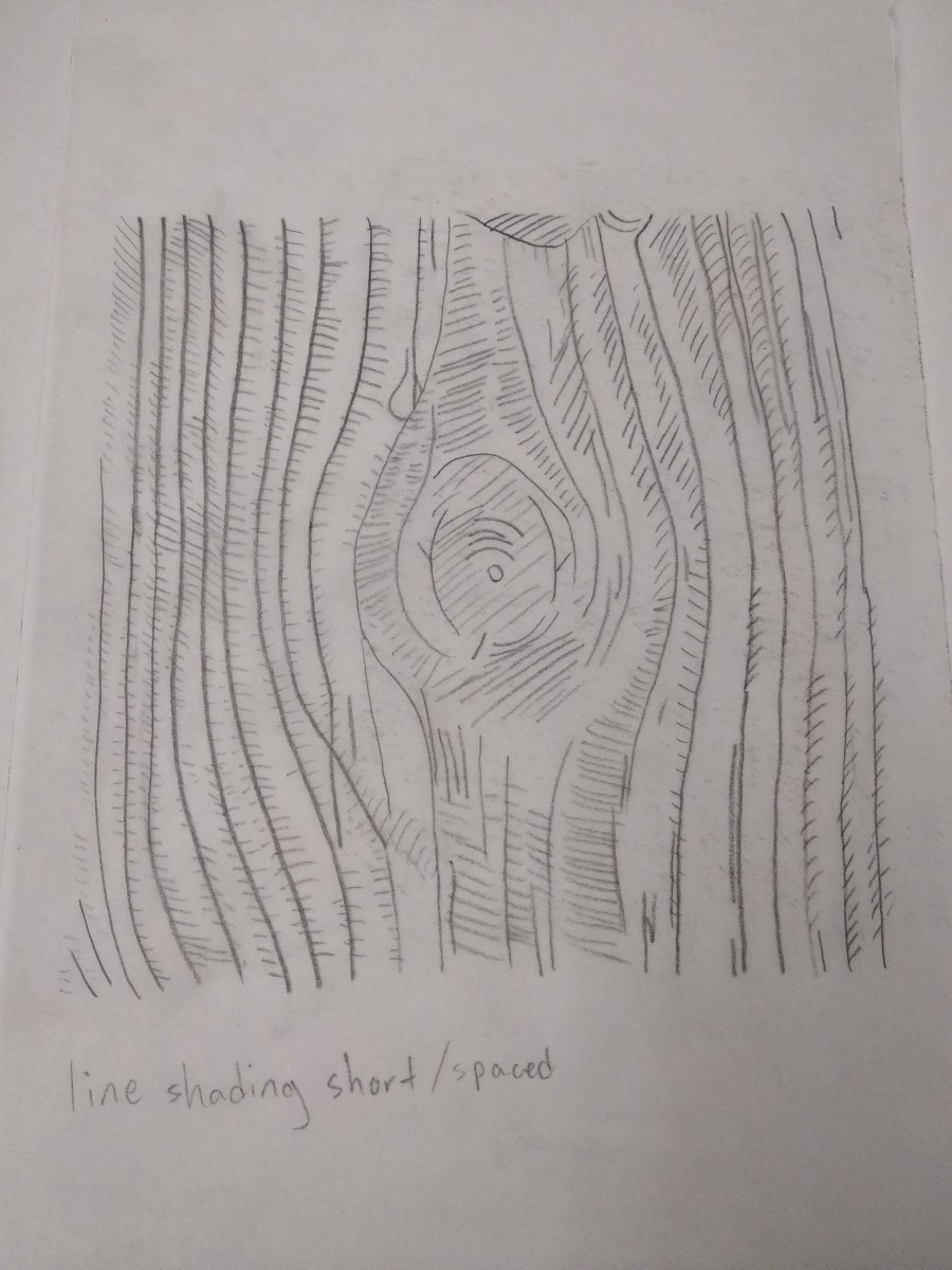
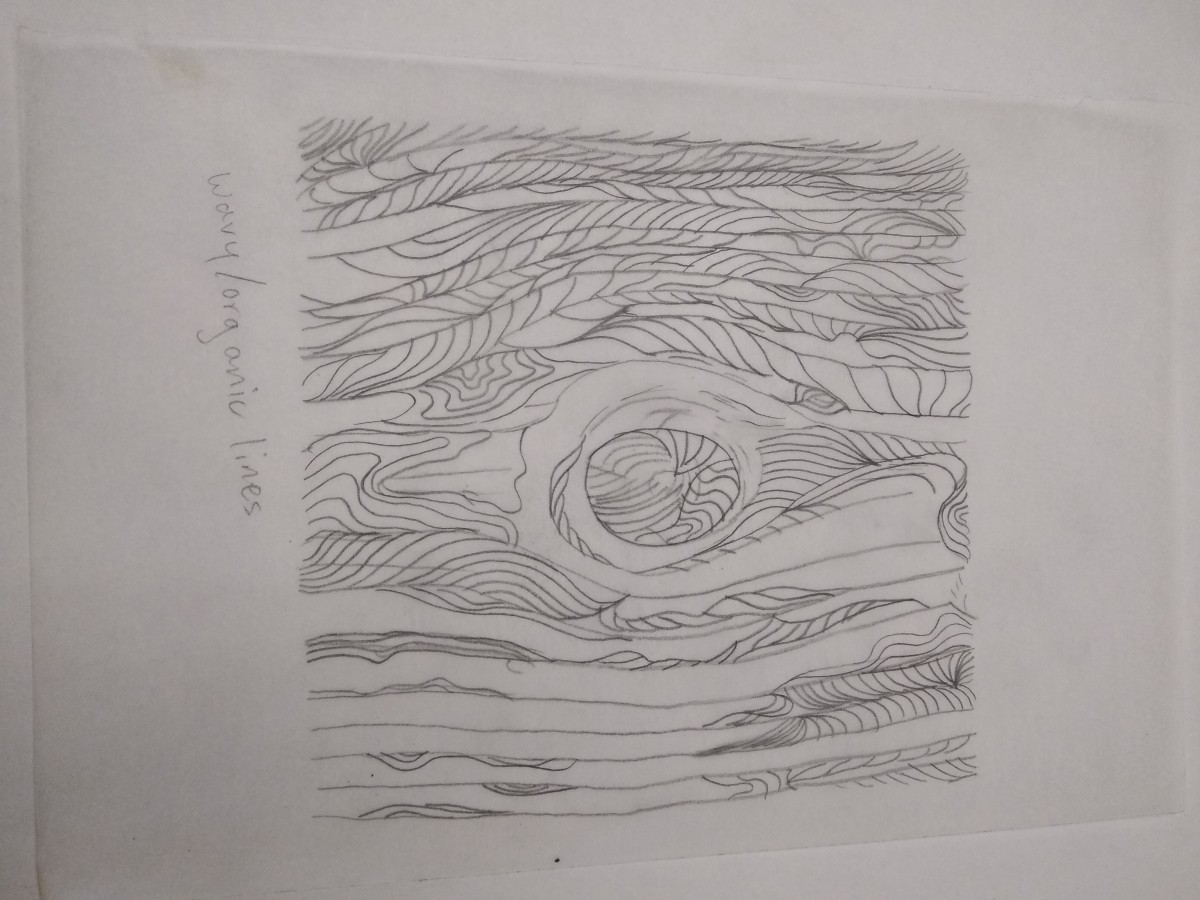
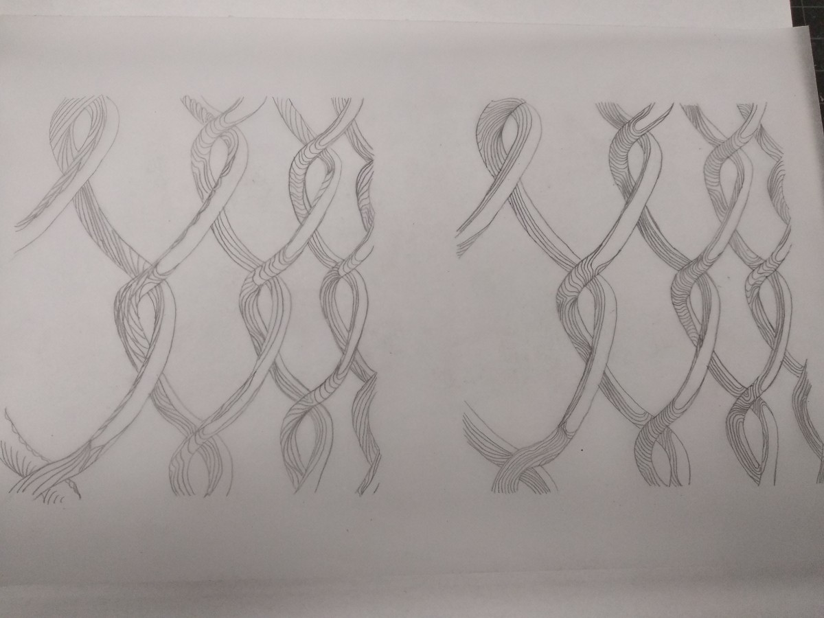
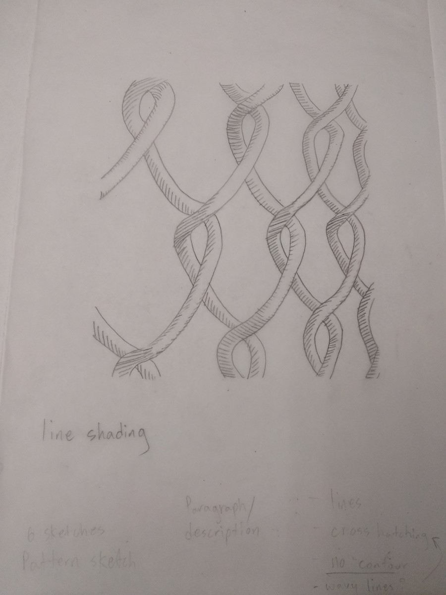
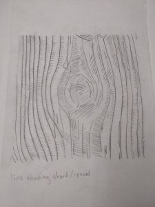
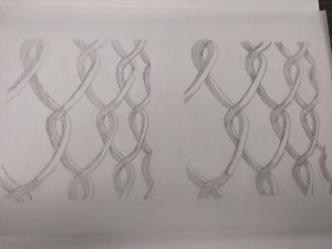
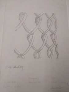
Sketches I did to visualize and interpret my ideas for line and type. I experimented with different styles ranging from hatching, cross hatching and line shading. I developed/finalized some of these into type once I felt ready to do so.


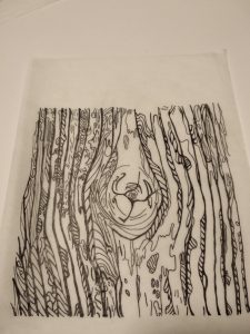
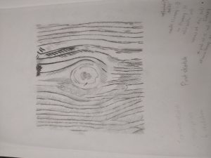
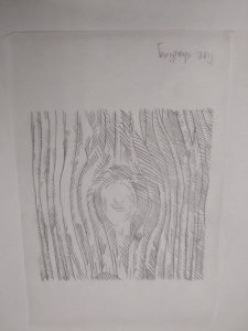
Line sketch for tree bark and developed with ink.

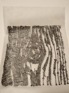
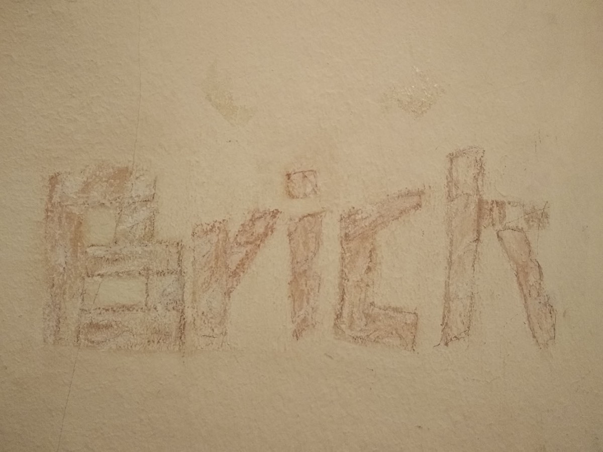
Type sketch of tree bark that was traced over with a 6B pencil and later transferred on bristol for inking.

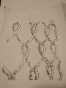
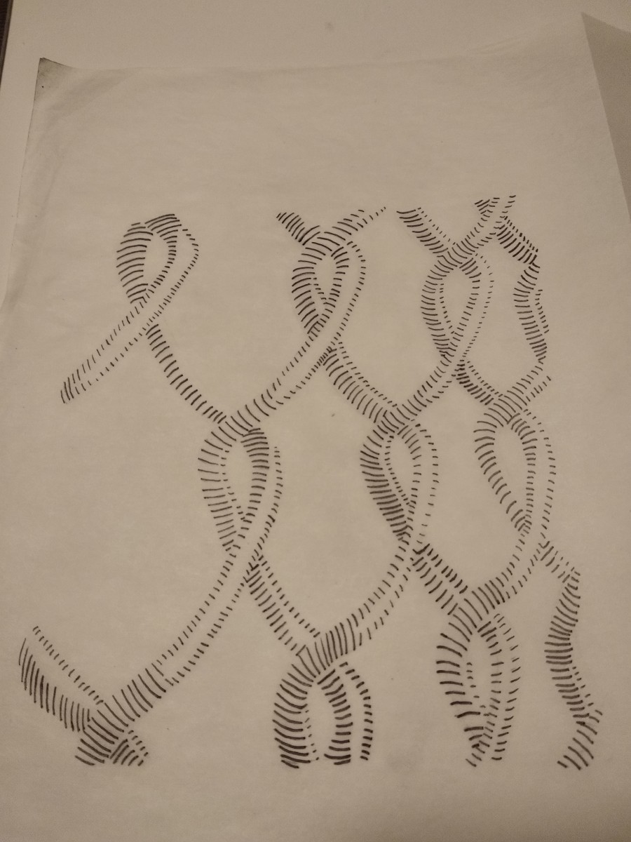
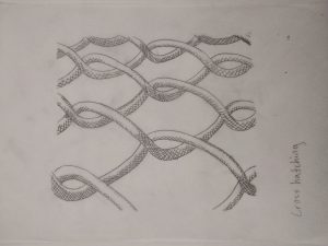
Line sketch of a fence/chain developed with ink. Darker lines were used to represent the areas with the most shading.

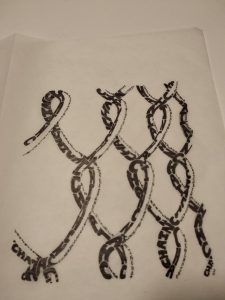
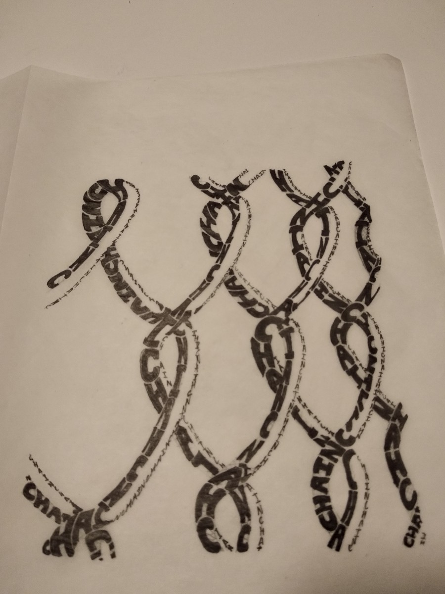
Type sketch of said picture developed with ink. Sans serif and bolded letters were used to accomplish different types of shade.
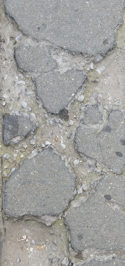
 

Texture: Tree

The tree bark picture is an example of detailed texture with a high amount of contrast. In addition to the balance of light and dark within the photo, the shadows casted within the crevices of the bark offer thick linings for this piece. Each bark outline is evenly spaced apart allowing movement and flow throughout the piece, contrasting the rough texture.

Pattern: Fence

The picture of the fence offers a strong light source coming from the front, which cast shadows behind its structure. This also forces the viewer’s eyes to focus on the much lighter areas of the piece, instead of the blurred background. Combined with strong shadows, it makes for a smooth and rounded surface with even composition throughout.

COMD1100 Project #1 Amy Lai Pan

Two cracks found on the sidewalk outside the Supreme Court building. The shapes are geometric. This is an obvious figure-ground, as the concrete “supports” the cracks and split. Overall the composition in this shot remains the same throughout, which is lighted with no shadows being cast.

Multiple cracks and splitting found on a sidewalk. This is a geometric piece. Since the focus is upon the dark spot (dried gum?), this shot qualifies as an obvious figure-ground. The surrounding concrete supports this point of focus.

A wall with chipped paint, clearly done with multiple layers over the years. This piece is geometric, accompanied by an obvious figure-ground. There is an imbalance of ground (negative space) against the figure (positive space).

The remains of a plaque that was once displayed outside the Jay Street Metro-tech train station. It is a geometric shape with a unique interior (industrial glue/paste?). This shot is an ambiguous figure-ground, as there is a 50/50 balance of figure and ground. Its composition changes within the interior, as the shadows are slightly cast in between markings.

Similar to the plaque-remains-picture, this piece is placed outside the same train station. This shot is a geometric piece. Its composition changes within the interior of the design, but the outside remains the same. This piece is an ambiguous figure-ground.

This shot was taken from a column inside a train station. It is geometric with the point of focus being a circle, followed by the chipping paint. This is an obvious figure-ground, as the background supports the figure. The orb in the middle of the picture has multiple light sources pointed at it.