Author Archives: Cameron Scotland

Museum Visit – Cameron Scotland


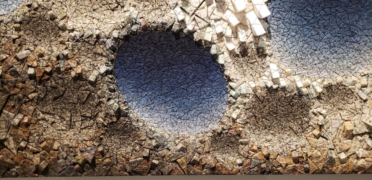
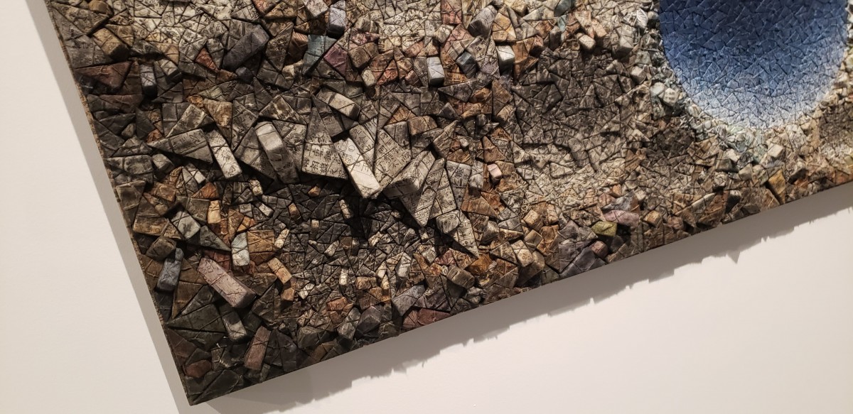
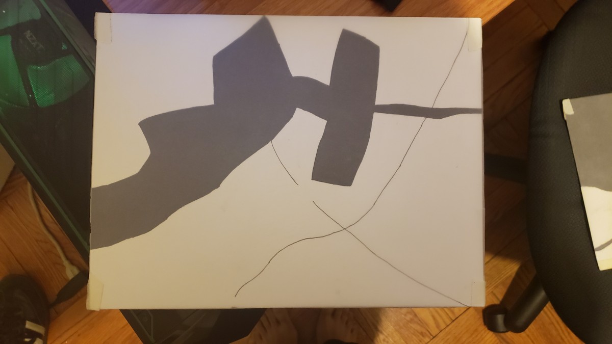
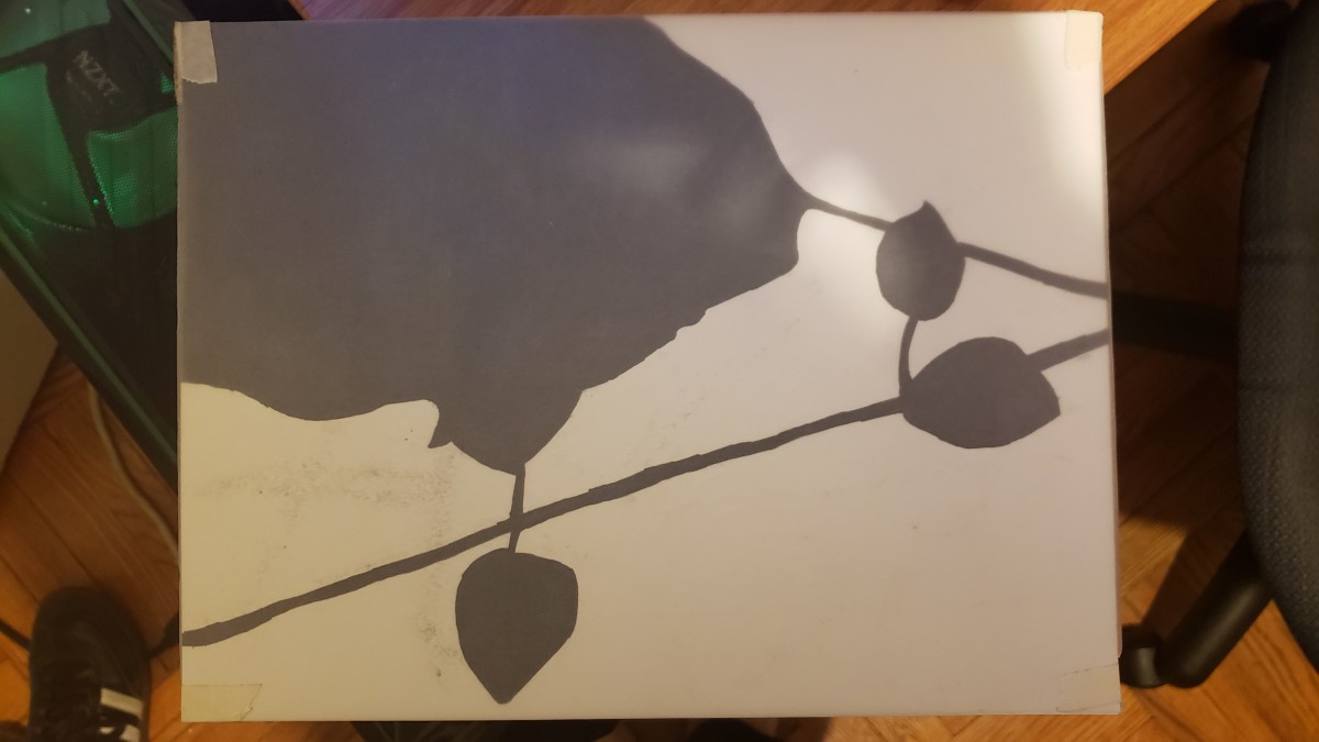
(My piece, close-ups of it, and also my two compositions from the first project)

Museum: The Brooklyn Museum

Date Visited: 12/16/18

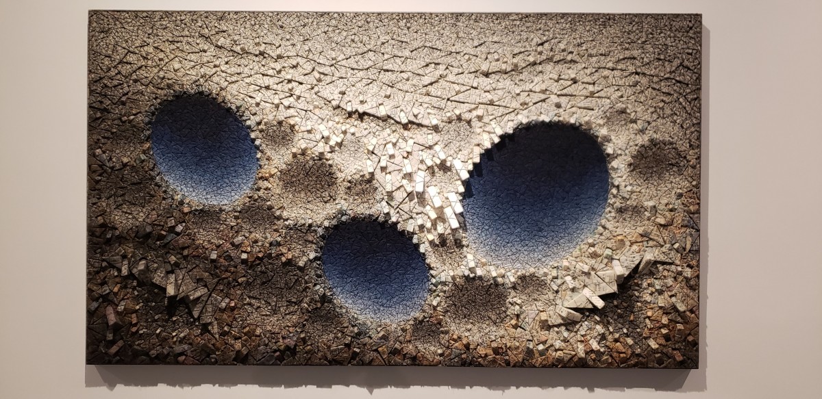
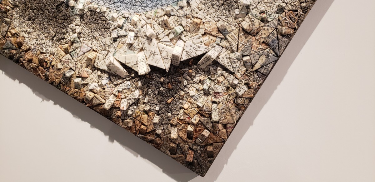
Piece Name & Date: “Aggregation 09-DO71 Blue”, 2009

Artist: Kwang Young Chun

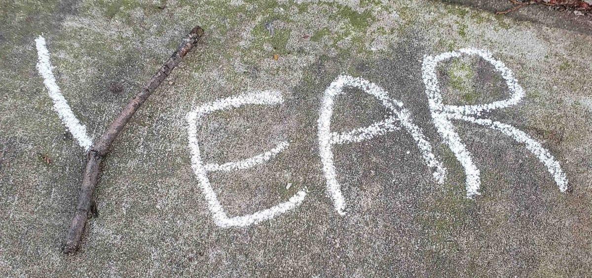
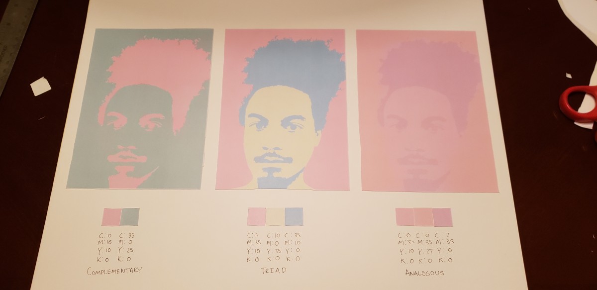
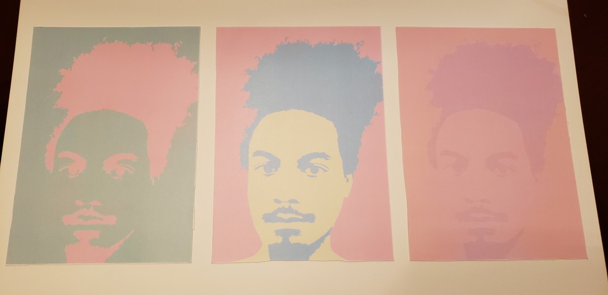
I decided to compare the piece I chose to our very first project which focused on obvious and ambiguous compositions as we shot pictures of random places and things outside. There were multiple pieces I would have liked to analyze but this one I found the most interesting and thought would be nice to breakdown in terms of all the things I’ve learned over the semester.

imagiNATION – Deliver


Here are my before and afters for my three compositions. I chose to work in my neighborhood for this project so I could freely go back and forth to the locations for my project if needed but I feel like it limited me slightly, but eventually I did find things to work with of course. The project wasn’t too hard but weather was the only thing that set me back at all so I just learned that I would have to plan more accordingly for future projects that would require similar efforts to complete. I think the yellow blotch was my best composition as it touched on color and texture more than the others although being slightly less readable due to the ‘T’ looking like a ‘J’. All in all the process went smoothly for the most part, disregarding the slight frustrations I had initially looking for places to work, but I’m content with my results and think I did alright this time around. This wasn’t my favorite project but I think it would have been more enjoyable had it been done a different time of year, so maybe I’ll try something like this again in the future.

Color Your Selfie – 5 – Deliver

Coming to a close with this project I was very happy with the results and overall enjoyed working on it a ton. I love color and using it like this in Photoshop was fun and helped me to learn a lot. The project was pretty simple but effective in helping teach about color as well as Photoshop tools. I now know how to use the color wheel and how to find color palettes/schemes that could work well together, along with using high contrast images to make coloring easy as done in the project. I feel I did well in crafting the project as a whole, and just think I could have used better paper/ink to print with so I’ll keep that in mind for future projects.

Color Your Selfie – 3 – Develop

 Analogous Composition

 Triad Composition

 Complementary Composition

My favorite color is pink, and there are many different characteristics that come with the color. Pink is loving, kind, and generous; it entails a friendly and a soft warm aura that draws people in. I feel these are personality traits I hold along with the many more characteristics pink has. Pink is a feminine color, it’s romantic and sensitive, and I feel I’m in touch with those aspects of my personality, along with not being super masculine myself. I chose this color because I think it’s very pretty and I always loved working with it and using it when I could. I enjoyed using it in this project and exploring how well it works with it’s different color scales.

Selfiemotion Phase 5 – Deliver

Mood: Tired/Dreaming

Final Composition/Sketch:

Sketches:

I had a lot of fun with this project and I’m very happy with what I’ve created; I feel my planning was good and I finished the work in a timely manner. The actual process for working was seamless as well. If there’s one thing I learnt it’s how to utilize twin tack effectively for collages as I prefer not to use glue usually; Twin tack feels much more clean and helped me layer pieces on top of one another easily.

Project 2: Texture & Pattern – Final Delivery & Sketches


Here is my final composition and work for our Texture and Pattern project. I enjoyed the project overall but felt I struggled with my first couple of sketches. Ultimately I came to a better understanding on what was needed to achieve proper contrast and texture, and was able to finish with results I’m satisfied about. I learned how to design with type and use varying sized/shaped letters to create different contrasts and textures, while also learning to use lines outside of a contour to copy images that in reality do not have these contour lines we seek in them.

Project 2: Texture & Pattern – Develop in Ink


The fence’s texture is smooth and curvy; For contrast, the fence is dark on certain parts but is very bright from sunlight on others while having a flat and mostly darkened background.
The rocks are smooth and mostly round, while some have more straight and rugged edges; The left most rocks are much darker and bold than the rocks to the right which are all very light in contrast, while finally being tied together by the very dark black background below the rocks.
I feel all my sketches achieve what my descriptions entail, including the roundness of the rocks . the contrast of the darkened and light parts of the fence, the rocks’ very dark background, etc.


Lost and Found: Phase 4

Overall, I enjoyed doing this project. Taking all the photos as I walked around different neighborhoods opened my eyes to everything around me and how interesting and intricate they could be. I was happy with a lot of the photos I took, and even ended up using some for my other course I’m enrolled in.

Having the project guidelines and following the process/phases helped me complete the project seamlessly, as well as teach me how to approach my work, and I’m sure that will help me in any future projects I work on in and out of this course.

I feel like I could have improved on my usage of tracing paper; I haven’t really used it before, but in the end I did manage to transfer my sketches over to bristol paper for inking. Although they were flipped, the overall composition of my work was preserved and I was ultimately happy with the end result.

Here are the links to my posts for each phase of this project, displaying my progress and process for this project: Phase 1Phase 2 , Phase 3