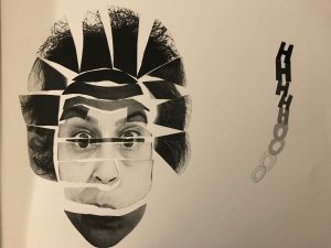
My self motion picture showed happiness and it showed how a smile can also be fake. My project also showed luxury in it thats why there are watches and jewelry all around the picture. The horns on top showed how evil it can be to only care about materialistic things in life. It shows how it can be a facade and that on the surface it shows happiness because you are happy you have all these things but deep down might be upset. It also just means happiness because people can be fully content with those type of stuff which is fine. Another symbol the devil ears show is the fact that some people might have to do evil things to get these expensive things (you never know).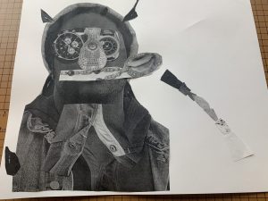
Category Archives: Uncategorized
project 3: Selfie Motion
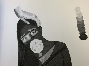
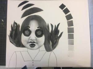
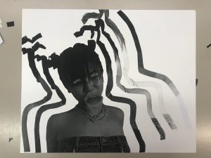
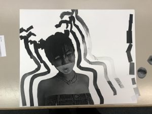
The mood for my composition is surprised. When creating this collage I thought of changing the contrast and brightness of my image to a very dark color with little to no contrast. I made sure to add a very wide open mouth because usually when your surprised your eyes and mouth become wider. I’d say the focal point for my composition are the eyes and mouth because they have more brightness which pops out more than the background. The reason why I added a shade lighter to my chest is to balance out the bright eyes I added. I wanted it to represent a shadow of light as if I was hiding behind a closet door and to my surprise I found out something like a friend was talking behind my back, just an example. when being surprised you are known to be in shock depending on the news so I wanted to emphasize that in my composition. I did have trouble in actually trying to work with my image just because I started off with an image of myself having a smirk which can mean many different types of things and I didn’t want to go the easy way out and choose happiness although it would of worked best. I think I needed more work in demonstrating movement in my image because theres not much that there, I couldn’t really figure out what to do with that but next time I think I could play around with my facial expressions and create some body movement. Overall I’d say I did a good job in showing my mood.
color_Shades
Selfiemotion-step05
Selfiemotion: deliver
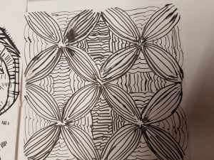
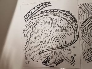
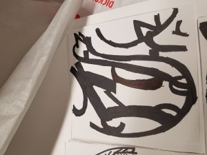
Mood: Angry
Focal Point: Mouth
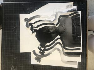
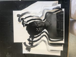
(Yes my project is to be looked at upside down)
I had fun with this project! I didn’t like it at first but when I actually sat down and got to work it started growing on me. The biggest thing I learned from this project is how gradients and space create some sort of movement within pieces. I learned how to manipulate these two factors to my benefit in which I could use later in life.
I think I tripped a bit capturing angry. Although I think I achieved the mood to an extent, I definitely could’ve pushed it further and shown my message clearer.
Project 3: Selfiemotion
project 2
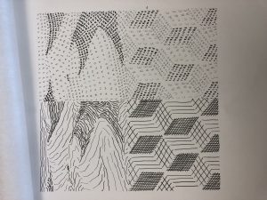
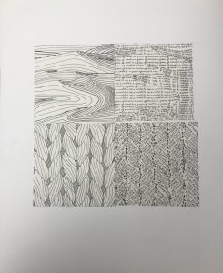
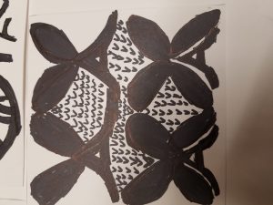
For this project, I focused more on the smoothness of the textures of each photo. For the desert, I know that sand looks smooth but is actually rough, therefore, I used lines that aren’t completely straight to demonstrate that. At the same time, since the original photos made me feel very satisfied, I made the typography one as neat as possible. As for the cubes, I feel as though the flow of direction is very important so I made the lines and texts all go in a direction like a waterfall.
Project 2 – Txture & Pattern – Final
Project 2-Txture and Pattern, was extremely challenging. I had such a great time doing the line work for both of the images I chose – which were a braided rope for pattern, and desert sands for texture – but when it came down to the type composition I came to a stand still.
I was into the line compositions and trying to figure out how different line weights, line directions, etc would work best at conveying my images. When ti came time to start the type compositions, I wasn’t sure where to begin.. I researched fonts that might relate to the images, and founds some fonts that were named appropriately: “Sand Dunes,” “Fuzzy,” and so on. But even with my font selections I have a difficult time translating the images. It was only until I read the graphics excerpt that I figured out it wasn’t so much about the font I chose to use but the way you use it. So I started more sketches but this time focused on the different contrast of the images and tried to translate them with a more basic type.
I am a bit disappointed in the way that my final type pieces came out but I know I came a long way from where I started with Project 2 compositions and I’m satisfied with the outcome.
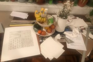 Final outcome: 2 line compositions, 2 type compositions mounted on 14×17 bristol board, and chaos on the dining room table

