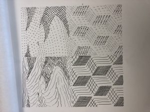
For this project, I focused more on the smoothness of the textures of each photo. For the desert, I know that sand looks smooth but is actually rough, therefore, I used lines that aren’t completely straight to demonstrate that. At the same time, since the original photos made me feel very satisfied, I made the typography one as neat as possible. As for the cubes, I feel as though the flow of direction is very important so I made the lines and texts all go in a direction like a waterfall.
Graphic Design Principles
A City Tech OpenLab Course Site


