http://www.michaelkenna.net/gallery.php?id=14
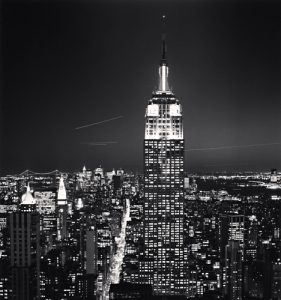
This photograph is called “Empire State Building, Study 2, New York City, USA, 2006” which was taken by the photographer Michael Kenna in 2006. The Empire State Building is a Skyscraper located in New York, NY in Manhattan, which has 103 floors. The intention of the photographer was to capture a perfect view of New York City. There are always tourists that travel from other places out of NY and they intend to go to the top floor of the Empire State Building because they’re interested in seeing a good place and it’s a good place to take pictures especially in New York City. When I look at the Empire State Building, I’m thinking of this building as “America’s Favorite Building” and “Most tallest building.” It’s great especially the way the picture came out. When I see this, I get a calm mood because of the fact that this photograph was taken in black and white because it’s the photographer style. This image is a perfect example of a perfect view, which I wish my view were like this.
In the image of the Empire State Building, which was taken by Michael Kenna, there are three formal elements from the Steve McCurry video of nine photo compositions tips. The following three elements, which I believe was used in the image, are Leading Lines, Symmetry and a frame with a frame. In the photograph, Leading Lines are used because you can see there are so many lines on the buildings especially the Empire State buildings itself. Symmetry is used because some of the parts of the building look very similar. A frame with a frame was used in this photograph because the viewers can perfectly see a perfect view of New York City. These elements do help to create the mood or feeling in the photograph because viewers can have a different point of view when they are seeing things in the top floor of the Empire State Building


Michael Kenna does a god job of photographing a New York City icon in this photo. The Empire State Building represents New York around the world.
It is an example of leading lines as the streets on either side of the Empire State Building lead to the building itself.
The Empire State Building is placed however a bit to the side making it almost symmetrical but not quite.
Lastly, a frame within a frame is a bit more literal and this photograph can’t be said to use a frame within a frame. The photograph itself has four sides and when the main elements of the photo are inside another frame like a window or a door, we call it a frame within a frame. A great example is the photo by Thomas Holton that we looked at in class of Gladys upon her retirement.