1. Video Link
2. Presentation PDF Link
MTEC 2120 Final – Pocket Gopher
Presentation for working prototype.
You can explore with pressing play button on the screen.
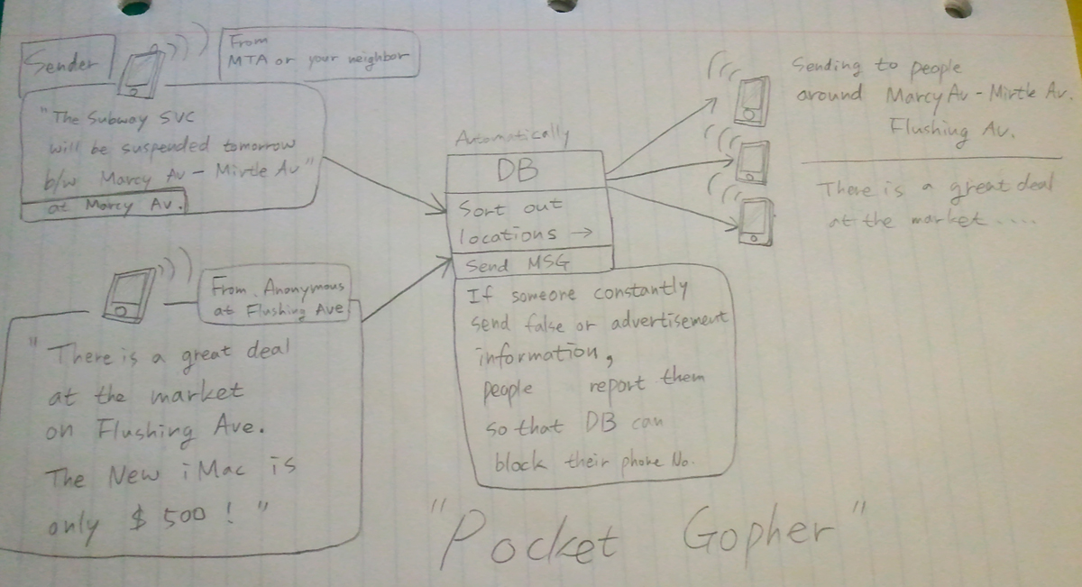
Project Title : “Pocket Gopher”

During the chaos time of hurricane Sandy, we were shocked because we realized we did not have enough information of our neighborhood. We did not know when a subway would run, which gas station actually had gas, or where is the shelter, shuttle bus stop, and so on.
So, I thought it would be great if we had a mobile application which we can share information in our town. The base is very similar to ‘Twitter’, but the difference is when someone post useful information of certain area, you can get a alert text message if you are in the same (or near) area.
For example, if you happen to know that every train service is suspended between Jay st. and 42 st. Time Sq. due to the heavy rain, you can post about this via the application “pocket gopher”. Then, the server automatically sort out the location and send message to all the members in the area (Jay st / 42 st Time Sq.)
I named this project “pocket gopher” because as you know, gophers (ground squirrels) are altruistic animals. They frequently stand watch at the entrance to their tunnels and whistle when predators are spotted, causing all the other gophers to run for the safety of the tunnels. Just like this, you can help lots of people with posting valuable information via “pocket gopher”.
<Idea sketch>
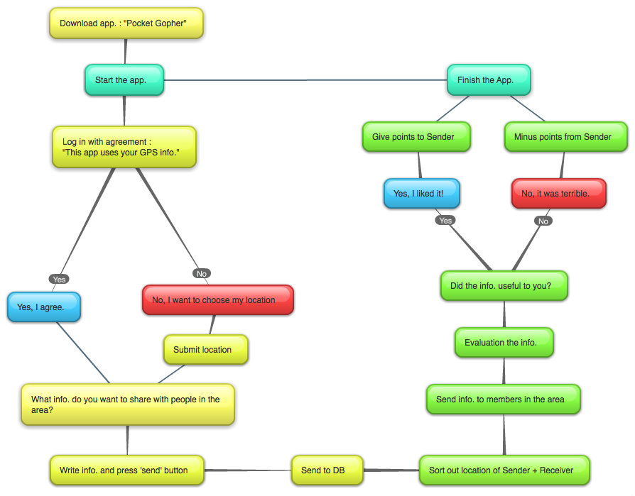
<Flowchart>

Survey Questions :
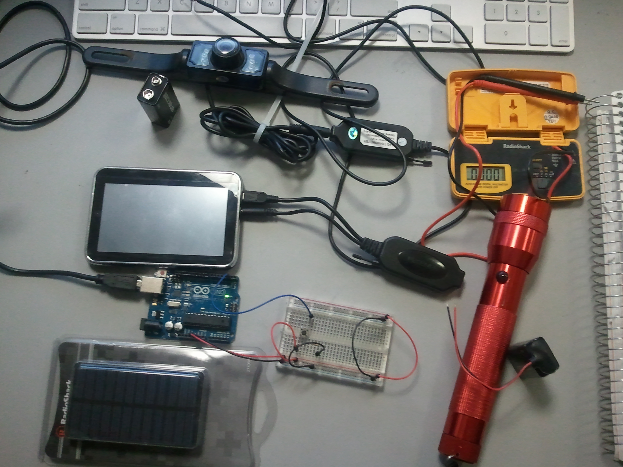
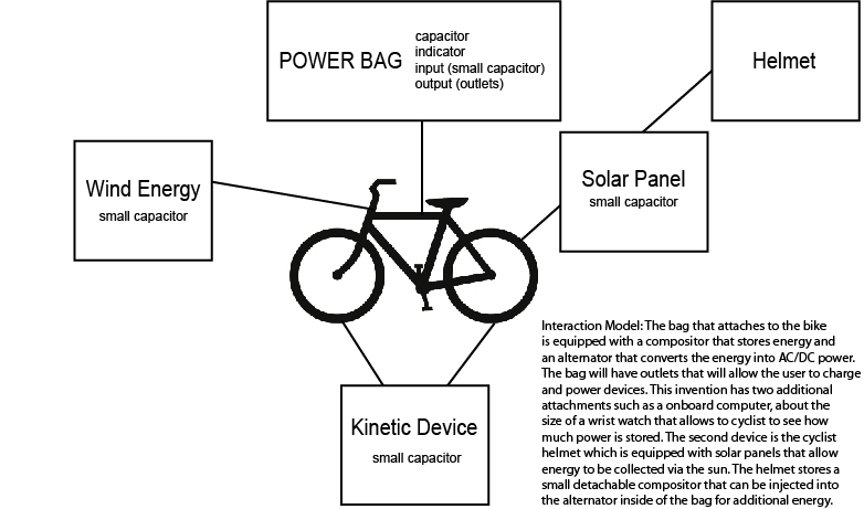
We have solar panel (6V) / camera (12V) / navigation screen (5V) / wires / 9V battery / snap connectors / breadboard / digital multimeter / flash lights / Arduino / USB connector.
The problem is all these parts have different voltages. We are trying to solve it with 12 volt battery for camera and regulator or transformer.
How can we shrink time when a user interacts with an interface?
I am not sure this is good example or not but this reminds me of easter egg of new version of youtube player. When we are waiting for loading video, there is a spinning white dot icon. While its spinning, user can play worm game by pressing arrow keys (white dot becomes a worm). Sometimes loading is very long. Then, this cute game can shrink user’s time efficiently.
What do you think about letting a machine make choices for you?
It was mentioned the iPod shuffle in this reading as an example of machine make choice for users. I personally am getting familiar with letting machine make choice for me in everyday life. For instance, I usually set my playlist randomly, so that my mp3 player can select random song for me. But that is not completely random because there is option such as, ‘random in recently added songs’ or ‘random in favorite songs’ so I can make a range of random songs. I think this is similar to the example of ‘Amazon.com’s recommendation search’ in the reading. I am much more comfortable with these computer’s choice things nowadays as computer’s getting smarter.
What is one way you’ve figured out how to save time?
I know this sounds silly but I used to set my clock 10 minutes earlier than actual time so that I could do all things 10 minutes earlier. This worked a few days =) Also I always try to make a list that I finished already / have done so far / what I have to do things like that so that I can see whole picture of procedure. I think it is helpful to save time.
The article says that we can make quantitative data to a graph. The first part of reading, it says about graphical display – pros and cons, etc. Graphical display is not always effective and efficient. The array of irrelevant data cannot be a good graph, no matter how fancy it is. The article used ‘Solar radiation and stock prices’ graph as an example.
Choose one of the images from the reading.
– I chose the graph of ‘stomach cancer, white females; age-adjusted by country,1950-1969’.
What is working about the image?
– We can see the density of white female with cancer nationwide.
Is there anything unnecessary or any information you think is missing?
– I think it could be very helpful if it has population density of female so that we can make a comparison.
Have you seen any designs where you’re paying more attention to the aesthetics than the information?
What do you think of Maeda’s observations on simplicity and emotion?
John Maeda says that from a rational perspective, ‘simplicity’ makes good economic sense – because it is easier & cheaper to produce. However, it also looks cheap. People expect emotions from product’s design. The author mentioned that in professional field, people tend to think it looks unprofessional when they show their emotions to others. I think that is why, ironically, people feel more lonely and look for more warm emotions in their everyday life.
Is there an object or design that you are attached to?
I agreed with his saying : ‘the best art makes your head spin with questions. Perhaps this is the fundamental distinction between pure art and pure design. While great art makes you wonder, great design makes things clear.’ I believe that good design is simple enough to figure out how it works, but added human emotion that has care, attention, and meaningful feeling.
In this reading, Bill Moggridge informs us about different research methods. He also mentions his design principle : think first about the ‘people’ part of the design. Who are the users? What do they want? I remember I watched Bill’s interview clip at the class. He said,”this is what I am really thinking : What are you thinking?”. He always considered in user’s perspective as an interactive designer. That was impressive to me. We need to discover user’s latent needs and desires by research and we should observe and go into actual situation in order to make a better design for ‘people’.
The author presents 51 ways of method to learn people. Every method looks useful to me especially flow analysis and affinity diagram. I often draw a affinity diagram whenever I need to do a brainstorming. Then, I would use ‘fly on the wall’ or ‘shadowing’ to observe what people actually do in their everyday life. Also I should ask to people then create prototype of the design and evaluate it by ‘try’ methods such as ‘scenarios / empathy tools’.
The OpenLab is an open-source, digital platform designed to support teaching and learning at City Tech (New York City College of Technology), and to promote student and faculty engagement in the intellectual and social life of the college community.

