Category Archives: Uncategorized

Alex Feng’s Extra Credit


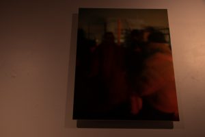
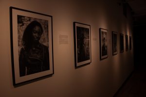
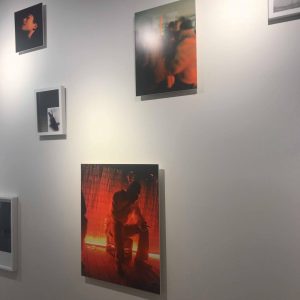
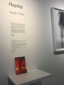
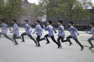
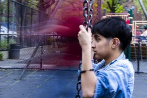
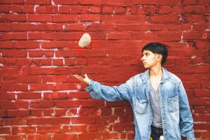
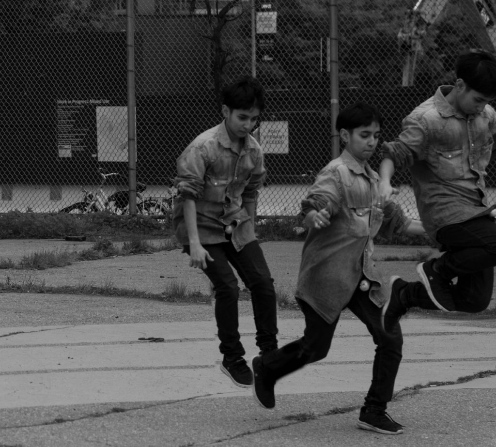
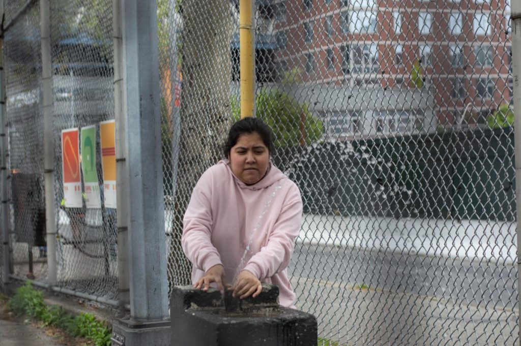
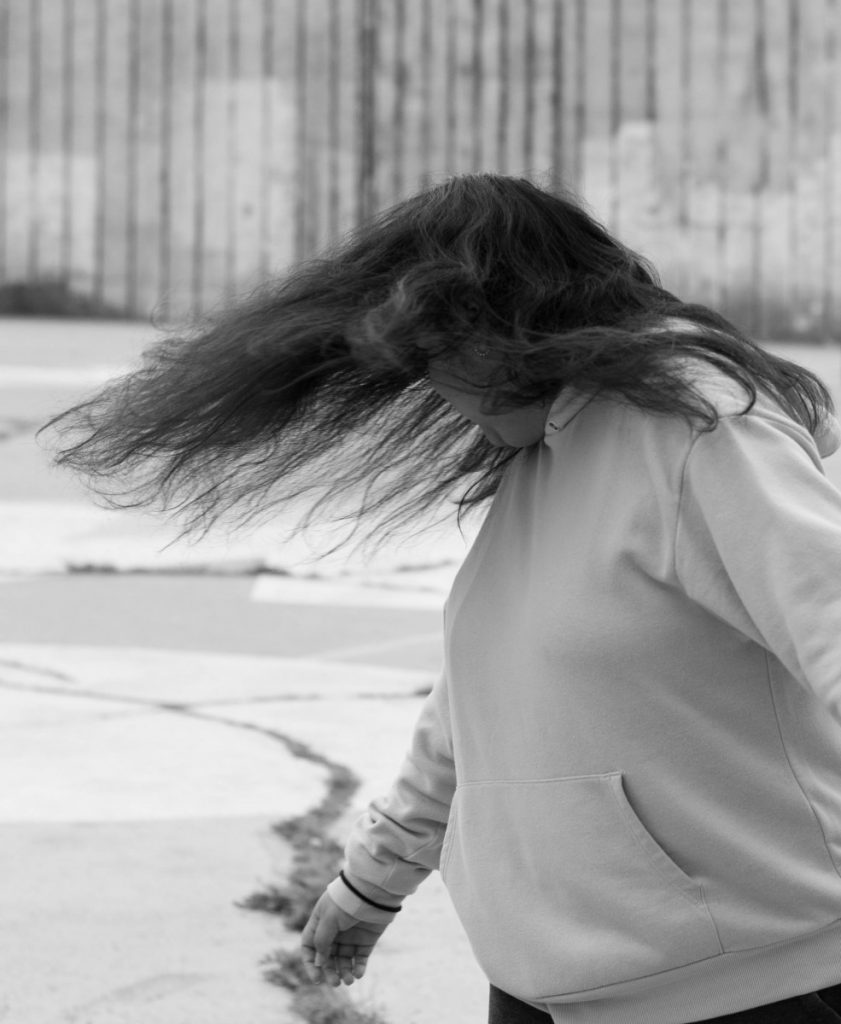
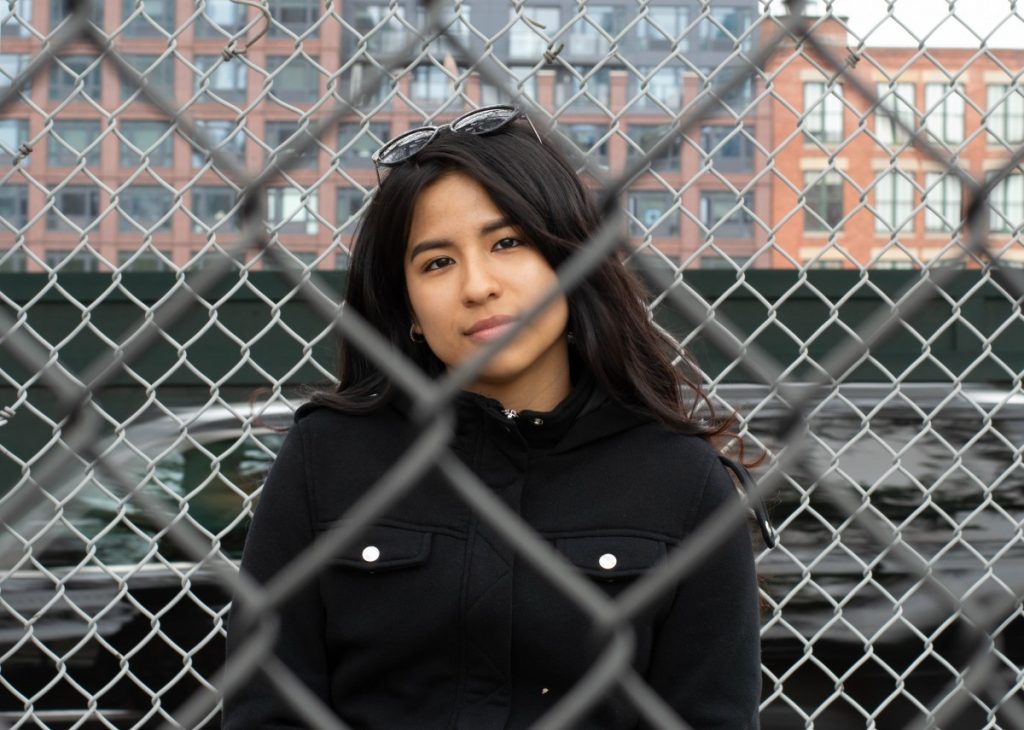
When I first arrived in the exhibit, it was mostly empty and quiet, but maybe it was because I came in around noon on the last day it was supposedly going to be shown. This trip to the exhibit may have been the first where I went to a photo exhibit at least so I didn’t really know what to do, but randomly walked around and came across some interesting photos. However, there were some photos where I may have done something differently. The only great photos I thought that were displayed were the first three and last three that are uploaded supposedly that the pictures will come out in the order I uploaded them in. The first three photos were purposely taken with a blurry look to it as if the subject was moving around. Normally, photographers may try to get their subject or object nice and sharp, but this photographer managed to get a great photograph that uses a blurry concept. As for the last three photographs, it all highlights a certain small part in the photograph while making everything else out of focus which I personally think is a great technique to use to give importance to what message the photographer was trying to tell with their photographs. The rest of the photographs that I have uploaded have some issues that I would fix or maybe it’s just me that is getting weirded out.

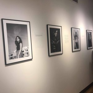
The 4th picture that is taken by this photographer choose a concept to blur out the face and have everything else in sharp with a middle and portrait shot. What is bothering me is that they should have just blurred out the entire head including the hair because the hair could represent some sort of identity whereas their concept was “blank” or no identity so they kind of failed to fully execute it in my eyes. The 5th and 6th picture concept was about religion and the photographs came out really nice. However, it really does not have anything that hints at the religion of the models so I would have tried a different approach or given them a different background to be shot in. The 7th picture is interesting in the point that the model is wearing clothes that belong to their culture and it contrasts with the background which gives off a white American vibe. Perhaps that was the purpose to show this contrast, but I would have liked it to be shot elsewhere to highlight the model even more.

Extra Credit LJ NYU

Brazil Nun

Overall, my visit at the NYU photo gallery was enjoyable. I found the photos impressive and felt like they were one-of-a kind. There were two photos that caught my attention.
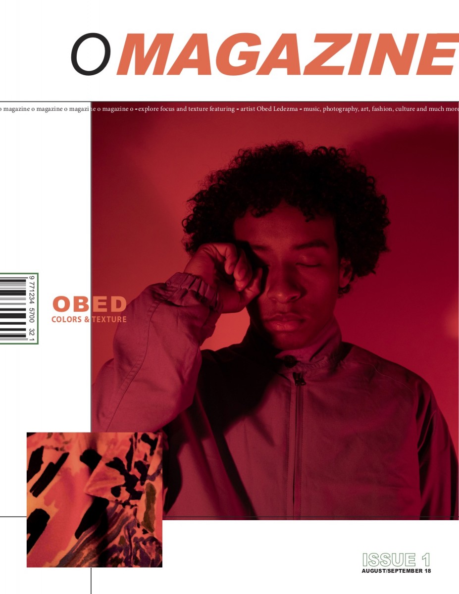
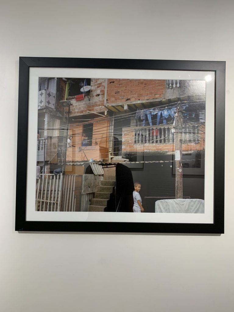
In the first photo, I found that there were many elements that made the image fascinating: leading horizontal lines from the houses, frame-within-a-frame from windows. In addition, I believe that the photographer did not follows the rule of thirds on purpose and its to show a documentary type of image. What I liked the most from this photograph is the stairs that somewhat made this image three-dimensional.

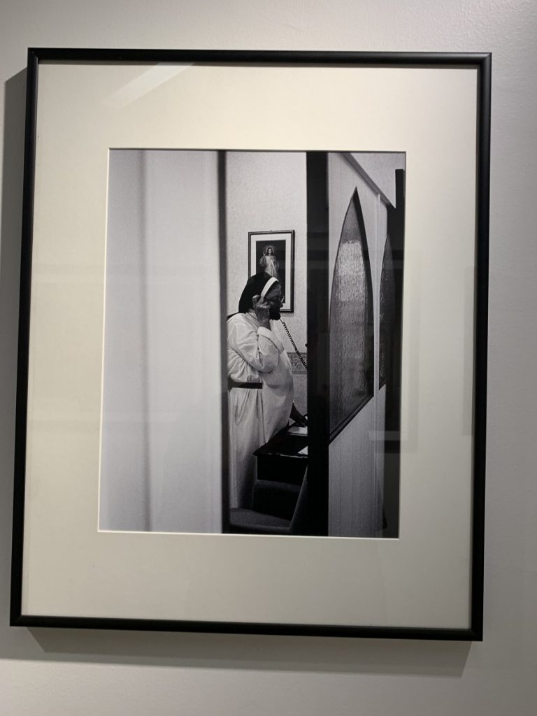
The second photo shows a nun talking on the phone. What I liked about this photo is the double framing that made it seem that someone is watching over her. Also the picture of Jesus perfectly frames behind the nun’s head even though it’s a candid image.

Steliuos Spinthouyrakis Extra Credit

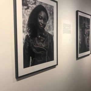
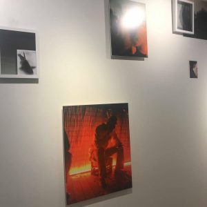
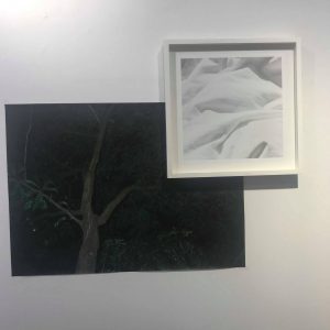
As a whole, I enjoyed this photo gallery a lot, I felt as if all photos were well taken and had a though out idea before the photo was actually taken. I would of never of thought these photos were taken by students if it wasn’t said. Walking through and seeing all of them, they all told a story. There were so many different types of photos, I really enjoyed the black and white portrait photos because it felt like they were from the 70s or 60s. Although all of them were still good, the ones I dislike the most were experiment watermarked looking ones. They look as if the person was upside down. It left me very confused, I first thought they were paintings.

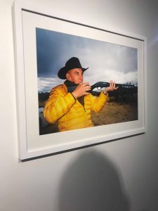
My first favorite one would have to be the old man with a yellow jacket aim in with a rifle. The angle that the photo was taken in allows you to see everything that is going on, as well as his facial expression which gives the photo more emotion. My second favorite photo would be the rodeo one, where you see the bulls and the rider, I like this photo because it shows a genuine relationship between the bulls and the rider. My third favorite would have to be the picture of building completely destroyed left in ashes. I like this one because it makes you ask a lot of question, you want to keep staring at it hoping you understand it better.


Extra Credit


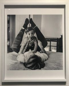
One of the photographs from the gallery that I liked the most was the one in black in white that captured what seems to be a mother and her child. I enjoy how the light comes from the left side, creating shadows that form horizontal patterns on the subjects’ clothing. The photographer did well in capturing the toddler’s facial expression just before his pacifier falls out of his mouth. What I think could’ve been done better is positioning the subject in a better area so that nothing in the background would interfere with the foreground, such as the line running down next to her right foot and the black object that is on the far right of the photograph. In my opinion, this kind of distracts the viewers eyes, from the main subject.

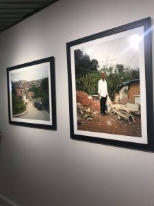
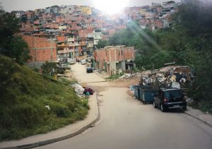
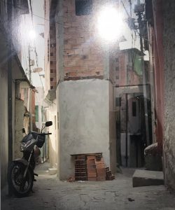
Another set of photographs which I really liked were these. They took me back to the country I was born in, Ecuador. The streets and houses are just like the ones near my grandparents’ house, small, colorful and humble. My favorite one out of the three is the one where you can see the houses from a far and a street leading up to them, which seems purposely photographed that way, in order to show the rule of thirds. The lighting works well even though there does not seem to be much sunlight when the photograph was taken. The only thing distracting, in my opinion is the black car on the right.

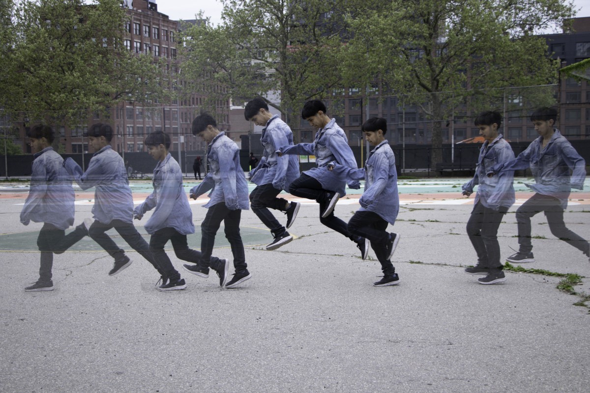
It was really good learning how to capture frozen , the blur motion in photography  by taking these photos shoots.  It took  me a while trying taking different shoots  until I got the shots. I tried to take the  zoom in and zoom out shots.      

Leaning Log #12

In order to get these shots I had to make sure my camera settings were at f4.5, ISO at 400 and shutter speed at 1/640. I had the camera in manual mode which made the process a lot easier. I had to make sure my composition was straight with the line in the background. I had to use the camera this way in order to accomplish the looks. My favorite part of the shoot was being able to be outside. I took multiple photos and combined them into one on photoshop using the mask and brush tool.