

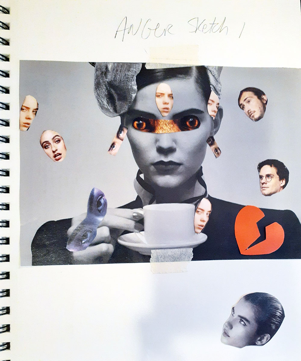
Hey, folks! Here are photos of my finished Texture & Pattern Project. Unlike the last project – where we couldn’t use line or type to convey texture and pattern – this time we used ONLY line and type to convey texture and pattern. So this is how it went.
As a graphic designer, my strength lies in anything BUT illustration. I’ll be honest – I detest drawing. It’s tedious, boring, uninspiring – and as a chronic multi-tasker – nearly drives me crazy to have to only do one thing at a time. HOWEVER – with all that being said – I HAVE learned a few things. First, I learned that I am better at translating ideas to paper than I thought.
Here is my final project:
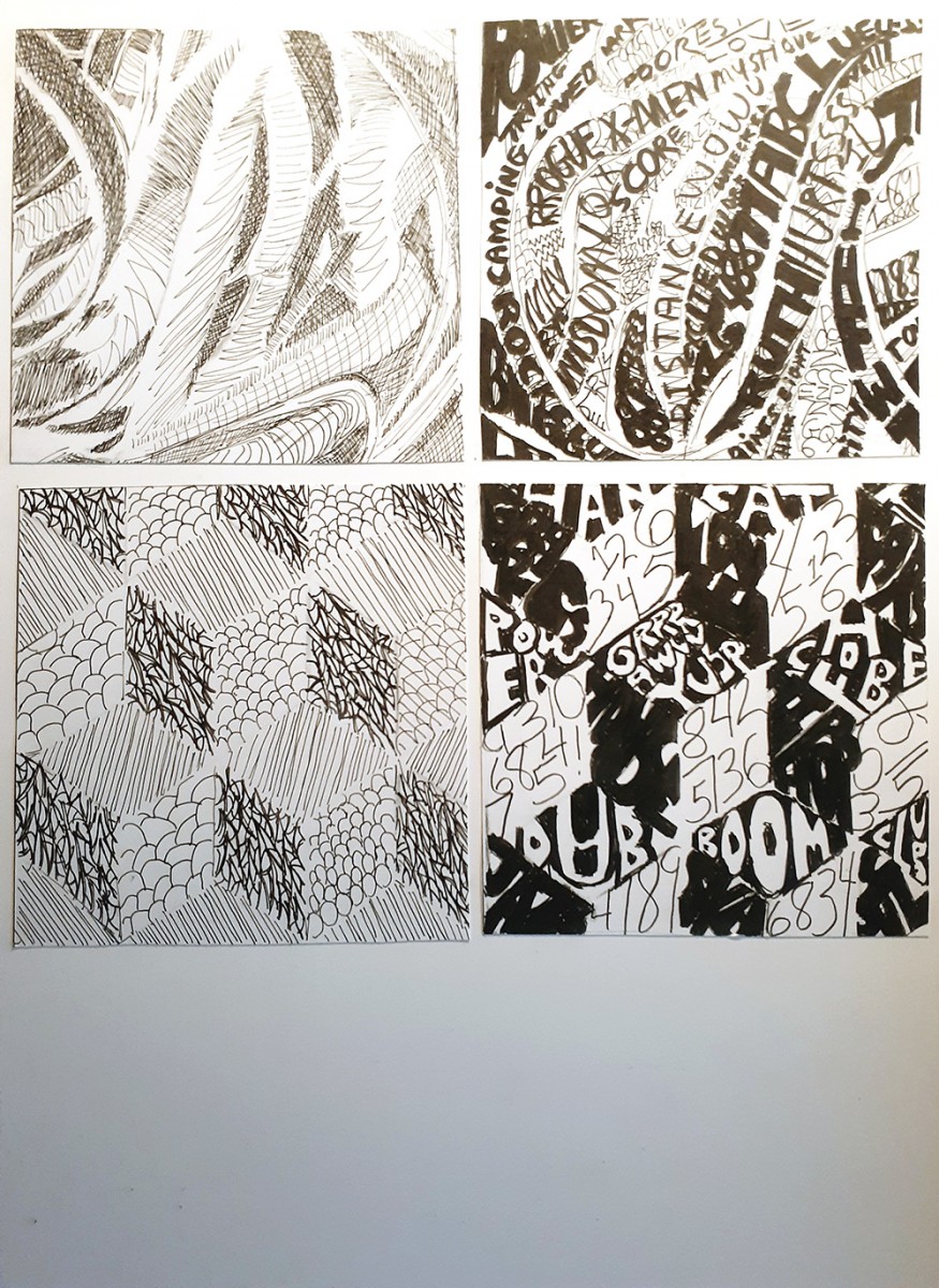
I double-tacked my Pasta line and my Cube lines upside down (though with the Cube you can’t really tell). Though I’m intimidated by hand illustration, I did learn how to use different tools to better serve my purpose. I can now speak semi-intelligently about pencil and ink varieties and the cost of Bristol these days (LOL)…but yes, I did run into a few challenges
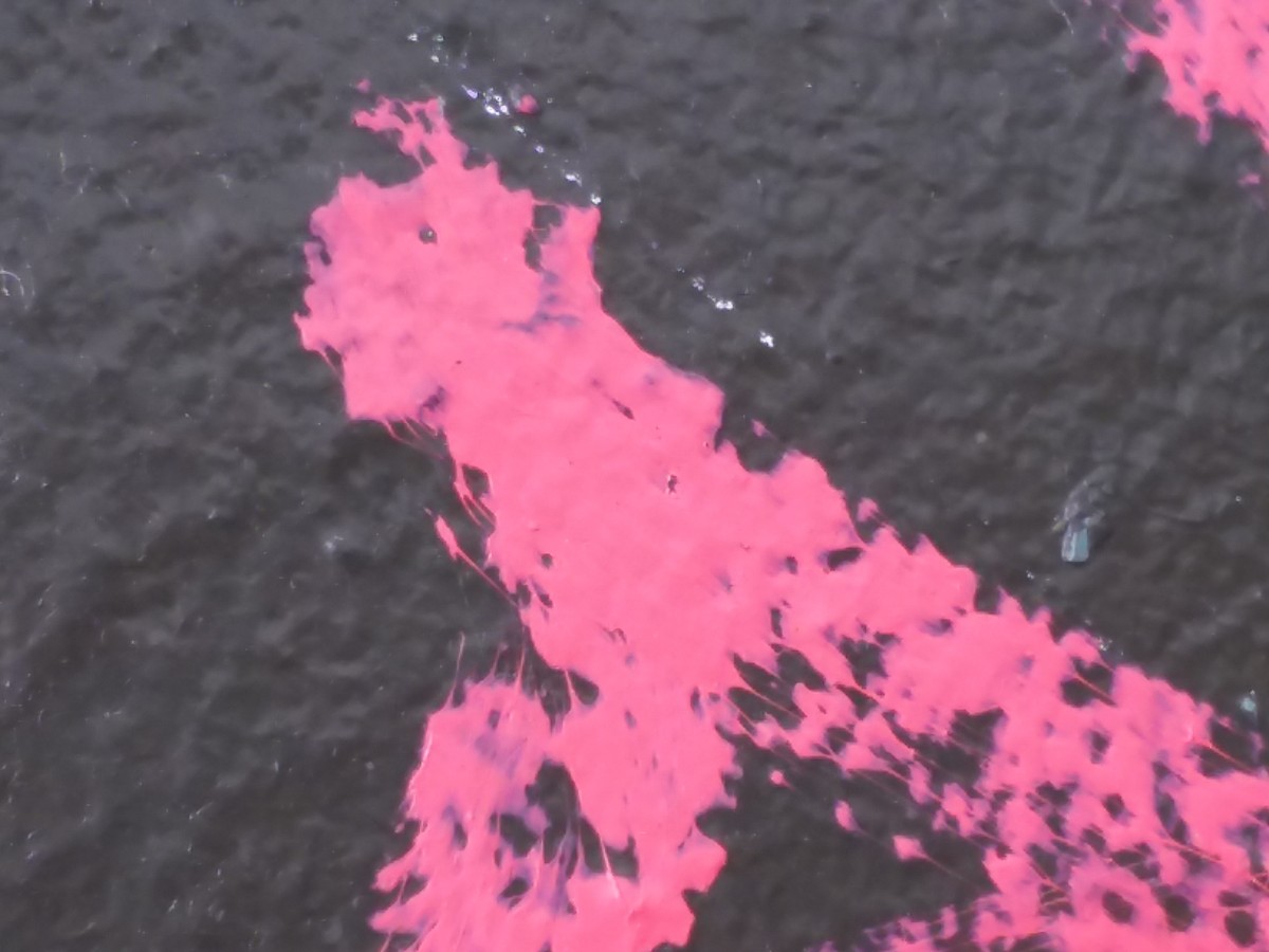
When I chose the Pasta photo for the texture portion of my assignment, I had no idea it would be this challenging. To make things easier, Professor Rennis had us break down the textures into 3 basic shades of grey. This helped simplify (a little) a very complex photo. Even with this great bit of technique, I still visibly had trouble with capturing the tone of the original photo using only line to create shadow and depth.


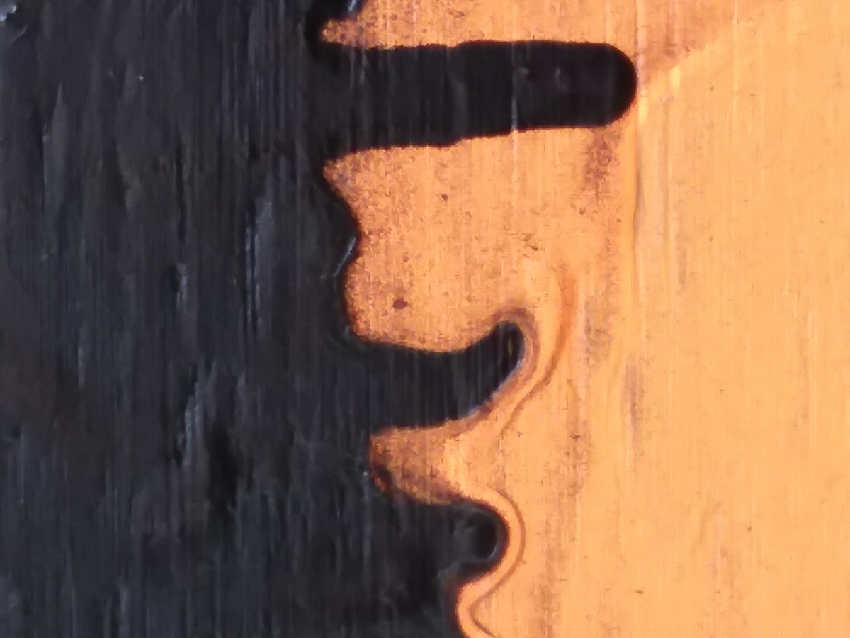
Again, I had a hard time translating the tone of the piece using the constraints of the project guidelines, but I kinda had fun with this one. I was actually pleasantly surprised that I was actually interested in using type to create texture. Though I’m not sure I fared any better with type, I still enjoyed trying!

I think I did a little bit better with pattern as opposed to texture, simply because I know how I like to work – I like structure. Nothing open to interpretation, just simple, obvious instruction and this cube provided it. After saying all that, you’d think I would have been more successful at conveying the original mood of the printout. I quickly learned that knowing what tools to use and how to use them is key in reproducing a mood. I am still handling my ink clumsily. However, I think I did a pretty good job of thinking out the differences in greys and attempting to create separation and shade with different line formations!


This one wasn’t as challenging as I thought it would be (again, structure), but I did go heavy handed on my middle grey structure, which made it nearly indistinguishable from darker areas of the drawing. All in all, I like this on the best. If I had the time, i would have done this over and eased up on the ink for my medium grey component (again, not knowing how to use my inking tools correctly)

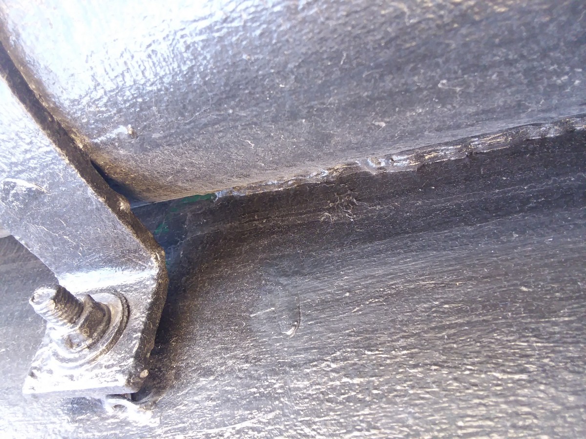

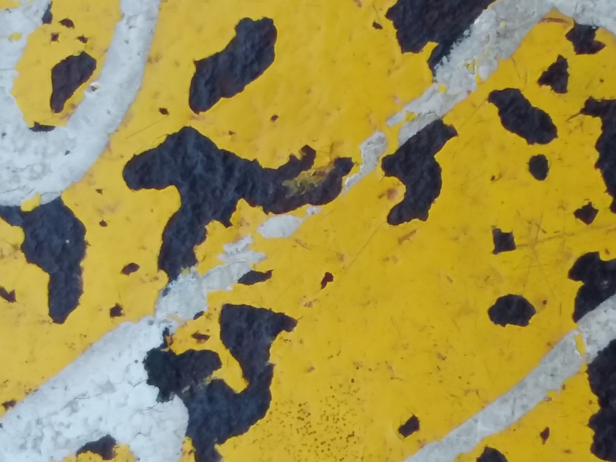
This pic was originally a pic of a metal pipe with chipped paint in Manhattan zoomed in to capture a world map-like pattern with an African-esque continent likeness in the middle. Final photo was simplified to the major Black and White shapes in the image.
Africa_Type_Original
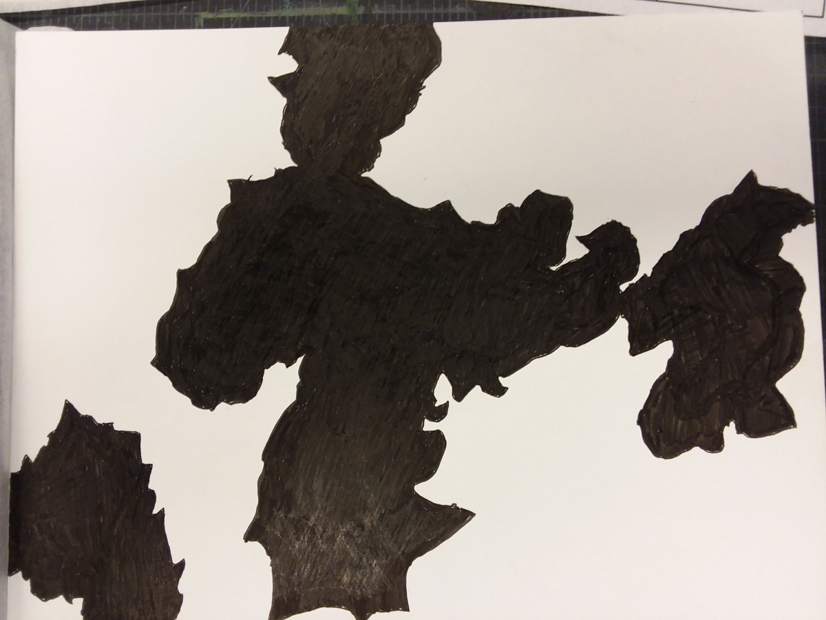
Africa, 46 million years ago – Ambiguous
This pic was originally a pic of a piece of styrofoam on the ground (I don’t have the reference file). Though there were cracks in the surface, I chose to simplify them to black. A simple line outside the bottom illustrates the break in the styrofoam. When simplified to black and white, it can be seen as different things from a beach, to an antarctic ice floe.
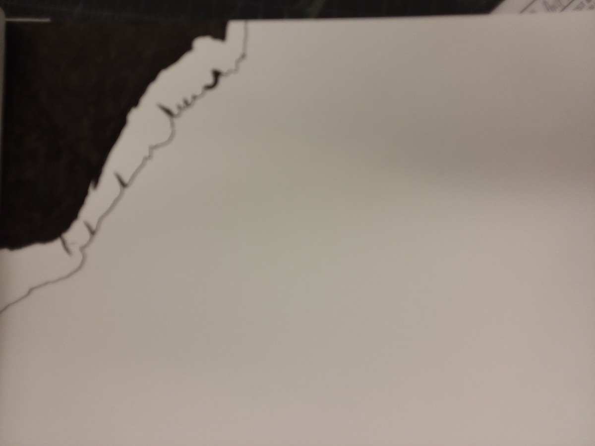
A Beach Or A Cliff – Obvious
The OpenLab is an open-source, digital platform designed to support teaching and learning at City Tech (New York City College of Technology), and to promote student and faculty engagement in the intellectual and social life of the college community.

