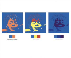
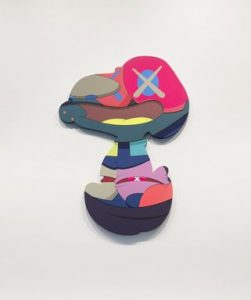
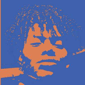
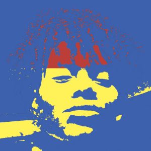
The art piece I chose is from the Kaws exhibition at Brooklyn Museum, from 2015-2016, cited as the “DIG E, Brooklyn Museum photograph.” I am comparing this to my color project. The differences I can state, is that Kaws’ usage of color is more elaborated, in a sense, where he uses about 13-14 different colors, as opposed to my 2-3. I was attracted to the “abstract-ness” of the piece as well as the color usage. The similarity, deals with the way certain colors are placed, regarding the eye being a different color to around the eye, as well as the lighter colors kind of being a focal point.
Author Archives: Jordan Stanley
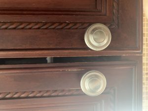
Groovy Braided Twist
White Blob
Locked Premise
This project was pretty fun, due to the fact that it felt very free, since it was based off of what I saw inside my imagination.
JordanStanley-ColorYourSelfieFinalComps
Jordan Stanley Develop Sketches/Trials for all Comps
Jordan Stanley Define. High Contrast B/W Selfie & Favorite Color Template
Imagination Pictures Project 5
Jordan Stanley Project 3 SelfieMotion
Project 4 Color Wheel – Jordan Stanley
Project 2 – Texture and Pattern (Jordan Stanley)
Project 2 – Texture and Pattern
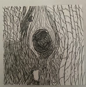
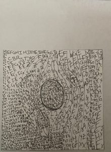
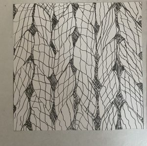
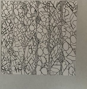
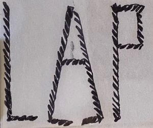
In my opinion, the lines were easier to do than the words, as it was somewhat challenging to decipher how to make one part “darker” in a sense compared to another. I ended up using the same strategy as the line one, which was making letters or numbers closer to each other to represent the darks/grays, as I did with the lines.
The project, though difficult, was fun to do, would I do this again? Ehhh, but was it a learning process? Definitely.





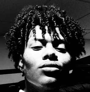




 My goal within this was to potray myself with the emotion of shyness/fear. Hence the “super darkness” of the image, or swirl of eyes. The eyes stare at me brought with the sharp edged arrow, moving me to hide my natural emotions, by covering my mouth. I enjoyed doing this, it was slightly challenging because I had to find somewhere to print (contacted a friend), and figure out like how i can portray this emotion that I supposedly feel.

