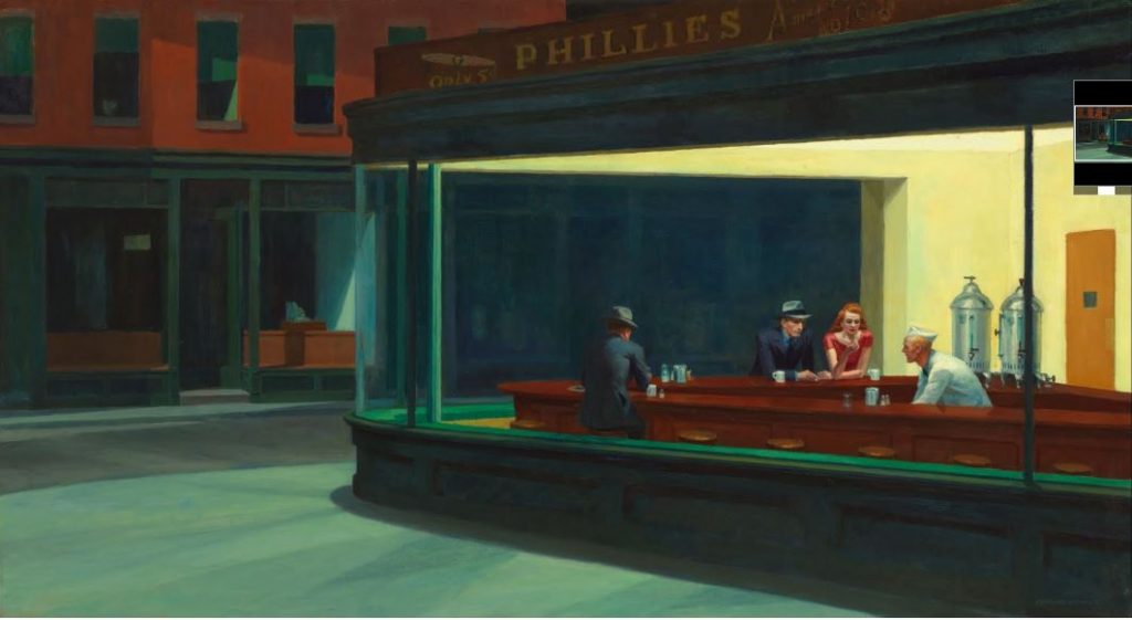
Edward Hopper, “Nighthawks”, Oil On Canvas, 1942
(courtesy Google Arts & Culture, Art Institute of Chicago)

Obvious and Ambiguous.
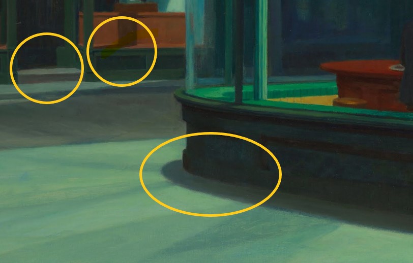
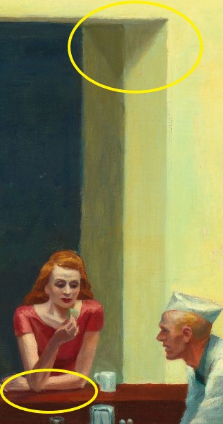
Through use of shadow, Hopper creates clear foreground/background relationships in a deliberately simplified space. The presence of shadows always means there’s light. This light isn’t created – it’s implied
Texture and Pattern.
While this may sound repetitious, Hopper’s brilliant use of shadow is what gives this piece it’s deep sense of dark nostalgia and introspect, so it’s hard not to talk about it. Not only does his use of shadow create clear figure/ground relationships, but also helps create textures that tell us that it’s nighttime, that there’s a corner, that there’s glass in the windows.
Motion and Emotion.
The focal point is obviously the diner, characterized by the stark contrast in colors suggesting electric light in an establishment. Grayscale (along with line), has it’s part in this piece, as it gives us the shadows that create the mood and establish clear figure/ground relationships.
Color.
What I really wanted to talk about concerning “Nighthawks” is the brilliant – yet subtle – use of color to convey mood. Color is what really this piece is all about. Color creates the obvious foreground relationships we see. Color is used to imply texture (I say “imply” because even as a modernist piece, it still nods at impressionism in terms of technique).
Look at how Hopper cleverly used color to also imply light and source. There are TWO lights in the piece – one inside the establishment and one outside the establishment. Though no light is actually depicted in the piece, we know where the lights are based on Hopper’s use of black mixed with color to create a sort of dampening of light in places where the unseen light source is actually directed. You see it on the curb, in the shop doorway and window. You see it on the first man’s back. We know that at least one of those lights is off scene – perhaps across the street. We know that shadows can always be traced to their source and Hopper shrewdly suggests a world outside of the scene.
Hopper uses a warm, analagous color scheme (yellows, oranges, and reds) to soften and humanize the interior and to lend personality to one of the figures, while using a darker analagous scheme for the exterior (contrast) and the other two characters. This reminds me of my analagous composition, which uses color to convey a dark, icey mood without actually using black.


