Monthly Archives: October 2018

Graph Analysis Homework

Average sleep need (left graph) and percentage of REM sleep (right graph) at different ages

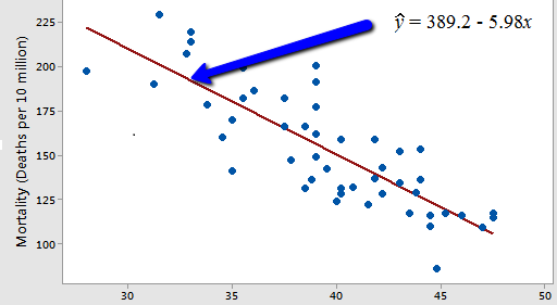
Age affects sleep more than any other natural factor. In REM (rapid eye movement) sleep muscles are paralyzed and dreaming is active. In NREM (non-rapid eye movement) the sleep is supposedly thought-like rather than bizarre and hallucinogenic. The first graph shows the relationship between hours or sleep and age which has very clear negative correlation. On the other hand, the percentage of that sleep being REM sleep has a slightly irregular negative correlation.


National Institutes of Health (US); Biological Sciences Curriculum Study. NIH Curriculum Supplement Series [Internet]. Bethesda (MD): National Institutes of Health (US); 2007. Information about Sleep. Available from: https://www.ncbi.nlm.nih.gov/books/NBK20359/


Assignment 2: Graph Analysis

https://abcnews.go.com/US/shark-attacks-told-graphs/story?id=31779076

This graph shows you the shark attacks between 2005 to 2014. It shows how many of the attacks have been fatal compared to non-fatal.These are from locations with highest known attacks. It is believed that these attacks were made by great white sharks, tiger sharks or bull sharks, although it might not be so accurate since it is hard for the victims to remember exactly what type of shark it was.

Graph Analysis of Electric Cars Sales – Assignment 2, Phong Nguyen

As gas prices increases each year, people starts to look for alternative way to save money. One of these ways is to invest in electric cars. Since to 2012, electrical cars sales have exploded from 73,000 sales to 542,000 in 2016. This is a 87% increased. This article also show what types of cars are the most popular and what company is leading over time. By looking at this graph, we can estimate that this chart will increase more over time. 

Article:

https://www.nanalyze.com/2017/03/electric-cars-usa/


Assignment #2- Graph Analysis

This graph is from the article called “The iPhone’s smartphone revolution in 4 graphs” posted on usatoday.com. This article is mainly about IPhone’s impact on the smartphone industry. As well as the time spent on smartphones since 2013-2016. The graph shows us the increase throughout the years.


-Evelyn Ordonez

Assignment #2 : Graph Analysis

This graph shows us the total cost of major natural disaster from 1980-2015. Throughout those years, each disaster cause over $1 billion in losses. As you can see on the graph it shows that in 2005 and 2015 there was over $100 billion in losses. In 2005 Hurricane Katrina did lots of damages that there was a lost of $161 billion. On the other hand, in 2015 there were four different disaster, in which it lead to a loss of $283 billion. Overall, according to this graph the U.S has lost more money from 2005-2015 over natural disaster.

Smoking rate in new york

https://truthinitiative.org/tobacco-use-new-york

This article tells us about the smoking rate in New York the amount if adults and high students smoke compared to the whole country  we can see that New York has 5.5% of high school student smoke and in whole U.S that is 8.8% in 2017 and that is a high percentage of high school students smokes in new york. The differences between adult and student in new york is 8.7% a part.

Good Evening Everyone,

My Name is Mamadou Bah, and my major is electrical engineering. Electrical engineering is a major that I am attach to because it is fundamental to our today’s survival. we cannot live without electricity, so i am passionate to know it better. throughout my studies, I have learned that i cannot be an engineer without being a good mathematician. therefore, I have take multiple required math classes. and this semester I am taking statistics and probability because it is required. This class is really important in electrical engineering because most of the classes require graphs to show real explanations of data and analysis. In  circuit analysis, we need graphs of Voltages Versus currents, Currents Vs. resistances, voltage vs. Periods, and ect… we use scatter plots to show how data are distributed in a graph and this is taught in statistics. thus this is really important for my major, so i am will to learn more about it.