Monthly Archives: October 2018

Poverty Rate in America

Article: https://www.usnews.com/news/best-states/articles/2018-01-24/smoking-rates-declining-but-uneven-progress-in-us

This article tells the reader that America is not putting enough efforts to curb smoking rates, earning a F grade for regulation and a C grade for health insurance coverage. Though there is a decline of smoking in adults, there are still many inconsistencies across many groups, like those with poor living conditions or poor mental health. The chart below shows the groups that are still affected by smoking within the 15.5 percentile.


Graph on a newspaper

These Graph show the circulation change of a newspaper during week days and during weekends. The blue graph show the change during week days and the red one is for Sunday

Link:   http://www.writeopinions.com/newspaper-circulation

This image requires alt text, but the alt text is currently blank. Either add alt text or mark the image as decorative.

How statistics and probability relate to my career in Electrical Engineering and Technology

Statistics and Probability will help me solve these following problems in Electrical Engineering and Technology

  • False alarm probability in radar
  • Any noise calculations (e.g., what’s the variance of a measured charge Q during an averaging time t under this-and-that voltage and current noise spectral density)
  • Designing networks (low/high band-passefilters, for example) that stay within specs in the face of component tolerances
  • It’s unlikely that all customers of a utility use their maximum rated current at the same time, but what capacity do I need to deliver enough power 99.9% of the time?
  • Mean time to failure for a device

The Happiest States of America


The article entitled, “ The Happiest States of America”, by Catherine Rampell, discusses the report by Gallup-Health ways Well-Being Index. This report attempts to “measure what it is that people believe constitutes a good life, who is feeling good about life and who is in need of a helping hand.”

The target population is the United States and the research variables used in this report is state’s median household income and well-being in each states. We expect a positive correlation and predict it will be strong. We predict this because the trend line illustrates a strong positive correlation between the two measures of state’s median household income and well-being in each state.

Additionally, the article states, the index used by the report is broken down into six smaller sub-indices: life, evaluation, emotional health, physical health, healthy behavior, work environment and basic access. The report does not really state whether a US state is happier if they are wealthier or whether people feel better living in a rural area  or if they feel happier living in a city. The report stated that Utah is the happiest US State on the Well-being Index  and  West Virginia is the worst on the Gallup-Health ways Well-Being Index.

We obtained the data from the following website:

 The New York Times – Economix section

URL:   https://economix.blogs.nytimes.com/2009/03/10/the-happiest-states-of-america/

Assignment # 2 – Analysis of Graph


The New York Times: “With 8 Years of Job Gains, Unemployment Is Lowest Since 1969”

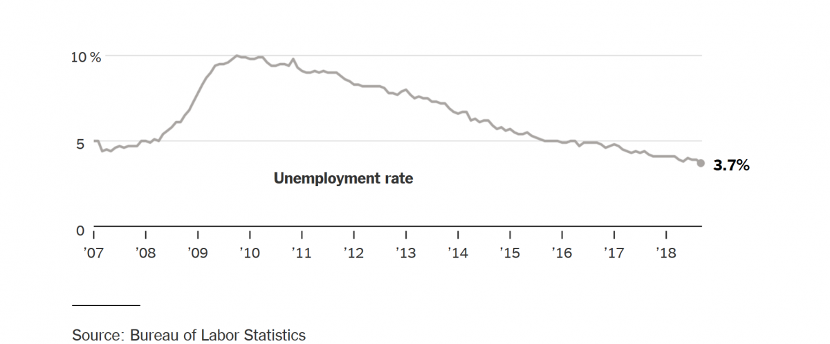
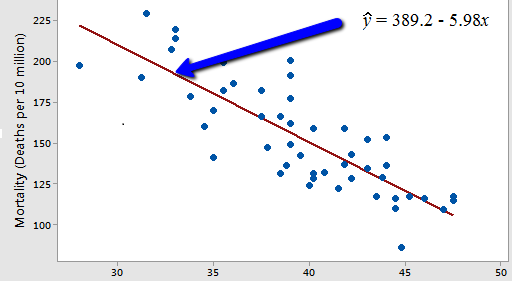
The article walks us through a series of historic events and factors which describes the following graph. Unemployment in the U.S has reached its lowest point since December of 1969 when hundreds of thousands of young Americans men were serving on Vietnam.  In September of 2008 443,000 jobs were lost as the financial system was collapsing around it, millions of jobs were lost the months following.  But after the hiring machine started, hundreds of thousands of jobs were created. 134,000 created on September alone makes it the 96th consecutive month growth. But as any other medium, this reflects into politics. The articles keep on presenting on how some economist don’t know how this milestone might not have any effects on voters on the polls as “surveys show that views of the economy are split along partisan lines, with Democrats and even many independents expressing less optimism than Republicans”.

This graph is a perfect representation on the events on the financial system in the last decade. On 2008 The financial crisis began with the lost of thousands of jobs. The years after did not show any signs of stopping as it reach its highest point on 2010. The years after are the results of carefully planning to fix the financial crisis which shows a slowly but surely slope going down as jobs are created throughout the years, landing at the lowest point at only 3.7% of unemployment.

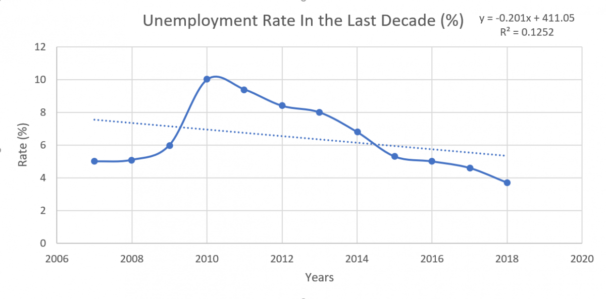
Using the following approximation taken from the previous graph we can easily replicate and determine some interesting information:

Years 2007 2008 2009 2010 2011 2012 2013 2014 2015 2016 2017 2018
Unemployment Rate (%) 5 5.1 6 10 9.4 8.4 8 6.8 5.3 5 4.6 3.7


********************************************************************************

Response to :

Suggestions:
I believe that you made an even more detailed version of the original graph you selected, however I think that you could’ve further improved the graph by making a different version of it so it could truly be a reproduction of the original graph rather than a replica. Perhaps you could’ve done a bar graph rather than another line graph.

Word Problem:
In 2010 the unemployment rate was at an all time high being at up to 10% of Americans. By 2018 the unemployment rate gradually lowered down to less than 4%, how much was the unemployment rate lowered from 2010 to 2018?

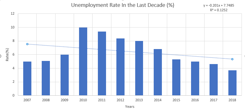
Between the years 2010-2018 the difference between the employment rate is only 6.3%, where at 2010 it was at 10% and 2018 at 3.7%. This is a an astonishing decrease as it meant 1/10 of the working force or working capable people were unemployed, however, this trend started to disappear as the years progressed.

On the new bar graph we can even more clearly see what the tremendous change this country went through with the economic crisis at 2008 to the hardwork of many to bring the country back to stability.


********************************************************************************


The New York Times


Graph in the newspaper

Omkar Chandarpal


Original article: https://www.usatoday.com/story/tech/news/2017/06/28/iphones-smartphone-revolution-4-graphs/103216746/

Summary

The iphone was the first phone that was capable enough to act as a substitute for a computer. Every year since its release, increasingly more people become iphone owners. The iphone is Apple’s best selling product. People have been using cellphones more and landlines less, they also spend more time on their cellphones.

Graph

This graph shows how increasingly more people become smart phone owners over the years.

Edit: Change after reading comment.