Sandra Jarro – 3 Point Lighting

The 3 Points of lighting are Background Light, Fill Light and Main Light.

Background light is a light used on the background to separate the subject from the background so it does not look so flat. The subject stands out more.

Fill Light is the light used to reflect the light coming from the main light to reflect the darkest side of the subject. It is used as a reflector.

Main Light is the light used to light up the subject. It is usually positioned on the side of the subject. It uses the key triangle which is a triangle of light on the darkest side of the object.

Posted in LL5-PortraitBasics | Leave a comment

lighting basics

The three points of lighting in photography is main light, fill and background light.

Main light is the light used to light the subject. Its usually the light with the soft box or umbrella.

Fill light adds light to the shadows caused by main light. It could be another light or a reflector.

Background light adds a light to the background. It is another light added to illuminate the background.

Posted in LL5-PortraitBasics, Uncategorized | Leave a comment

3 Point Lighting

Background Light – Light thats pointed towards the background, making the subject stand out from the back.

Fill Light – Reflects light coming from the key light on the shadow, brighting up the area and mood, so its not as dark or rugged.

Key Light – This is the main light used, that is pointed towards the subject. This often creates the brightest part of the photograph.

Posted in Learning Logs, LL5-PortraitBasics | Leave a comment

3 point lighting

key or main light is basically when the subject is facing directly to the camera and to get the best possible picture we look for the triangle of light which is the shadow that is casted by the nose.

Background light is when a light is pointed towards the background and adds depth to the photograph, we don’t look for a halo though.

Broad Light is by placing the light on the side of the subject which creates shadow on the opposite side of the face where the light is not facing.

Posted in LL5-PortraitBasics | Leave a comment

LL4 – Lighting Direction

image

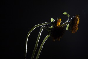
This photo was my favorite picture from the lighting direction series. This photo uses side light to highlight the stem of the flowers in a positive light. The lighting gives a nice texture to the stems and leaves as the fuzziness around them becomes visible. The highlighted stems and Dim flower petals help create a nice contrast in the image. The bottom of the stems are darker than the rest of it, which shows the flowers emerging from the dark.

Posted in LL4-Lighting Direction | Leave a comment

Lighting Direction – Darren Parvatan

IMG_2004

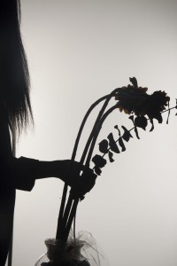
This photo uses a backlight which allowed the photo to appear as a silhouette. This was my favorite photo taken due to the creepy atmosphere you kind of got from it. You see the flowers leaning to the side along with a figure reaching out to it. There isn’t much visual of the figure but there is just enough to give it the chilling feeling it does. Having being just the day before Halloween at the time, I felt that this photo was also perfect to set that Holiday mood.

Posted in LL4-Lighting Direction, LL6-Portrait Lighting for Mood | Leave a comment

LL5-Portrait Basics

Write a post describing in your own words how traditional 3-point lighting is set up. Name and describe the role of each light.

Posted in LL5-PortraitBasics | Leave a comment

Gallery Report

Irving Penn, On Assignment:

This Gallery showcased the work that Irving Penn did for Vogue magazine. His work is interesting, having literal subjects to more artistic objects.  His beginning work was more black and white, but with his later years his work transitioned into color. The most interesting to me was “Small Trades” shoot. Out of all his other works that one spoke the loudest to me. He took most work-a-day jobs, or blue color men and photographed them, some included a Painter, a firefighter, body builder, and a boxer. These were also black and white; he also incorporated a horizon less background. None of his photos were edited in any software making the skill that much more difficult. The reason this is the appealing to me is because I always see myself as a worker. His work usually incorporates an extensive depth of field and an eyelevel shot, with textures similar to his subject.

Nick Brandt, Across the Ravaged Land:

Across the Ravaged land was another interesting gallery. His photos were black and white and were shot outside, not in a studio, his work was more natural. His subjects included animals, bird’s skeletons and other subjects found naturally. His work had mainly one subject, and a lot of background. Most of his work had a low angle. His one photo of a Lioness just finishing a meal is one of the most interesting photos out of the entire gallery, or trip. Just the face alone on the animal can say thousand words, having the rest can speak another thousand more.

Robert Polidori, Versailles:

Roberts Gallery was the straightest forward out of any seen that day. He is seen more as an architectural photographer.  His Photos are very large and are in full color.  His photos use extensive depth of field and a lot of deep space.  He also uses the most out of perspective lines, using corners, vertical and horizontal lines, and even more texture.  Most of his work is in frames and is geometric even though some of his subjects are not in the center, and are off balance.

Susan Derges, New York:

Susan’s gallery was the most complicated to understand; her technique was original to her. She uses exposes her paper directly, similar to photograms but not quite. He captures are in real time and show some blurry motion, in my opinion that is an aesthetic improvement. Her work typically have low contrast, where the main subject is black or darker, mainly silhouettes her work uses water and I want to say that she uses a top angle. She sometimes adds ripples to the water again making it more interesting.  Her texture was more similar to liquid and natural environment, such as moon light, branches and leaves.

Olivo Barbieri, Alps Geographies and People:

Barbieri takes photos from a helicopter, the photos were taken from the highest altitude out of all the gallery’s seen that day, along with that they were of mountains and in a few of people climbing them. These were edited in some software. They were taken at a high angle, in full color, and are very large in size. Most do have perspective lines but more importantly have negative space. Out of the entire galleries seen this is my favorite. The reason for this Is because initially walking in to view his work I was on the fence, I was not sure if I was going to connect or be unimpressed, but when I got into his work I saw the correlation to between his work and my style. I came to the judgment that his work would closely resemble mine. In vector and photograph style, clarity, color, size, and most of all the adrenaline rush capturing a moment from a high elevation, and cold temperature.

Phillip Lorca DiCorsia, Hustlers:

Phillips took the most shocking technique. He hired male prostitutes and had them to model for him. Until I was told they were male hookers I was under the impression they were model hired from an agency. His most impressive story telling device was the lighting. He had a variety of color tones and lighting, most of which was natural from the streets of L.A. his shoots were mainly from 1990 to 1992.  His composition took a form of solace because there was no more than one subject in any given photo. This effect gave a slight feeling of trust as if you could see and hear the thoughts of model.

Posted in Homework, HW5-Gallery Report | 1 Comment

exposure

IMG_9169

I believe this photograph is a good example of light and dark, I don’t remember the settings of the camera at the time of capturing the image, however we can see the subject in this case (the flower) in focus and with all the light shining on it, and we can also see the background out of focus and with no light shining on it. Creating a nice contrast within the photograph that makes it more exciting to our eyes.


Posted in LL2-exposure | Leave a comment

Gallery report

Pace Gallery: Irving Penn, On Assignment

When I just walked into the gallery, and saw some Vogue old magazines, I said to myself that this guy has to be a special artist, and there is no doubt about that since he’s been working with Vogue for a long time. Almost all photographs are portraits of people. I think fashion world is his favorite. His main artwork consists of black and white shoots. A lot of his work is centered, focused on one object shallow depth of field and shot at eye level. I was astonished about his work especially the composition ones and my favorite was the “bee on the lips”.

Hasted Kraeutler: Nick Brandt, Across the Ravaged land

This exhibit brought me into the wilderness of Africa. Mainly shot in black and white, and on shallow depth of field, Nick’s wild animals photographs were taken at a low angle and at eye level with focus on the subject. The sepia tone gives the photos a dry feeling of the African desert. The amazing sharpness of those pictures allows us to see the details of the lion’s fur and the dry wrinkles of the elephant. Some pictures give me an idea about the rough life in the wilderness and the fight between animals and man. I think this photographer spends his life in Africa.

Mary Boone: Robert Polidori, Versailles

This one is unique. After I started to get bored of this tour, Versailles Robert’s pictures amazed me and showed me what’s really piece of art means. I love it. He really cares about details. From broken parts of doors, to scratched spots on golden picture frames, and over used handling windows and tables; Versailles Palace close ups and medium shots all are shot with extensive depth of field. With vivid and sharp colors, the photos look like they are paintings, but also the details in the texture is what stood out the most. I also liked the strong perspective, present on a lot of his photos, especially when it takes you through many doors textured and colored in different marvelous ways. It was a short trip to Versailles in a shot period of time, for free, without being physically there; but really knowledgeable.

Danziger Projects: Susan Derges, New work 

It took me a while to understand what was that actually. It’s really unique, and it’s an interesting photography process that I get the opportunity to know it closely. But I think the use of artificial light, shadows and water called out my interest to try to do something alike. I liked the artificial colors since the shadows look quite similar to me. I think this kind of artwork creates a mood of calm and serenity.

Yancey Richardson: Olivo Barbieri, Alps- Geographies and people

This one was my absolute favorite of the 6 exhibits we’ve been to in our field trip. I was amazed not only because I easily realized that this set of photos were seriously manipulated, but how they were manipulated in an artistic way. This is what they call digital artist. The dominant Bright white on his gigantic pieces gives the feeling of freshness and joy. He shot them in bird eye or high angle. In a moment I felt like I wanted to be climbing the snowy mountains and breathe the fresh clean air from that altitude. At the end, these pictures don’t look like they have been manipulated after all; it’s really successfully manipulated. Incredible!

David Zwirner: Phillip Lorca DiCorsia, Hustlers

I didn’t like it from its title, but by walking in and having an idea about it; I discovered interesting things about his work. If I didn’t know in advance that his project deals with men prostitutes, I would never think they were prostitutes. Lorca’s photos generate emotions from faces. The amazing use of light creates a mood of sadness that reflects the prostitute’s men lives. More important, the created contrast between the subject and the background showcased the subject prostitute. I wonder why choosing this kind of subject? Is it in purpose to attract viewers?


Posted in Homework, HW5-Gallery Report | Leave a comment