I went to the Brooklyn Museum om March 24, 2016. Unfortunately I was unable to go with my class to the Museum because I was sick; so I went with one of my friends. I had to look at two specific exhibits: Double Take: African Innovations and I see myself in you.
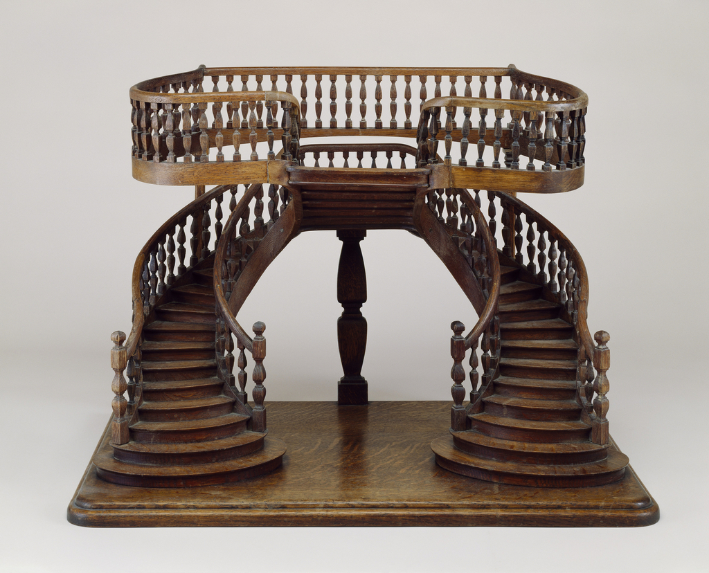
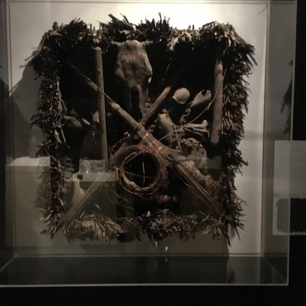
My favorite piece from the exhibit Double Take: African Innovations was the “Emblem of the Leopard Spirit” from the Npka society. It was created in the 19th century int the south west region of Mamfe and the artist is unidentified. This piece is created out of wood, animal skulls, plant fiber, iron, and pigment. This was used to regulate the social behaviors of men’s society among the Ejagham and the Banyan people of Cross river areas. There is supposed to be a drum membrane on this piece but it is missing. Drums symbolizes legislative authority. This emblem is created with a palm leaf mat; they also attached a ceremonial broom. The purpose of the broom was to sweep away “hostile medicine”.

Emblem Of the Lepoerd Spirit
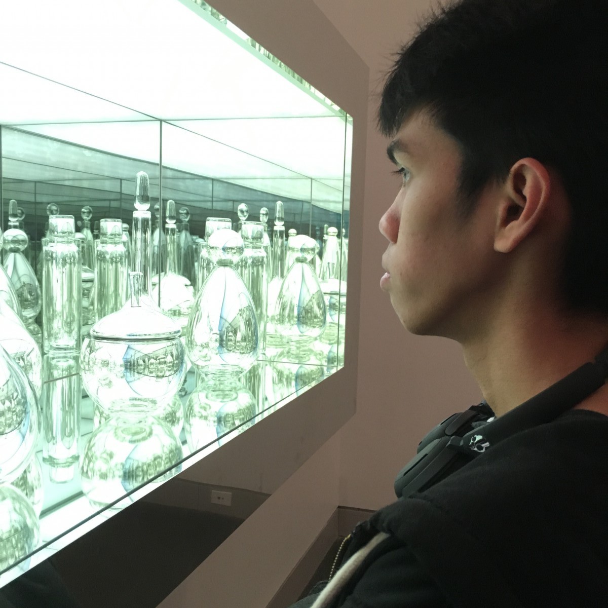
In the exhibit I see myself in you I really liked this one piece by Josiah McElhney. He was born in America in 1966. This piece is called Scandinavian Modernism Mirrored and Reflected Infintely and it was crated in 2005. This piece was one that drew me in as soon as I saw it. It is made with hand-blown mirrored glass objects that was strategically placed inside a box that had transparent chrome mirrors inside. Inside this box had a lot of light so there were a lot of reflections inside. Since the inside was all mirrored it gave the illusion that it was going on forever; it is basically a infinity mirror. This piece also caught the attention of my friend who isn’t that good at looking at art pieces. It had a science aspect to it and it was pleasing to the eye.
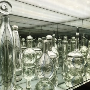
Joshiah MecElhney (American, born 1996)
Scandinavian Modernism Mirrored and Reflected Infinitely, 2005

My friend looking at the art piece.
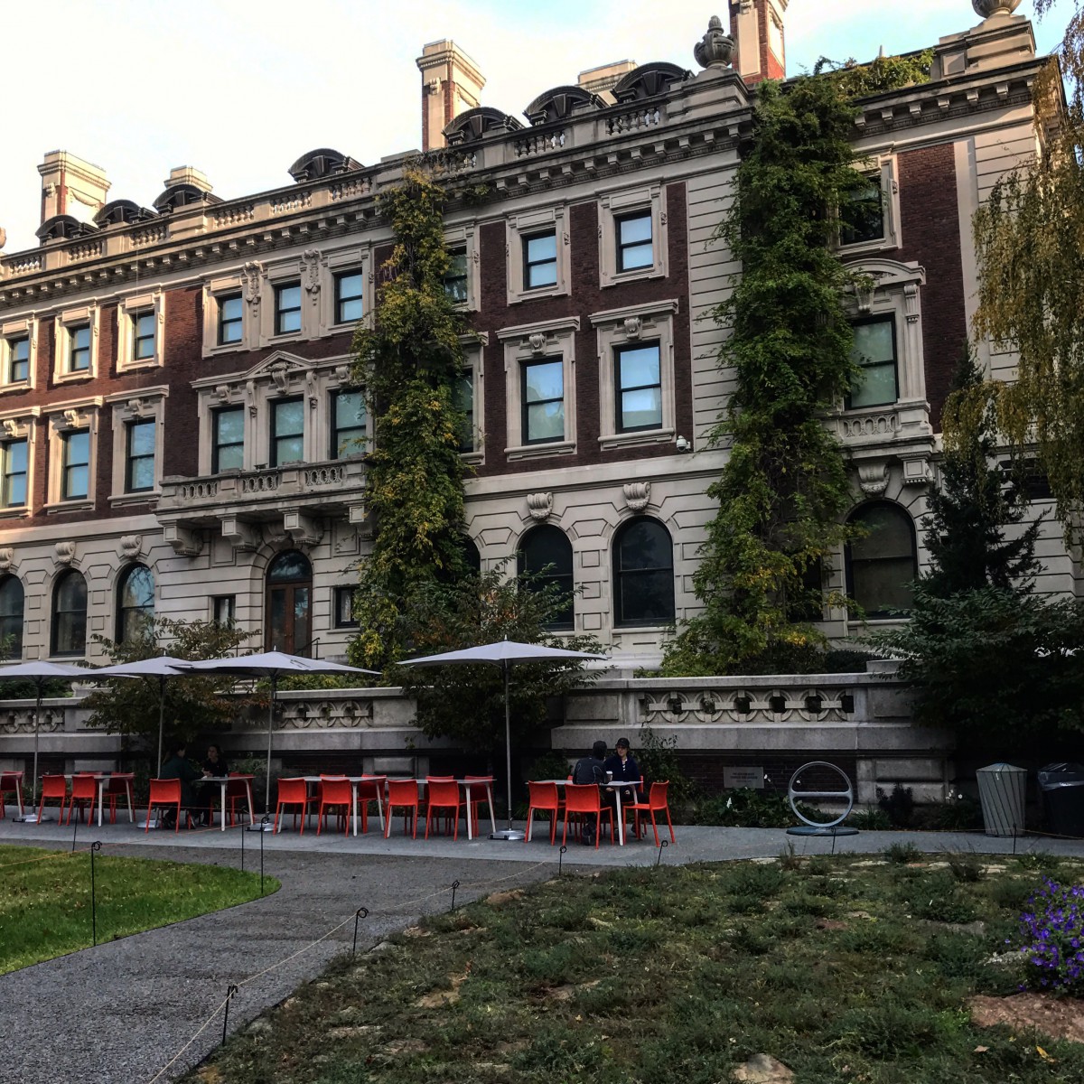
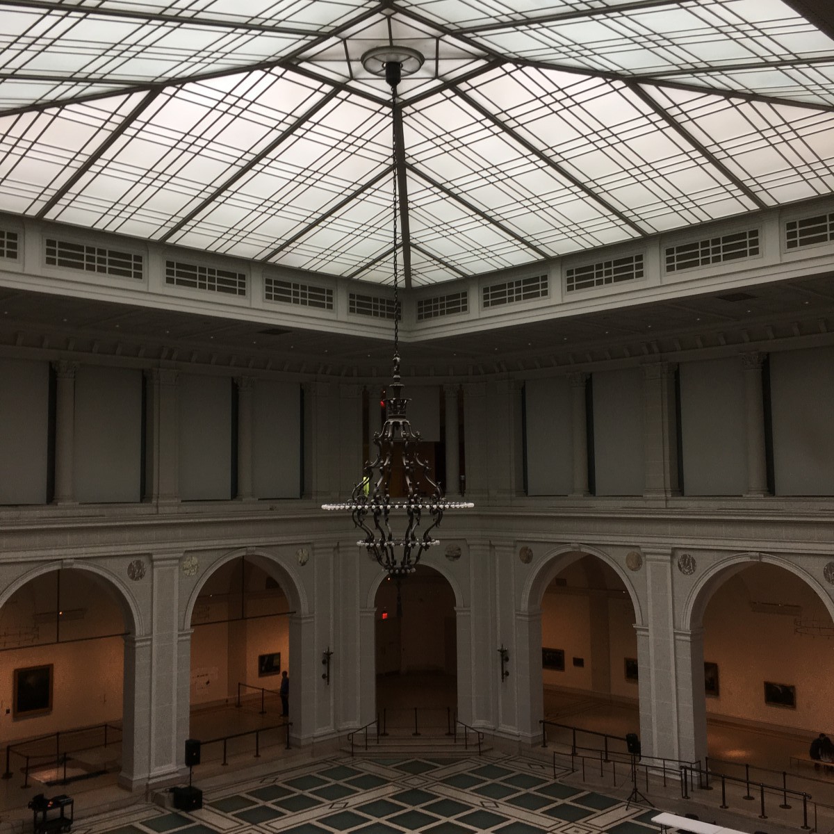
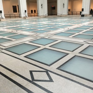
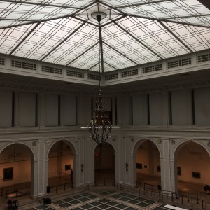
Even though the art piece that I previously talked about was one of my favorites another thing that I loved was the museum itself. The architecture of the building was something to marvel at all on its own. When you get to the third floor of the museum you will see this large area that has multiple arch ways to this large open area. This area is a light blue small squares, white boarders around them, and grey details. It was something out of a fairy tail.
When you get to the 4th floor you can still look down at the open area. You can also see the chandelier and the ceiling better.
I did like another piece by Stanfor Biggers (American, Born 1970) Named Blossom, 2007. This piece seems to have fallen out out “Alice and Wonderland”. I was drawn to this (as well as all the other pianos in the museum) because music is a huge part of my life and it reminded me of my child hood. This piece does play a song called “Strange Fruit” it was popularized in the 1930s by Billy holiday. I was unable to hear the sound though.
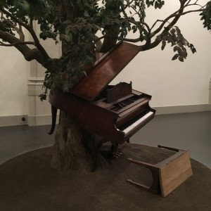
Sanford Biggers (MAerican, 1970)
Blossom, 2007
I had a lot of fun when I went to the museum (I also went to the Brooklyn Botanical Gardens). I learned a lot and saw many different things. I will most definitely go back when they have more exhibits to see. One of the things that I learned was that museums are important. They can make you feel different emotions from the pieces that they have on display; if it is an art piece or part of history.