Enter George Heisler’s website, click portfolios and you are met with an array of categories, or paths if you will, of different ways to digest his work. I opted for vibrant, and I was not disappointed.
Coincidentally, Alonzo Mourning’s photo that we discussed, then tried to replicate during studio time was in this set. As I cycled through his works, I was stopped by the portrait of Kevin Spacey.
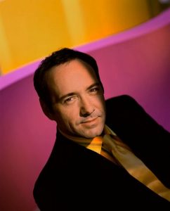
It was exactly that, Vibrant. Most striking is the lighting followed by the eclectic color palette both worn by Spacey, and then the encompassing background. The lighting appears to be cast from above [overhead] and slightly behind to the left according to the shadow of the nose and the silhouette of the head cast on the right shoulder. The lighting frames his forehead, eyes, nose, mouth and chin, for a dramatic effect. Opposed, the ears and the details of the hair are lost as collateral in this drama. He is wearing a black suit which works as silhouette in the shadows, but brightness of his innards [shirt and tie] contrast lovely against the magenta in the background. The bright mustard color found on his apparel is almost exactly replicated at the top of the frame, adding another layer of cohesiveness to the portrait. Wether this was intended or not, it is successful, and his gazing eyes through the camera and subtle smirk capture the feel good energy of this shot.


As you state the lighting is amazing and that is what Heisler is known for. But it is also the basic composition to placing spacey at a diagonal in the frame that crosses the background elements that are placed to create an opposite diagonal.
Funny though, I can’t look at this photo like I might have a few years ago.