Author Archives: Eliana

Final Project

For the final project, I want to use the article “How an Ad Campaign Invented the Diamond Engagement Ring” (read here). The article talks about how in the late 1930s, the practice of giving a diamond engagement ring was on a slow rise and De Beers Consolidated Mines, Ltd. wanted to get more people excited about diamonds so they hired N.W. Ayer, a New York based ad agency to build a campaign that would popularize the sale of diamonds. The campaign coined the phrase “a diamond is forever,” and sold people the idea that diamonds were ” symbols of indestructible love.” This strategy proved insanely successful for De Beers. As the article says, “Between 1939 and 1979, De Beers’s wholesale diamond sales in the United States increased from $23 million to $2.1 billion.” Today, it’s commonplace to propose with a (huge) diamond and many women aren’t satisfied with anything less than amazing. It’s interesting to see that there is such importance placed on a piece of jewelry and it all started with an advertising campaign.

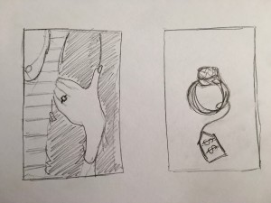
The ideas I have in mind for the shoot are a close up of a ring itself (maybe in a box or on a table) to show it off, for a ring to be on someone’s finger (making it a little more personal/romantic), or a more humorous approach like a ring with a price tag or ad attached.

Sketches

  1. The text is informational; the tone isn’t overly serious and it’s very positive in the beginning when the author talks about his personal experience.
  2. My approaches are literal because they both show an engagement ring. The idea with the tag/ad would be more literal than the other since it’s actually showing the reason/method N.W. Ayer made the original campaign while the other idea is more about the emotion or people associated with engagement.
  3. I think one still life approach is necessary because my main focus is the importance placed on the ring itself. One approach with people involved is also necessary to give the shot a little more personality and make it relatable.
  4. My models would be whoever is in my group if they’re willing. I don’t plan on using any faces in the photos, just arms/hands. I’ll need both a male and female participant.
  5. The object in each photo would be the ring. A price tag or a ring box may be included as well.
  6.  Both ideas need a good amount of light – the couple shot needs to be well lit and the ring shot needs enough light on the ring itself to show the detail but not in the overall photo.
  7. I want the photo with the people to resemble a shot that would be in engagement photos – very bright, soft, and optimistic but also romantic. For the ring by itself, it would be similar to food photography in terms of the shallow depth of field but I would want it to be darker and a little less optimistic.

Optimism

I think that shooting on a white, bright, well lit background would be the best way to illustrate a glass being half full. To add to the optimism, I think that making the glass of water seem more like a tropical drink than just a plain glass of water might be an interesting route. People seem to be happiest in the summertime so making the drink feel summery using food coloring, fruits or an interesting straw in a cool glass (like a mason jar or a really tall, thin glass) would be a good idea. Multiple glasses of different sizes would be interesting as well to show the versatility of having this optimistic outlook in any situation.

Poetry

Phillip Levine’s “Coming Home, Detroit, 1968” and e.e. cummings’ “she being Brand” are two poems that use a car to help illustrate their messages. In Levine’s poem, he uses the names and colors of cars to paint a picture for us “Ford Rouge sulfurs the sun, Cadillac, Lincoln,
Chevy gray.” Being that Detroit is nicknamed the Motor City as it is “recognized as the historic heart of the American automotive industry,” it is fitting that Levine used one of the very things that made the city popular to show the contrast between that positivity and the negativity that came with the race riots in that time. The voice of the poem comes from someone who has to deal with the harsh reality and literal burning of their city every day but also has to continue living life as you can see with the line that reads “One brown child stares and stares into your frozen eyes until the lights change and you go forward to work.” The cars in this poem show the feeling of the time through their colors and also show that you have to keep driving regardless of what’s happening around you. The metaphor of the car in cummings’ poem is just as fiery as he details a new sexual encounter with a woman. The poem explains that he started off way too quickly and when she didn’t react well to what he was doing, he realized he needed to be gentle just as you would be with a real car.

i went right to it flooded-the-carburetor cranked her

up,slipped the
clutch (and then somehow got into reverse she
kicked what
the hell) next
minute i was back in neutral…

The way in which the poem is written speaks to the awkward reality of the situation. Sometimes cars need to be attended to with utmost care and respect.

Seeing that the two poems are so different but both use cars, it’s a bit hard to know how exactly to illustrate the feeling of what could be seen as hopelessness as well as one of passion. My car is a black 1950s Cadillac which I think is sleek enough to illustrate “she being Brand” and simple enough to illustrate “Coming Home, Detroit, 1968.” I think that even lighting and making the car seem small and far away could work well for Levine’s poem. And for cummings’ poem, possibly lighting from the back to create a silhouette or from a 45 degree angle to emphasize the contrast would work well to give it a sensual feeling.

Botany of Desire

Michael Pollan expresses, to a point, his concern with the idea that the agriculture company Monsanto wants total control over the agriculture industry in the U.S. As he explains, the genes for the potatoes he’s allowed to grow and sell remains the intellectual property of Monsanto. Being that the way food has been grown is harmful to the farmer (and also to those eating these crops), the modern solution is the genetically engineered plant that can protect from insects and diseases without the help of pesticides. This genetic engineering would give the company control over plants and essentially make Monsanto the Microsoft of agriculture. Pollan goes on to say that “we’re about to find out what happens when people begin approaching the genes of our food plans as software.”

As for props, I think the basic things that would add to the potatoes are silverware (knives, plates, etc.) or potato chips to show one of the ways the potato can be used.

Foursquare vs. Yelp

The Foursquare and Yelp campaigns are similar in that they’re both humorous. The Foursquare ads use words that are different but sound similar to illustrate the different wants of the people in the ads which makes it interesting while the Yelp commercials use a particular kind of humor (showing people who are in uncomfortable situations and need a solution, that the man offers, which seems like the obvious option) to get the viewer to think similarly. Yelp is known for its reviews and there is a strong sense of trust involved while Foursquare has a much stronger social sense since you can look up places to go and then check in at these places. The audiences are different in that those looking to use Foursquare are concerned with a more social aspect than those looking to use Yelp which is more of a source for trustworthy advice.

The tone of each of the campaigns speak directly to their audiences just as the photography style does. They chose to shoot scenes in real environments but for Yelp, they make sure the actors interact with the viewer so that you can definitely relate to them. For Foursquare, the models were shot going about their lives and not looking at the camera which shows who the viewer could be if they used the app.

Beats and Bose

Though the line “hear what you want” sounds like it could be for noise canceling headphones, the intended message for the Beats ads is that while wearing them you get to hear exactly what you want rather than silence the world outside the headphones. The intended audience is people who are into the appearance and name of a product rather than its function (since Beats headphones don’t have a stellar reputation for sound quality). Thinking of the models they used to advertise the Beats headphones, the audience could very well be people who see themselves represented in the ad. As for the Bose ad, the intended message is definitely that the Noise Canceling Headphones are amazing at their job and cancel out the most annoying of noises. The imagery used (a small child, construction, a dog) suggests that the target audience is suburban people or those that deal with annoying sounds on a day to day basis.

The photography styles differ because the Beats ads use higher contrast, and the angle is a little low but mostly eye level close ups while the Bose ads are evenly lit and they’re whole scenes instead of close ups. These styles help the intended meanings because the high contrast and angle show power and style which is essential to Beats while the diffused light and the distance of the subjects from the camera in the Bose ads is essential to the feeling of turning down the noises you don’t want to hear. The styles also speak to their respective audiences differently.

Campaign Analysis 2

These two photos though similar in being 3/4 views differ a lot. The Schick photo has a lot less contrast than the Gillette one. The expressions of the men are quite different also, with the Gillette man staring right at the camera and the Schick man looking off into the distance. The Schick photo is overall brighter (there is light behind him as well) and uses broad light, highlighting the open side of the model’s face. This model is also the focus of the ad while the Gillette model is not the central focus. In that ad, there is less light and short light highlights his feature which adds to the his intense stare.  All of this helps to show that the two brands are selling very different ideas.

With the Free Your Skin ad, Schick is trying to communicate that with their brand of razors, you have the freedom to make your facial hair a masterpiece. Their visual representation with an actual animal is an exaggeration of the art you can create but the exaggeration works well for the audience. The Gillette ad is very different in what they’re trying to communicate. Showing a completely clean shave on a strong, athletic figure makes you think that their brand is tough enough to handle any shave but precise enough to keep one’s sensitive skin in tact. Because their audience is strong, manly men, they show that their razors protect sensitivity but not at the expense of being strong and manly. The tone of the two images is very different because their audiences are totally different men — Schick’s target being men who are concerned with the artistry of their facial hair and Gillette’s target being men who are concerned with the utility of removing their facial hair.

Campaign Analysis 1

Sarah Silver’s photos for Pantone and Lois Greenfield’s photo for Raymond Weil are similar in that they both use dancers as visual representation of the products advertised.

The formal photography elements that are similar and differ between the two ads include light, texture, focus, line, and tone. Both campaigns are sharp overall in terms of focus, making you pay attention to the dancers and their movements which is important in both campaigns. They also use direct light to further draw attention to the dancers. The direct light creates shadows from the way the dancers are moving but highlights their actions. The lighting used in the Greenfield’s photo emphasizes the dancers, making them clear and bright and gives a tone that is full scale, while the lighting used in Silver’s photography was intentionally designed so that shadows and colors were controlled. Silver’s photos also use lights to create the feeling of texture to speak to the products that Pantone creates.

The metaphor that the Greenfield photo creates speaks specifically to their headline of “precision movements” using these incredibly muscular and strong dancers to show the feeling of being precise as well as fluid. The Silver photos speak to the fact that Pantone and their products are artistic. They are similar in the idea of ever moving time and creativity.