Author Archives: A Protain

Final Project 2

For my second final project, my photographs will be based on a magazine article titled, The Toxic Skincare Ingredients Hiding In Your Beauty Products, from Philadelphia Magazine. The blog expresses the potential dangers of chemical ingredients used in daily personal care products. The writer, Lauren McGrath speaks about possible health risks and products that contain such substances. These products are absorbed through skin pores, entering the bloodstream. But why are they still for sale and how are the chemicals helping us?

For my shoot, I would like to focus on the chemicals of personal care products. I would like to use products that appear to be familiar, without having the brands identified.
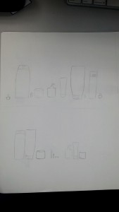
products

  1. The tone of the text is serious and it appears to be pleasingly informative.
  2. My approach will be literal and metaphoric to focus on the tone.
  3. My approach will be still life and include people.
  4. My model will be a female classmate.
  5. The objects used for this shoot will be skin and hair care products of popular brands (used miscellaneous).
  6. I will use lighting with low contrast, to represent a dark view of the dangers of the products.
  7. My photographic technique is to make personal care products appear to be toxic and harmful. I will like to use a dramatic look with back lighting so the products give off a glow with colored sheets. Deep depth of field will be used to show every product sharply including the model’s skin.

http://aboutfaceskincare.com/blog/the-toxic-skincare-ingredients-hiding-in-your-beauty-products/

Final Project 1

For my first final project, my photographs will be based on a blog titled, Fashion Jewelry is Popular and Economical. The article describes how popular costume jewelry has become and the appreciation of inexpensive jewelry. Costume jewelry is manufactured with base metals and then plated with gold or silver to give an appearance of fine jewelry. Although it may not last for many years, it can be worn countless times for many occasions.

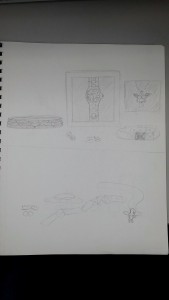
For my shoot, I would like to focus on trendy, designer fashion jewelry. I would like each fashion piece to appear just as luxurious as fine or bridged jewelry.

jewelry

  1. The tone of the text is cheerful y informative.
  2. My approach will be literal.
  3. My approach will be still life.
  4. N/A
  5. The objects used will be jewelry that is currently trendy from various designers like Michael KORS, Juicy Couture and etc.
  6. I will use diffused lighting to eliminate hard spots, shadows, and reflections, because of the high luster.
  7. My photographic technique is to make costume jewelry appear to be luxurious and worth buying. I will like to use a black reflective surface with spot lights. The depth of field will be shallow so the viewer can see the details of each piece.

https://enlightenme.com/fashion-jewelry/

Optimism

The word “optimism” derives from the Latin word “optima,” meaning the best outcome or belief in the greatest good. This is an example of an individual going into the direction of hopefulness and confidence about the future.

To represent the optimistic view of a half full glass, I would like to use a wine glass. A wine glass imitates the look of success, health, and wealth, because of its curves. The background should be light and bright to set the desired tone of the photograph. Props that can be used are fruits. Maybe a slice of lemon, a strawberry or pineapple can be placed on the rim. Fruits can also be placed inside the water. Cherries, raspberries or blueberries can be used. The rim can also be salted.

Poetry

Both poems, “she being Brand” and “Coming Home, Detroit 1968” describes a man driving though a city. The metaphors used throughout each piece are entirely different in format, tone, and in what they are trying to express to the reader.

The first poem by e.e. cummings describes the experience and the rush of driving his brand, new car for the first time. The poem’s exaggerated composition is also similar to a car in motion and when it comes to a stop. The metaphors used throughout the poem sounds erotic. The driver explains his experience as he’s about to start the car for the first time, “..a little stiff I was careful of her.. my gas felt of her radiator made sure her springs were O.K. Later, he ends the poem describing the climax, “..the internalexpanding & externalcontracting.. brought allofher tremB-ling..” The poem interprets the desire of the first sexual encounter between a man and a chaste woman.

The second poem by Phillip Levine describes a man driving through the city of Detroit during a depressing period. The poem describes the atmosphere of the city and people. The metaphors used throughout the poem sounds sad. The narrator explains the experience of driving home seeing the misery of others, “one brown child stares and stares into your frozen eyes.. The charred faces, the eyes boarded up, the rubble.. we burn this city everyday”. The poem interprets a time in history where Detroit had deadly riots frequent which left property destroyed.


Michael Pollan’s Botany of Desire

The author, Michael Pollan, describes how our country selectively breed and genetically engineer our plants. On an average annual basis, an American farmer can grow enough food for only 100 people. With the help of Monsanto, the company aims to control potato harvesting as their own intellectual property to keep the same gene. Due to previous expenses on toxic chemicals, (which pollute ground water, food safety, and health) the company wants to issue a new change. Monsanto wants to replace the toxins with genetic information that can protect themselves from insects and diseases.

One idea can be a comparison of what the potato looks like in the inside and outside. Another can be a potato that looks damaged on the outside to reflect on the harsh chemicals. Another can represent two potatoes that look either identical or different with a patent number written on the surface.

Beats vs Bose

Beats and Bose are two leading brands of premium headphones. Both companies are famous for their over-the-ears wireless feature for consumers who are looking for a noise canceling quality.

Beats “Hear What You Want” campaign uses a profile shot of black athletes. The company specifically target black consumers who are interested in fashionable electronics. Each shot focuses on the sleek features of the headphones to show the brands model and logo. The models used for each image are disengaged from their viewers with a contemplative expression. The background for each image is either blurred or a neutral color, which is best for the product to be a focal point. This works for the campaign to support the quality of Beats products.

Bose’s Noise Canceling campaign uses a landscape shot of visual proof to represent noise level decreasing. The company specifically targets middle-aged adults who are interested in blocking atmospheric sounds. The images show a construction worker with a jackhammer, an active child and a playful dog. All three examples are relative in the same concept for each environmental ruckus. Each photo was taken in diffused light with soft shadows. This works best for the campaign to support Bose’s noise canceling feature.

Foursquare and Yelp

Foursquare and Yelp are two competitive search engines that helps people specifically find a location or area of interest locally and its reviews.

Yelp is not only great for recommendations, but also provides helpful reviews. Yelp’s new TV commercials, portray a humorous and resourceful style of entertainment, where their characters are stuck in awkward situations. The “We Know Just The Place” campaign gives a fictional, over exaggerated response of how consumers may react to their experience. The company’s advertisement was featured to promote their platform, while expanding into new markets. Yelp is represented as a reliable problem solver to escape each individual’s catastrophes.

Foursquare’s outdoor print campaign portrays a stereotypical view of how their platform instantly connects with their consumers. The “Foursquare learns what you like and leads you to places you’ll love” campaign presents a realistic scenario, unlike Yelp. The photographer pairs two contrasting models with completely opposite, individual taste. Foursquare encourages exploration of cultural differences for all types of people. The company’s style gives an idea of knowing their customers needs with both local and accurate recommendations.


Shaving Ads

Troy Goodall’s Schick and Tim Tadder’s Gillette campaigns are stereotype-based approaches targeted towards men to convince them to shave. Each photographer’s model is positioned in 3/4 profile shots, facing 45 degrees away from the camera. This is a more define feature revealing both the broadside of the model’s face.

Schick’s Free Your Skin campaign portrays a hippie with an animal clinging to the model’s face. The message conveys a humorous, subliminal approach to encourage men to clean up their appearance. Goodall’s model is an average older man who looks rather sophisticated and casual. His relaxed appearance also mimics the grey tones of his attire and the background. His body is positioned as a frontal shot looking off to the left, disengaged from the audience. The image reflects on how a viewer might respond to an individual’s choice of appearance. The choice of lighting also reveals he broadside of the model’s face and beard as the focal point.

Gillette’s Fusion ProGlide campaign portrays a hairless football athlete. The message conveys a direct approach as a result of how a man will look after a clean shave. Tadder’s model is a young man within the sports industry. His photograph is taken from the chest up, looking fully engaged and directly at the audience. His appearance heavily emphasizes on how well Gillette’s razor works. Tadder’s choice of broadside lighting defines and frames the model’s face as the focal point. The high contrast of the image also reflects on the importance of well grooming and the razor’s longevity.

Dance Photography in Advertising

The ad for Raymond Weil shot by Lois Greenfield and the ad for Pantone shot by Sarah Silver both executed similar and different campaign elements.

Greenfield’s Raymond Weil ad contains a monochromatic visual. The dancers in the black and white composition are the only elements used as the focal point. In this campaign, figures represent the headline – “Precision movements.” Their body language is compared to the hands of a watch. In the shot, light sources appear from a high angle on the left side creating dark shadows. Each dancer is placed at a different distance, which makes them appear closer in depth producing a shallow space. The negative space around the individuals makes the portrait become balanced. The image also has a high contrast with a few middle tones.

Silver’s Pantone ad contains a polychromatic visual. For the “Make It Brilliant” campaign, lights were used to paint colors with the same vibrancy. In this ad, the colors represent different moods and are used as the focal point. Within the composition, geometric shapes were utilized as walls, props, and texture designs to keep the environment balanced. Although the walls help to construct less negative space, the dancers were placed amongst each other at different distances creating a deep space. The image produced also has a low contrast with mostly middle tones. 

Both campaigns used dancers as a human element to bring life to their concept. In each shot, they portray a different message and expression. The dancers for “Precision Movements” metaphorically relates to the hands of a clock by their specified positions. The dancers for “Make It Brilliant,” metaphorically added a touch of life to the newly created neon colors. Each successful shot forms an illusion by a technique called frozen motion photography.Â