Robin Michals | COMD 1340 Photography 1 OL89 | FAll 2020

Category: Class Topics (Page 1 of 3)

Week 14 – Digital Darkroom: Local Corrections

Needed for this class

  • Lightroom
  • final project files

Review Global corrections

Global corrections adjust the entire file. In Lightroom classic, this includes everything in the basic panel: White balance, Tone and Presence. In the Lightroom/Photoshop App, it includes the controls under Light, Color and Effects.

Local corrections

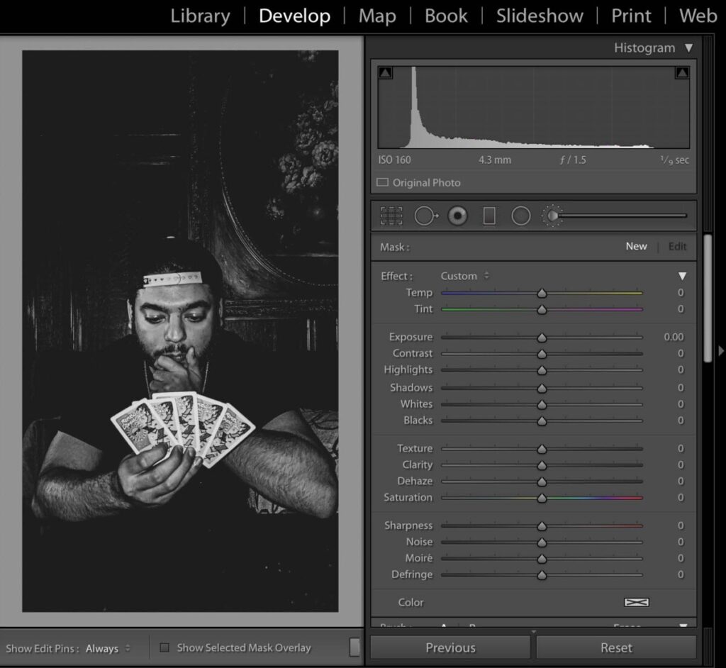
After you make global corrections, sometimes you will want to make corrections to part of your image. Generally, the brightest part of the image commands the most attention. Sometimes that is not where you want your viewer to look first so shifting the exposure of parts of your image can create the image you want.

Selective Edits is a premium feature. You should have access to it if you have an account.

The two main tools for local adjustments are the adjustment brush and the graduated filter.

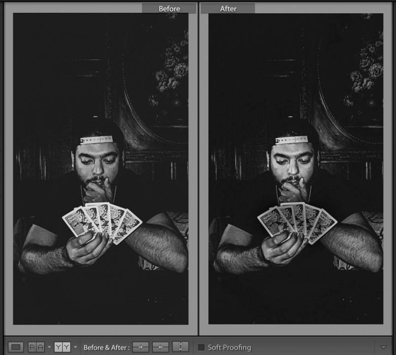
The important thing in this photo by Bryan Rodriguez is the face of the card player. However the cards are brighter and demanded too much attention. Using the adjustment brush, I darkened the cards. Creating a second adjustment, I lightened the face of the card player a little more. The goal was to bring more attention to the person’s face and less to the overly bright cards.

Lab exercises

Review Global Corrections

Local Corrections

Homework

Final Project

Due next week, December 15th:

3 albums each of a minimum of 30 photos

1 album of the 10 best photos of the 90 total, adjusted in Lightroom

a 3-5 min presentation of the final project – projected from the album on Flickr.

Presentation Guidelines

  1. Start by introducing yourself and your project. One big picture sentence such as, ” I photographed variations on the theme of windows with most of the photos taken in downtown Brooklyn.
  2. If you are showing 10 images, you have about 30 seconds to describe each photo. Tell us what your intention was, what interested you about the photo we are looking at, and give us information we may need to know to understand the photo. Tell us what makes it visually interesting ie the use of shallow depth of field or some other feature.
  3. Your presentation will improve if you practice.
  4. Do not tell us about what you did to the photo in Lightroom.
Week 13 – Portrait Lighting Styles

Needed for this class

  • Camera or cameraphone
  • A window w/daylight
  • A model if possible or you can take self-portraits

Portrait Lighting Styles

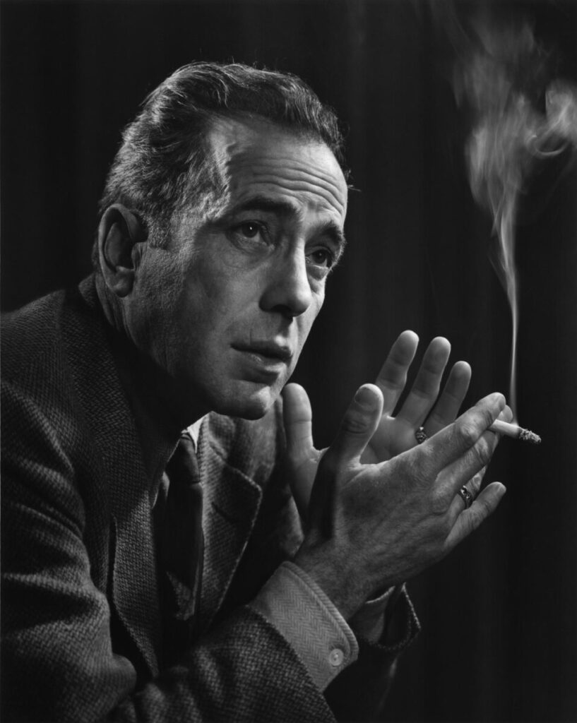
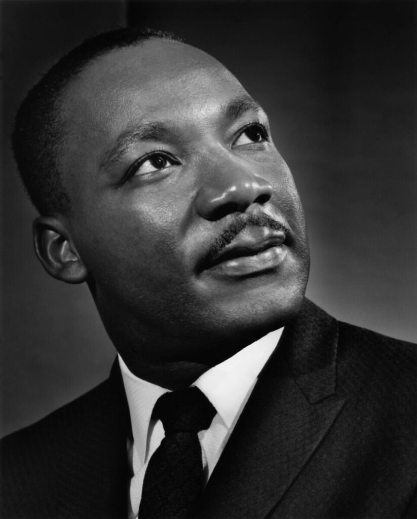
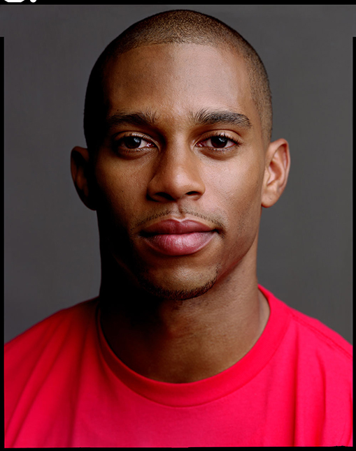
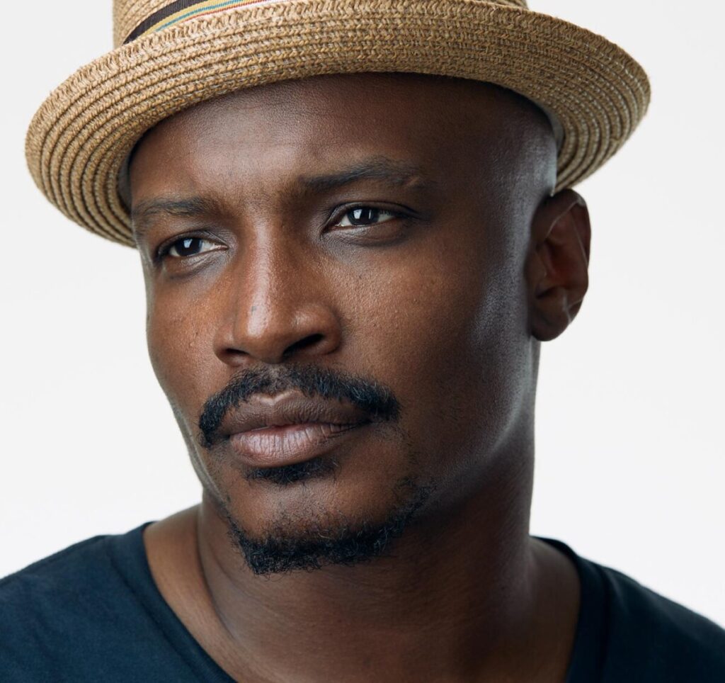
There are a 5 basic lighting styles for portrait photography. Each style is defined by how light falls on the face. The examples below were all shot with lights in a studio but you can replicate these patterns with window light.

  1. Rembrandt Light – the model is face forward, main light is at 45 degrees and casts a light on the opposite side of the face to form a triangle on the cheek.

Rembrandt Lighting
Michael B. Jordan. Photographer: Peggy Sirota

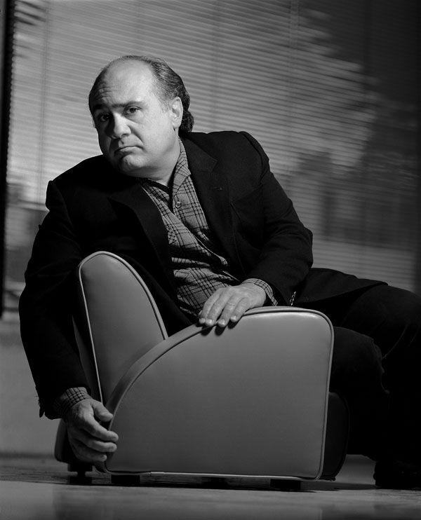
2. Broad Light-model’s face in 3/4 view-light falls on the side of the face with the visible ear. Good for controlling the reflections on glasses.

Danny Devito. Photographer: Gregory Heisler.

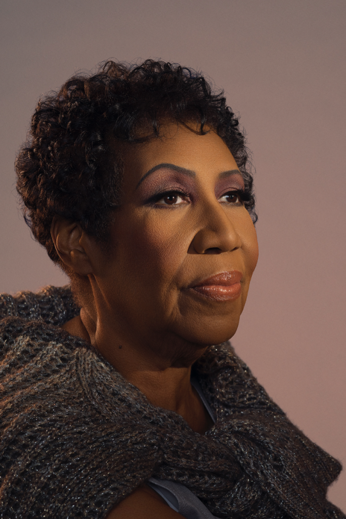
3. Short Light-model’s face is in 3/4 view, the light falls on the side of the face with the features. (Not on the side with the visible ear.)

Both of these are examples of short light.

Chadwick Boseman. Photographer: Caitlin Cronenburg

4. Butterfly Light, Clamshell or beauty or glamour light-model is face forward, front light.

Tyra Banks. Photographer: Matthew Jordan Smith

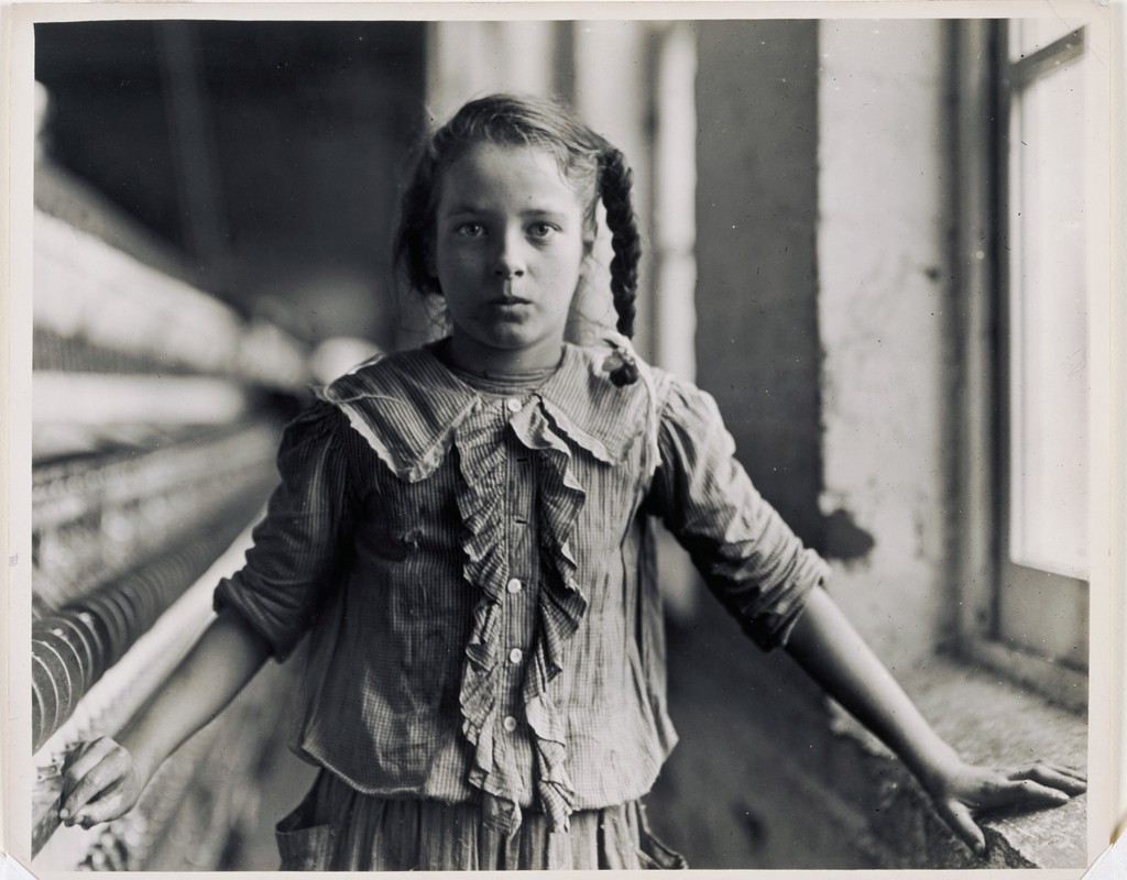
5. Split Light-model is face forward, the main light is at 90 degrees to the camera and falls on one side of the face. 

Lewis Wickes Hine (U.S.A., 1874–1940), One of the spinners in Whitnel Cotton Mfg. Co. N.C. December 1908.

When we shoot portraits in the studio, we can move the lights around the model. When shooting a portrait with a window, we have to ask the model to move their position in relation to the window.

This video shows how to use a window to create Rembrandt, split, broad and short light.

https://youtu.be/WnMYnOjA1ec

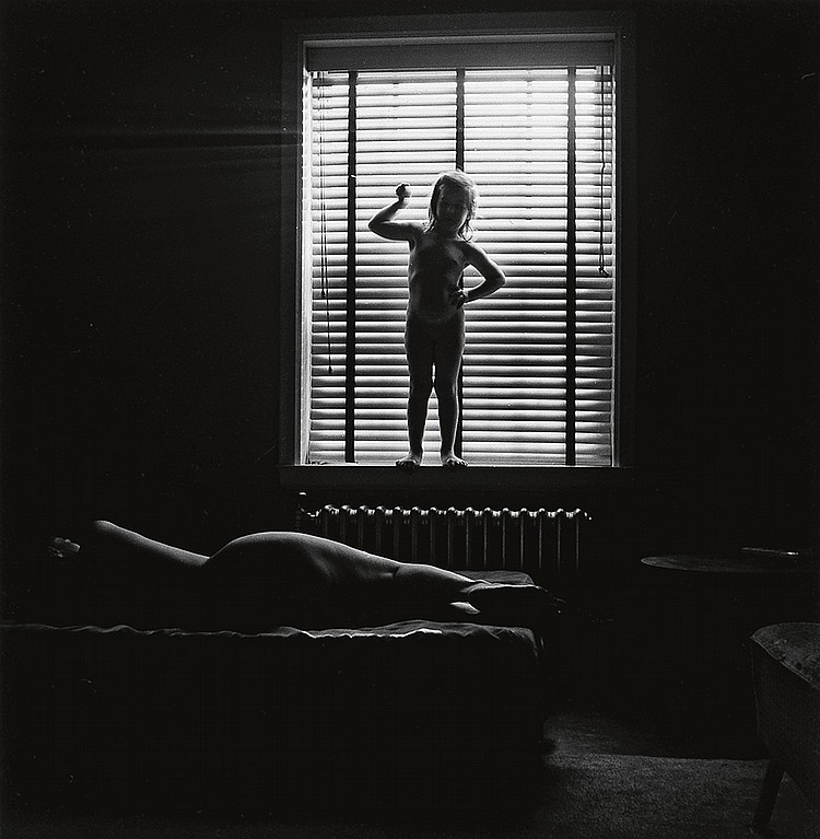
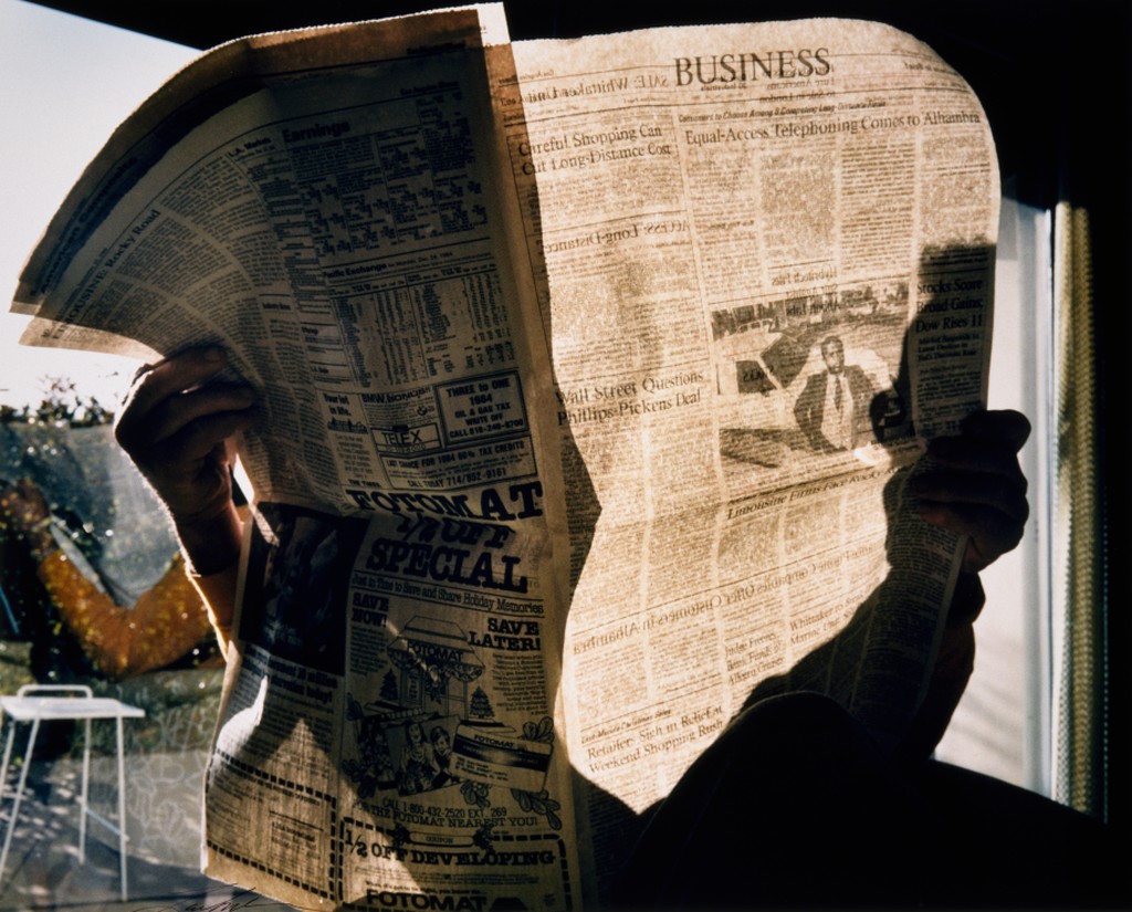
And while not exactly a portrait, window light is terrific for creating silhouettes.

To create a silhouette, have the subject stand close to the window and aim the camera towards the window. Set the exposure for what is outside the window so the subject is very underexposed.

Eleanor and Barbara. Chicago. 1954. Photographer: Harry Callahan.

Inspiration

Lab Exercises

Please complete the following lab exercises, creating a post on Openlab with the category indicated to share your results.

Homework Assignment

Final Project

Week 12 – Portrait Basics

Needed for this class

  • Camera or cameraphone
  • A window w/daylight

Portrait Poses

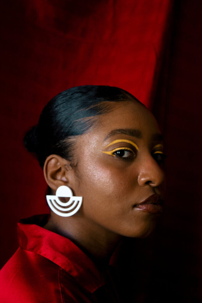
There are three basic positions for someone’s head and face in a portrait.

  1. Front view
  2. 3/4 view
  3. Profile

Expression

For family photos a smile is a must but not so for a portrait. It is however important that your subject look comfortable. It is your job as the photographer to talk with your subject and make them feel comfortable.

Focus

When shooting a portrait, the subject’s eyes must be in focus. Full stop. period.

Generally, portraits are shot with shallow depth of field to separate the subject from the background. Be careful to have enough depth of field so that the subject’s face from what is closest to the camera to what is farthest is in focus.

If you are shooting with a cameraphone that has portrait mode, it will blur what it calculates to be the background to simulate shallow depth of field. You can also use an app such as Focos to simulate shallow depth of field.

Wide Angle Distortion

Wide Angle Distortion is created when using a wide-angle lens AND the camera is very close to the subject. The object close to the lens appears abnormally large relative to more distant objects, and distant objects appear abnormally small and hence more distant – distances are extended. 

Focal length and proximity to the camera affect how a person’s face looks in a photograph. A wide focal length and proximity between the subject and the camera create wide angle distortion and will distort a person’s features.

Photographer: Chip Simons

Think about selfie sticks. What are they for but to get the camera away from your face? This makes the photograph look more complimentary to the subject. This is really important with a cameraphone because it has a wide angle lens. The center of the lens and the sensor cannot be very far apart given the thin design of cellphones.

Inspiration

Lab Exercises

Please complete the following lab exercises, creating a post on Openlab with the category indicated to share your results.

Homework Assignment

Final Project: Shoot 1

Due: December 1, 2020, 8 am

Week 8 – Midterm – Critique Guidelines

Critique Etiquette

  1. Please give the presenter the respect of your full attention.
  2. Any comments or questions you have during or right after a presentation should be directly related to your colleague’s photography.
  3. When you comment on your colleagues work, start with the positive. Use the terms below that we have learned this semester.
  4. It is very important that the presenter hear from a range of students in the class. Your opinion and judgements are important. Offer your thoughts generously. Do not leave the work of responding to the others in the class.
  5. Conversely, please do not speak over your classmates.

Vocabulary

Framing: How the frame brings together the elements inside the rectangle juxtaposing them, creating relationships between them

Types of shots: how much information is in the frame

  • a long shot
  • a medium shot
  • a close up
  • an extreme close up.

Frame within a frame – use elements in the frame to enclose the main subject and draw attention to it. A frame within a frame can be a window or door or it can be items in the foreground such as branches.

Angle of View:  describes the camera position in relationship to the subject. The angle of view may be: 

  • a worm’s-eye view
  • a low-angle
  • eye-level
  • a high-angle
  • a bird’s-eye or aerial or overhead view
  • an oblique angle.

Rule of Thirds – Instead of placing the main subject in the center of the frame, divide the frame into thirds horizontally and vertically and place the main subject at one of these intersections.

Fill the Frame –  (get closer) – do not leave empty areas that do not add to the composition and plan to crop in later.

Diagonals – Sloping lines

Leading Lines – lines in the photograph that lead the eye to the main subject

Patterns – repeated elements. Break the pattern for visual interest

Figure to Ground -the relationship between the subject and the background sometimes described as negative and positive space.

Diffused light – light that comes from many directions and creates soft shadows

Direct light– light that come from one direction and creates hard shadows

Contrast: The measure of difference between bright areas (highlights) and dark areas (shadows) in a photo

High contrast : Large difference between highlights and shadows. Mostly lights and darks without many mid tones        

Low contrast :  Little difference between lights and darks. Mostly mid tones.

Frozen Motion-Motion is stopped and captured in the frame with a fast shutter speed.

Blurred motion-moving elements blur with a longer shutter speed.

The Decisive Moment: A term coined by Cartier Bresson- “the simultaneous recognition, in a fraction of a second, of the significance of an event as well as the precise organization of forms which gives that event its proper expression.”

Quiz

Quiz

Homework

HW 6: Reflections

Week 7 – Digital Darkroom – Global Corrections

Needed for this class

  • Lightroom Classic or Lightroom Photoshop App

Inspiration

Sebastian Hidalgo – Pilsen, Chicago, IL

Terms

Aspect Ratio-the proportion of the width of the image to the height of a 2D image

Clipping-the intensity of the light falls outside of what can be recorded by the camera and there is a loss of detail.

Color Profile-the data for a digital device, such as a printer or monitor, which describes its gamut, or range of colors. Used to match the gamut from one device to another.

Exif Data-information stored by the camera in the file.

Gamut-range of colors

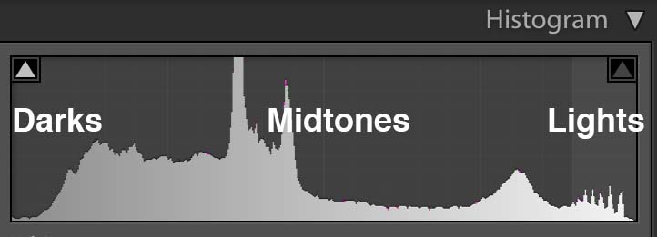
Histogram- a graphic representation of the tones in an image. A spike of data on the left side indicates underexposure, on the right overexposure.

Neutral Value-RGB values are equal or gray

Non-destructive Editing-adjust the image without overwriting the original image data. Instructions are written to a sidecar file that tells the software how to interpret the image.

White Balance-the setting that adjusts for the color temperature of the light and that will make a white object appear white or a gray object a neutral value

Global Corrections

Global corrections adjust the entire file. In Lightroom classic, this includes everything in the basic panel: White balance, Tone and Presence. In the Lightroom/Photoshop App, it includes the controls under Light, Color and Effects.

Using the Histogram

The histogram is a graphic representation of the tones in the photograph. It is a guide to exposure decisions. Most images look best when there is a full range of tones from black to white in the image. But there are no iron clad rules.

Below is a terrific photo shot by Bryan Rodriguez. The expression of the card player is perfect and you can feel him making a decision about what to play.

Card player

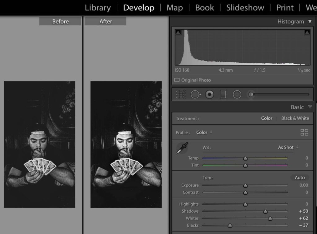
Looking at the histogram, we can see that most of the tones are dark. There is no true black or white. To raise the contrast of the image and use the full tonal range, use the following adjustments:

  • blacks slider to the left until the data hits the left side of the histogram
  • whites slider to bring attention to the right until the date just touches that aide
  • shadows slider to +50 add detail to the dark areas

Card Player with histogram

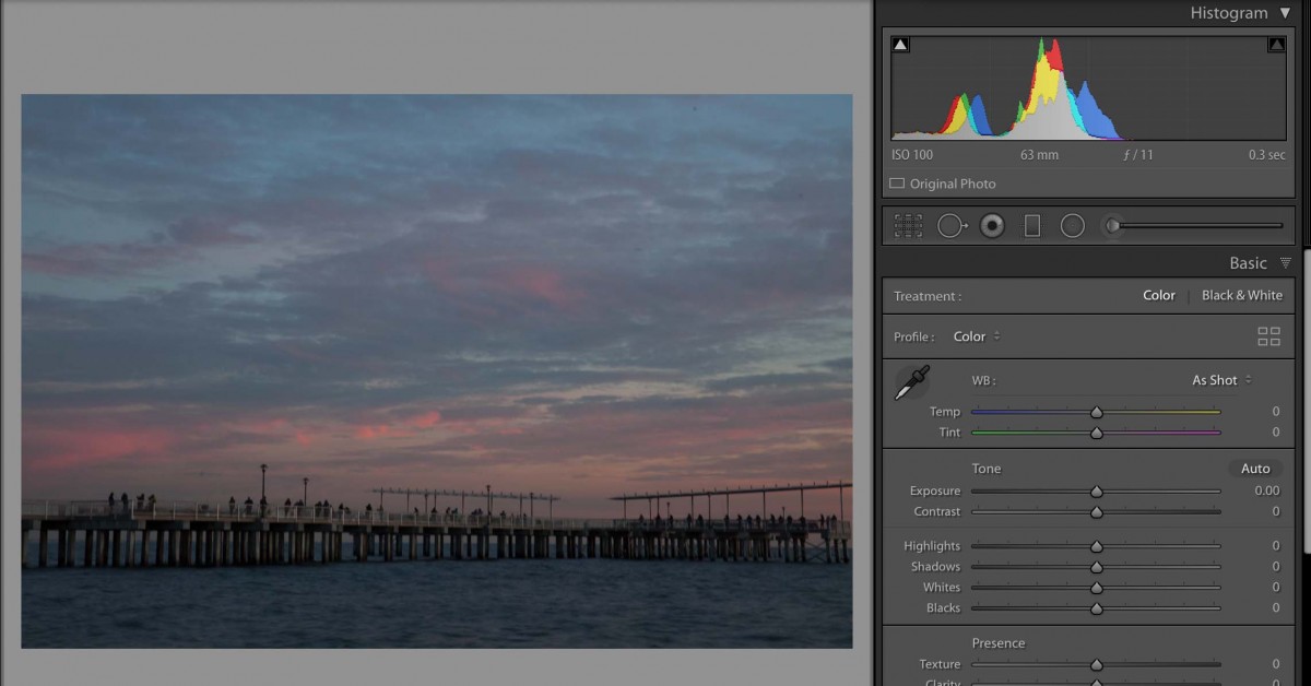
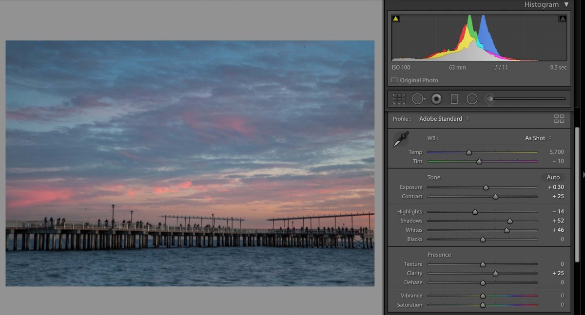
In this photo of the pier in Coney Island, the histogram shows that is underexposed. But we also know that it is an evening scene and that there is nothing in the photo that should be bright white.

A few tips for Lightroom Mobile:

  1. To access the histogram, tap on the image with two fingers. If you can’t really see the histogram background, brighten the display.
  2. To see the image before your corrections, press on the image.

Lightroom Workflow:

  1. Classic: Lens corrections and Transform panels. Correct lens aberrations and Transform, rotate and straighten.
    App: Optics, geometry.
  2. Classic: Crop. Left below the histogram. Keep the lock on to maintain aspect ratio.
    App: Crop
  3. Classic: WB on basic panel – Set white balance.
    App: Color
  4. Classic: Exposure section on basic panel – Read the histogram to set exposure. Most images should have the widest possible dynamic range, meaning that there should be data across the entire histogram.
    App: Light
    Both:
    a. Exposure slider-use to adjust the overall tonality
    b. Set black point-shift double click.
    c. Set white point-shift double click.
    d. Use shadows slider to brighten mid tones.
  5. Classic: Presence section of basic panel – Adjust clarity (mid tone contrast)
    App: effects
  6. Classic: Presence section of basic panel – Adjust vibrance.
    App: color
  7. Classic: Presence section of basic panel – Use saturation with care: +10 at most
    App: color
  8. Classic: Detal panel – Sharpen-amount at least 50
    App: detail

Lightroom Photoshop App Resource

Lightroom Classic Resource

Midterm

Critique

Lab Exercises

Global Corrections

Quiz Review

Homework

Midterm Project

« Older posts

© 2024 Photography I

Theme by Anders NorenUp ↑