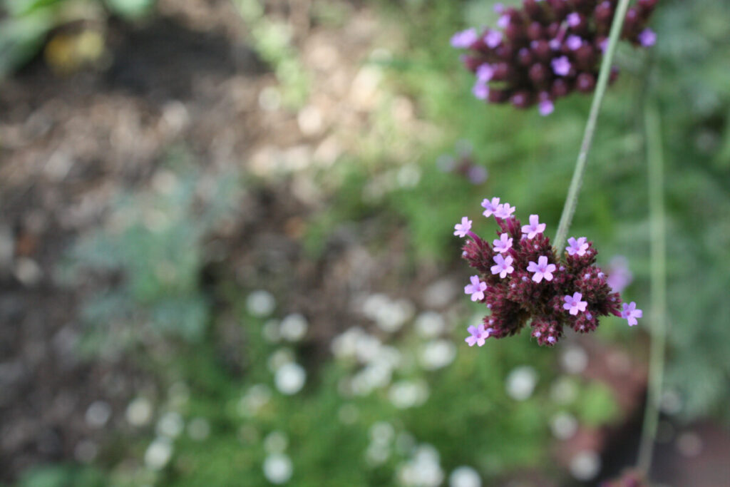
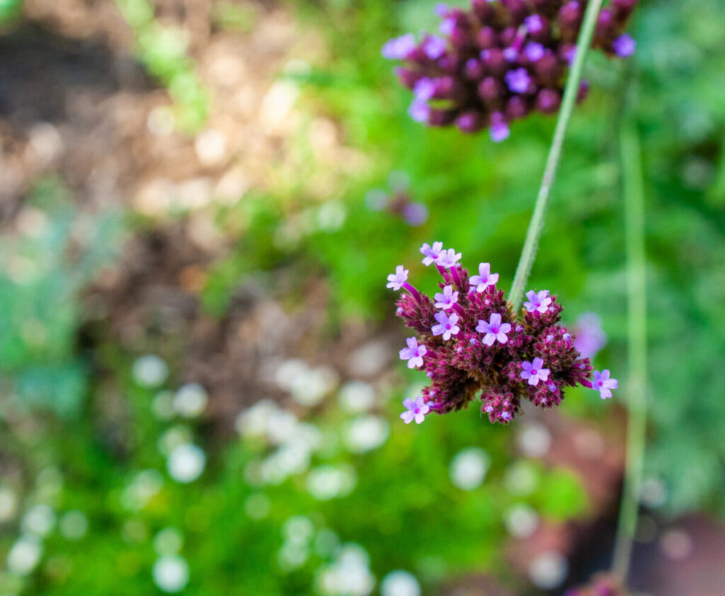
Before on the left, After on the right. The main thing that I have done was to decrease the shadows and increase the contrast. I also cropped the photo so that it aligns more with the rule of thirds, improving the composition in my opinion. I’ve done more minor tweaks across all the editing setting to get an overall more clear and vibrant photo. At least that was the intention.
Category: Lab: Week 7 – Global Corrections (Page 2 of 2)
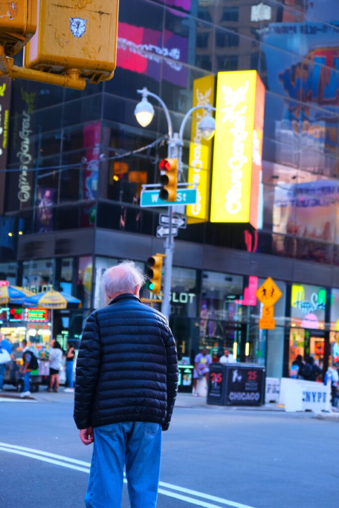
When editing, I first went to Geometry and adjusted the upright to Auto which helped me center my picture. I then went on to set my white and black points. I brought down my shadows, highlights, and shadows. I added some vibrance and saturation as well as brought up my clarity. I finally sharpened my image to 50. This brought my photograph to a blueish hue which brings me to remember a more arcade/ video game feel which I associate a lot with the bright lights of Times Square.


Recent Comments