

Robin Michals | COMD 1340 Photography 1 DO97




I really like the backlighting in all 4 of the photos and how the colors stay neutral in them. I think you could’ve tried to go and focus on one thing in each photo rather than the entire frame to add some depth into them. The frame of each picture is filled which I like. Each photo is overexposed though so you lost some details in them.
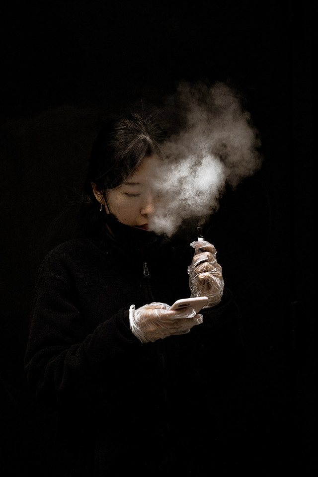
The photo of the woman standing alone smoking while on her phone stood out to me the most because it reminds me on isolation and relaxation. It was part Suzanne Stein “New York Street One” collection. From what I’ve seen of Suzanne Stein is that she likes to take photos of people with cigarettes’ a lot. And that maybe it relates to her because she might be a smoker herself. Or that its like mainly a “New York” thing. It seems to be have taken during the pandemic winter because the woman is wearing some plastic gloves and that she’s also wearing a coat. The feeling of the photograph I would say isn’t moody but like it just seems to be there or relaxing?
In the photograph the elements that are used are Rule of Thirds, Dominant Eye and Figure to Ground. Rule of Thirds is used because mainly the subject is in the middle of the photograph, the hands , face , phone , smoke. It all condenses itself, allowing the viewer to see it all in one go. Figure to Ground is used from the negative space to positive space where there seems to be a lot of empty places within the photograph, which allows everything to pop out on it own. And dominant eye is because if you look close enough you can see some of the girls jacket blend in on the left side of the photo and a change in shadow towards the top left.
© 2024 COMD 1340 DO97
Theme by Anders Noren — Up ↑
Recent Comments