Author: Michelle R (Page 1 of 2)
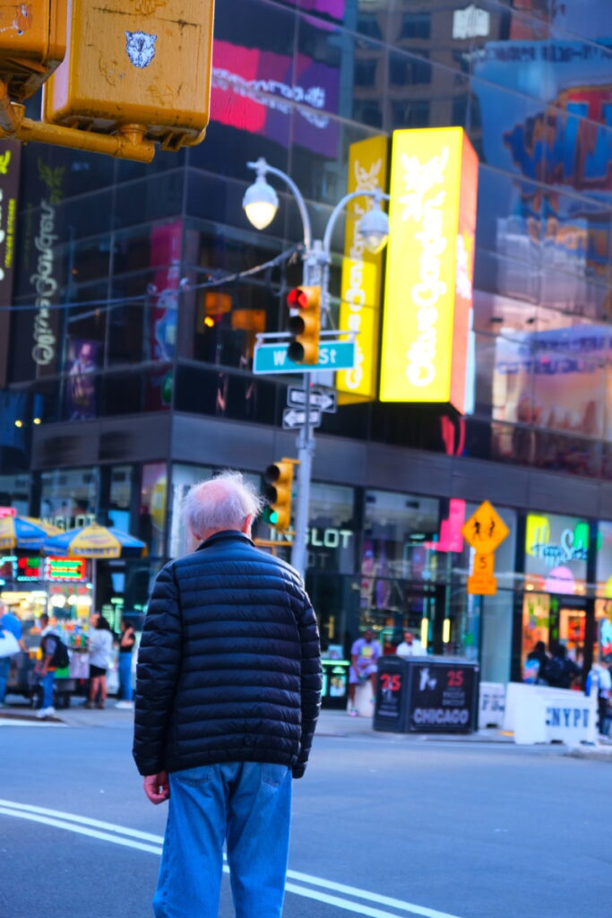
When editing, I first went to Geometry and adjusted the upright to Auto which helped me center my picture. I then went on to set my white and black points. I brought down my shadows, highlights, and shadows. I added some vibrance and saturation as well as brought up my clarity. I finally sharpened my image to 50. This brought my photograph to a blueish hue which brings me to remember a more arcade/ video game feel which I associate a lot with the bright lights of Times Square.

This picture shows great use of pattern and its broken by the magnets in the middle. 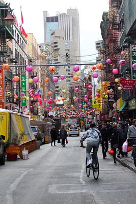
Great use of extensive depth of field. 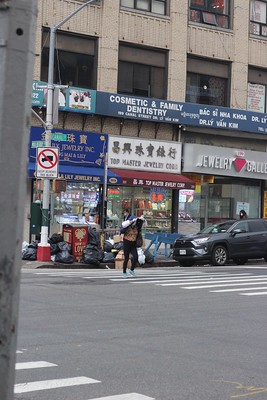
If cropped a bit could be a great use of rule of thirds and great use of concept. 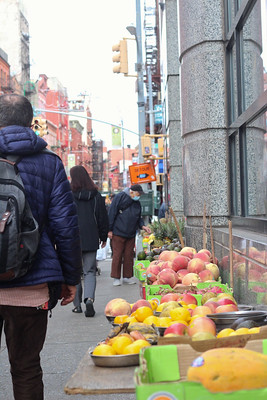
Good use of diagonals along with rule of thirds. It shows a good pop of color amongst the city with the vibrant fruit.
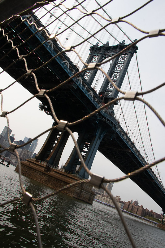
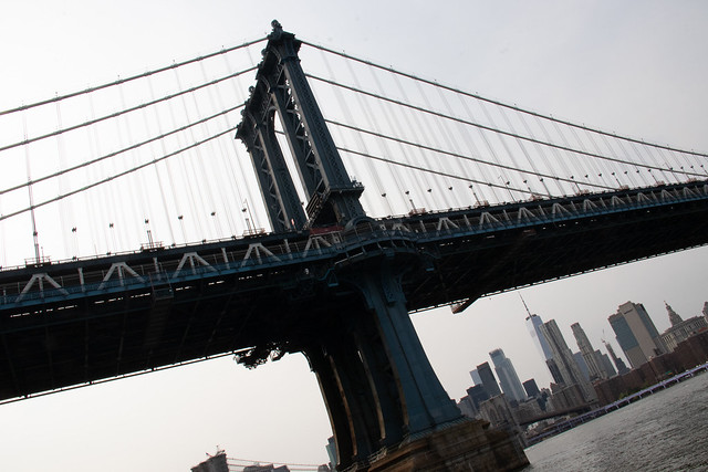
Upon taking pictures in Brooklyn Bridge Park, I have come across the bridge and have taken it from two different angles. In the first image you will see a worms view of the bridge as well as usage of frame within a frame as it was taken with a fence in front. It gives it a deeper depth to the picture not just as a bridge but how it looks under as well. In the second picture you are able to see the bridge from a medium shot as well as an onlique angle to give it more better preception. You can see from these two pictures that such an subject can change with different angles and photographic compositions.







Recent Comments