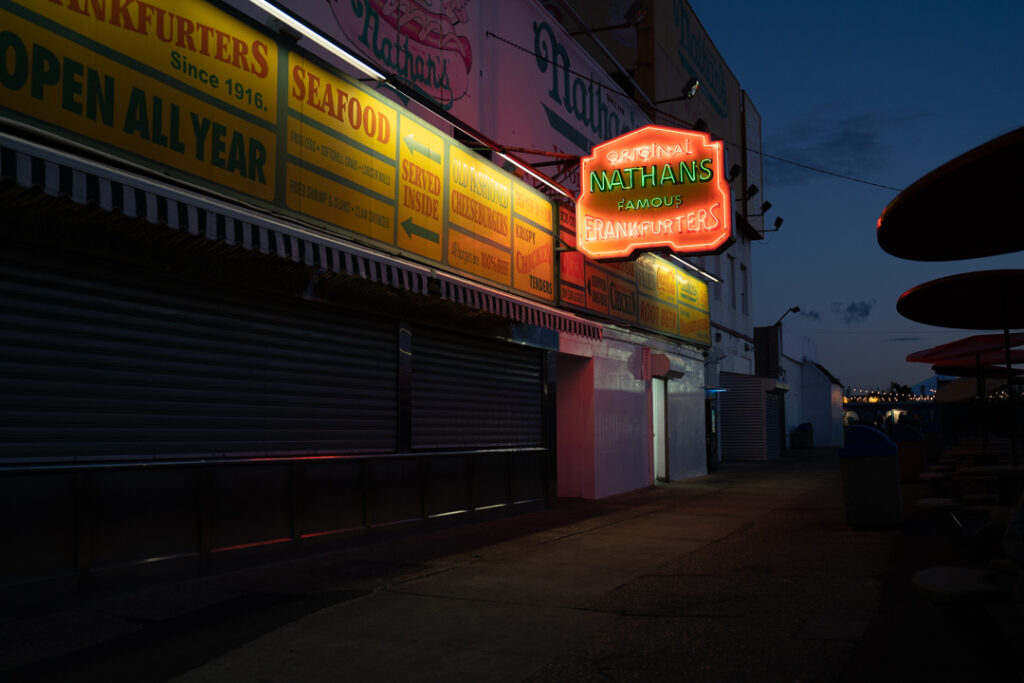
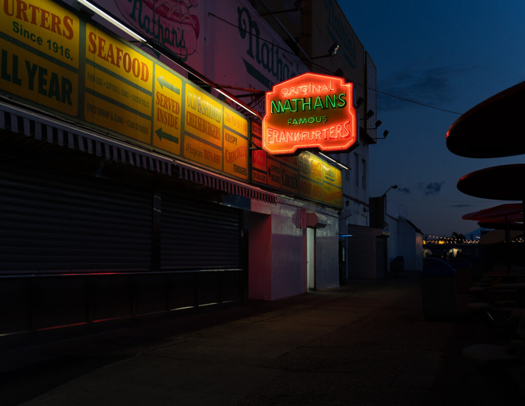
For the changes I put down the highlights to show the sign more clearly. Moreover, I added more contrast and put down the whites a little bit.
Author: John Gregorios
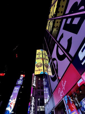
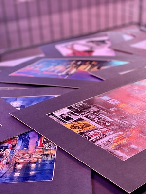
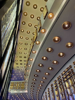
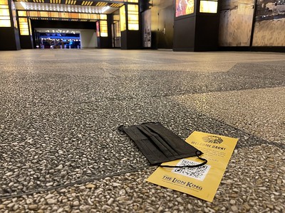
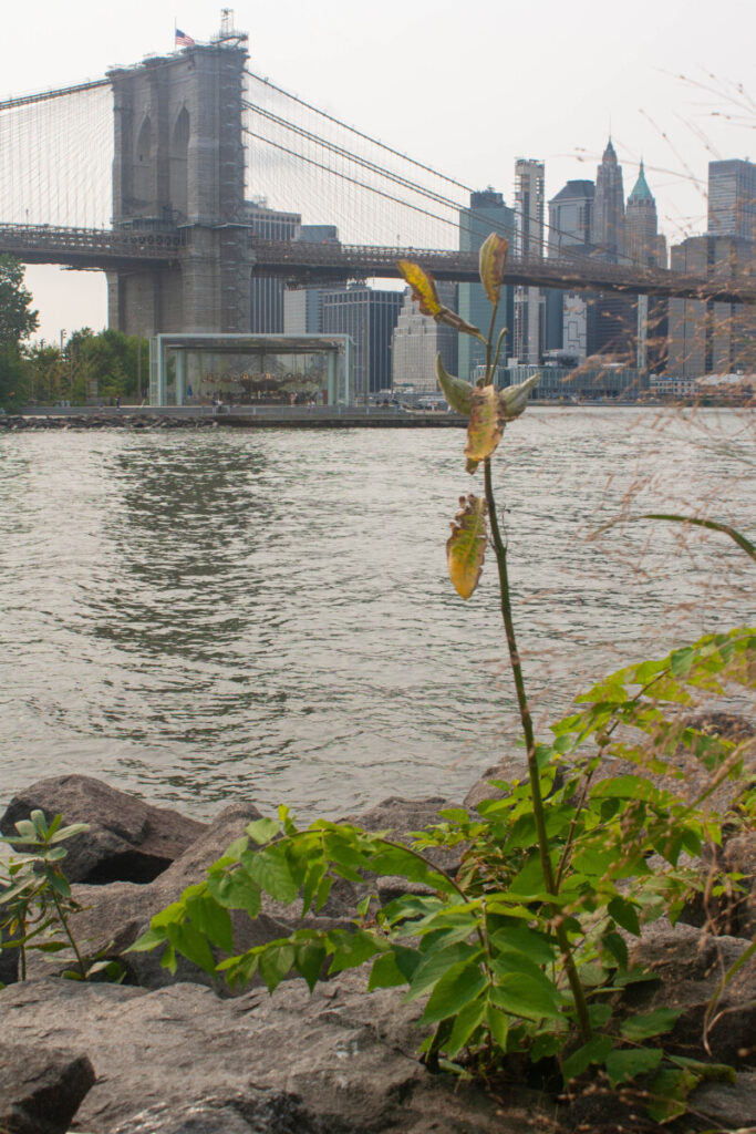
- The top left photo is good due to the usage of a low angle that exaggerates the shape and size of the buildings.
- The top right photo is good due to the constant pattern in the image and also the neon lighting.
- The bottom left is great because again the pattern is very pleasing to the eyes and also the good usage of angle and lines in the image.
- The last photo is good because the main subject is placed in the bottom left of the image which is a good usage of the rule of thirds.
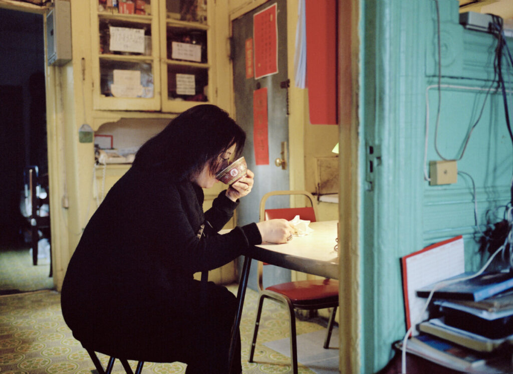
Photography is the art of making imagery through manipulation of light. In my humble opinion, nothing best illustrates this description more than Thomas Holton’s photo called “Break Time”. The subject matter of the photo is a woman, possibly the mother, sitting alone in what looks like the family’s living room or kitchen. The intention of the photographer in this photo is to portray the life of someone just living their everyday life. The feeling that is portrayed in the photograph is the sense of loneliness but also some hints of strength. My favorite part of the photo is definitely the overall color palette of the image. It has that toned down colors that really give the photo a cinematic feel to it. Moreover, even though the overall tone of the image is somewhat lonely with the usage of a warmer light, it adds a very homey/warm vibe to the photo.
One of the elements that immediately catches my eye is the repetition of the color red. It is very eye-catching and gives the overall mood of the photo somewhat of a warmness to it. The second element that is apparent in the photo is the usage of the right wall to have separation between the figure and ground. Moreover, this gives the photo a more 3d look that stops the photo from looking flat. And lastly the element present in the photo is the usage of leading lines. We can see this everywhere in the photo, from the handle of the unused chair to the door itself. But the strongest line is definitely the table that is being used by the women which directly leads the viewers eyes to the subject.



Recent Comments