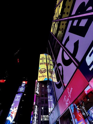
- The top left photo is good due to the usage of a low angle that exaggerates the shape and size of the buildings.
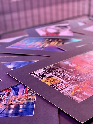
- The top right photo is good due to the constant pattern in the image and also the neon lighting.
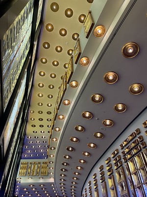
- The bottom left is great because again the pattern is very pleasing to the eyes and also the good usage of angle and lines in the image.
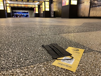
- The last photo is good because the main subject is placed in the bottom left of the image which is a good usage of the rule of thirds.
Robin Michals | COMD 1340 Photography 1 DO97
© 2024 COMD 1340 DO97
Theme by Anders Noren — Up ↑


Leave a Reply