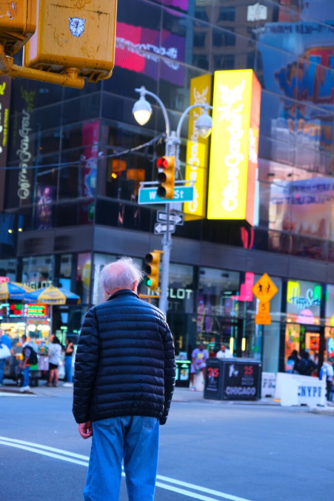
When editing, I first went to Geometry and adjusted the upright to Auto which helped me center my picture. I then went on to set my white and black points. I brought down my shadows, highlights, and shadows. I added some vibrance and saturation as well as brought up my clarity. I finally sharpened my image to 50. This brought my photograph to a blueish hue which brings me to remember a more arcade/ video game feel which I associate a lot with the bright lights of Times Square.
About This Course
COMD 1340 Photography 1 DO97
Tuesday 2:30pm – 5:50pm V111
Professor Michals
rmichals@citytech.cuny.edu


Fixing the highlights was particularly effective. Look at the Olive Garden sign.
Somehow the color got a little too saturated. In the surroundings it is fine but the man’s head looks a bit too hot.