Williams Kayla Project 3 Final
Leave a reply
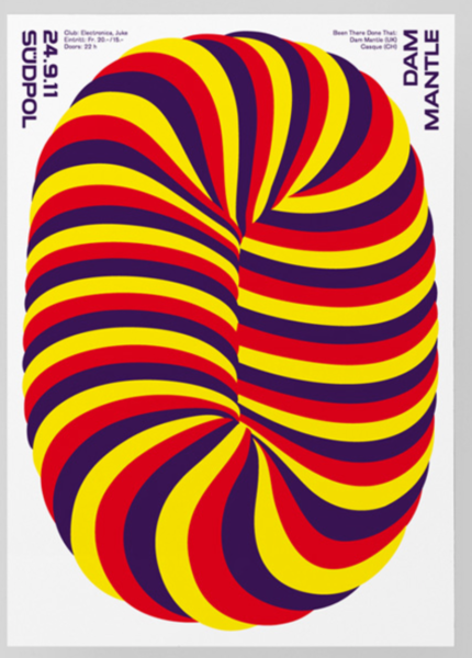
This design works best for me because the colors and picture catches my attention and the lettering is easy to read unlike with other posters that caught my attention, but was a bit difficult to read. However, in a way if someone was passing by those other posters and was not in a rush to go anywhere, then they could really stop and try to figure out the other posters. But this one was more easy and still caught my attention.


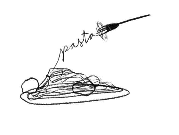
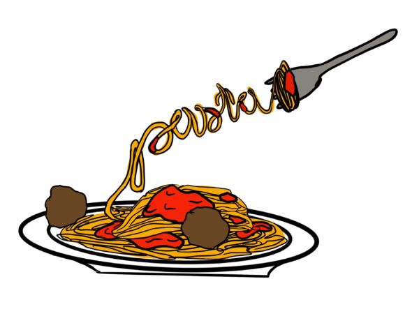

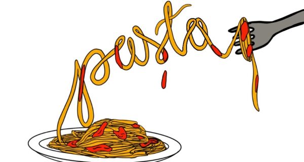

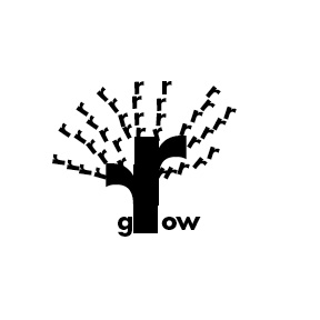
I couldn’t choose between two words but after the drawing I think I’m going to go with pasta


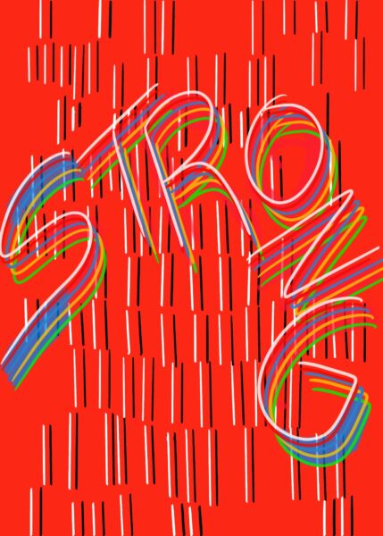
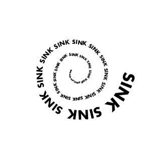
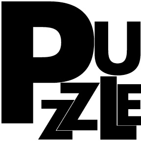
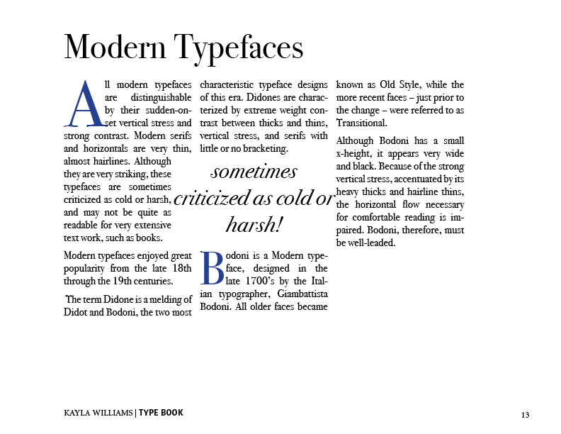
I really enjoy these pages. I like how the words in the first page kinda goes along with the image on that sent at the top. And it just seems like typeface used works so well with the image. For the second one, I enjoy the simplicity of the typeface, how it was sans serif and bolded, yet put onto a full blue background. It’s so simple, yet it makes the page more easier to read and understand.
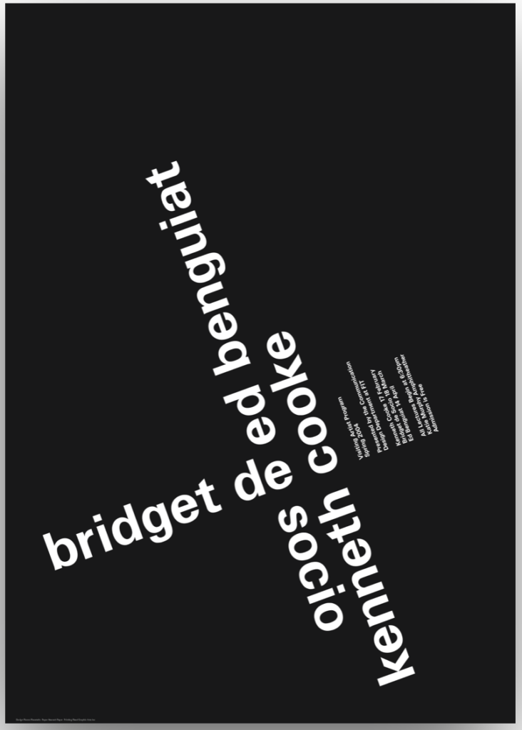
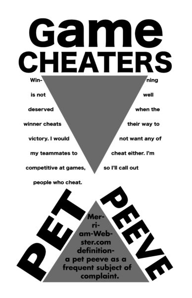
For these posters, I felt the white background one worked best because the information is clear and easy to read. Most of his posters had tiny font sizes, but although the posters were probably big enough to see, the words were diagonal and in weird places. The black background one worked the lest for me because at first glance I don’t really understand the information, you really have to look and read for a bit to see what it’s trying to say.


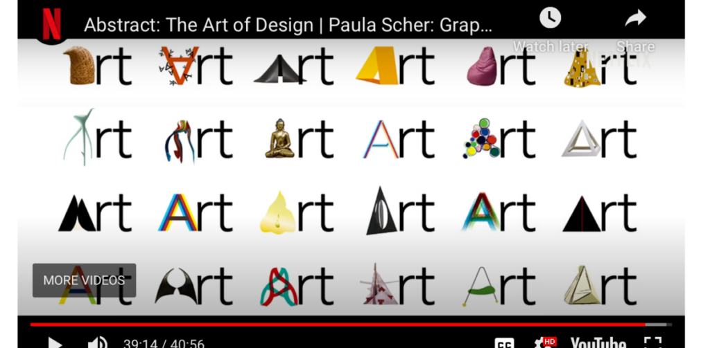
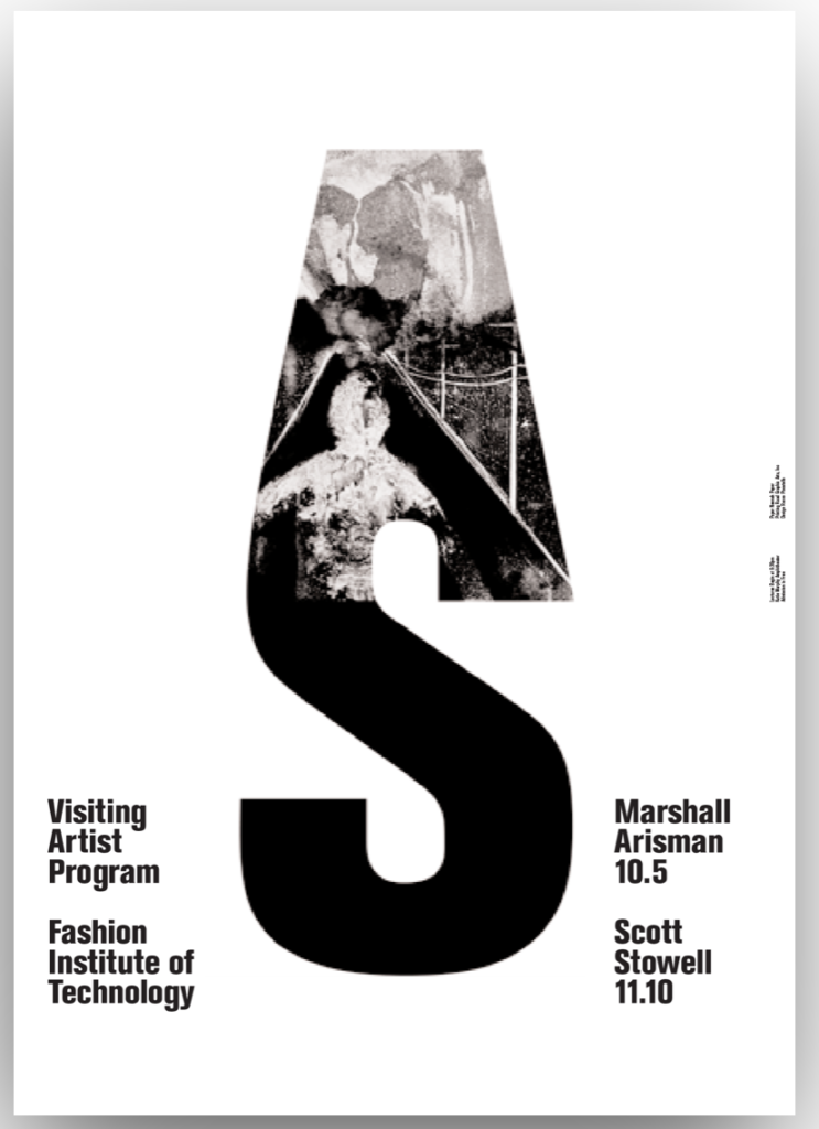
This was Paula’s expressive lettering designs for the Philadelphia Museum of Art. I like how she made the different types of A’s to represent Art. It’s kinda like changing it to a different art piece every time, or different type of Art.


The OpenLab is an open-source, digital platform designed to support teaching and learning at City Tech (New York City College of Technology), and to promote student and faculty engagement in the intellectual and social life of the college community.

