When you begin designing your magazines, you will have to select a font for the body text. There are some things you have to consider:
- You have decide on the appropriate font. Reading it should be easy for your audience. You can choose a sans serif font or one with serifs.
- You have to select the right body text size and leading. The point size of the body text should not be too large or too small. Also keep in mind the leading.
- Selecting the body text alignment will also be important. Using a flush left will will have a more casual appearance. Justified text is more structured and will allow you to fit more text on the page.
Read the following article for details to help with your selection: Setting Body Text for Comfortable Reading
 For our next project, you will design an autobiographical magazine. We will refer to it as the Autobiographical Zine project. You will have to create and print a 12-page zine (not including the cover) about yourself. You will be required to use images and all the typographical implementations that we’ve covered so far. You will even include a table of contents and numbered pages (we will get to this in coming weeks).
A site that will be very helpful to you in the next coming weeks is Magazine Designing. You should bookmark this site because we will be referring to it often. There are plenty of tips and tutorials to help you with your design. I suggest you get started by reading the article Structure of the Magazine.
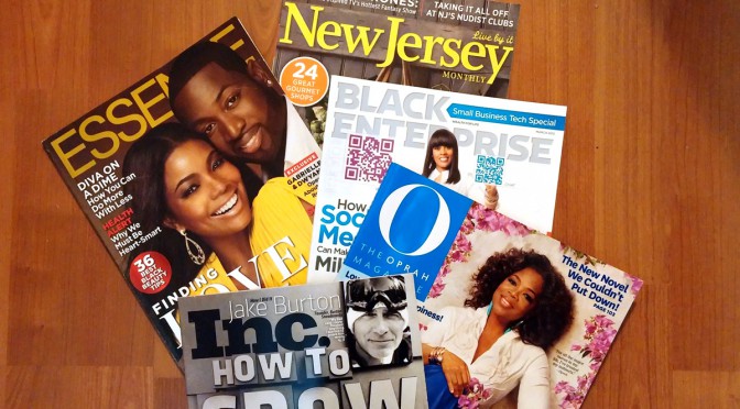
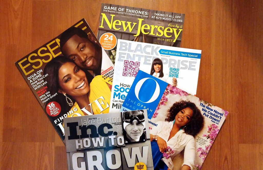
For class on Monday, March 17th bring a copy of 2 different magazines with you to class and we will begin to take a look at the common elements of magazine design.
A City Tech OpenLab Course Site


