
Due for Monday, Feb 24
Homework Reminder for Class on Friday 2/14
Take the best and worst prints of stacked words and write a paragraph (about 5-6 sentences) describing why one works well and why the other doesn’t well in terms of leading. For this exercise, you were to concentrate on getting good leading with your 2 stacked words. On Friday, you will have one last time to complete this printing if you need to try it again.
Joval Davis 1/31/14
Journal #1
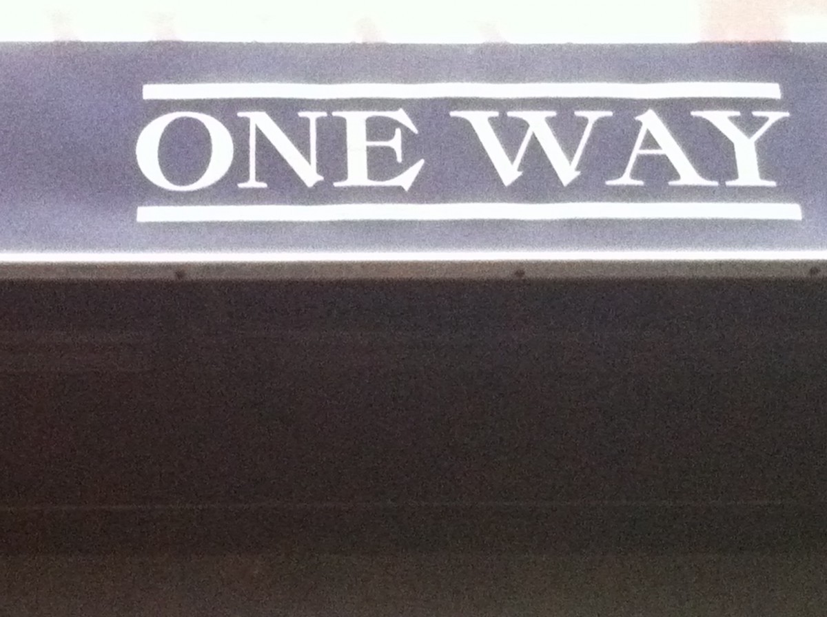
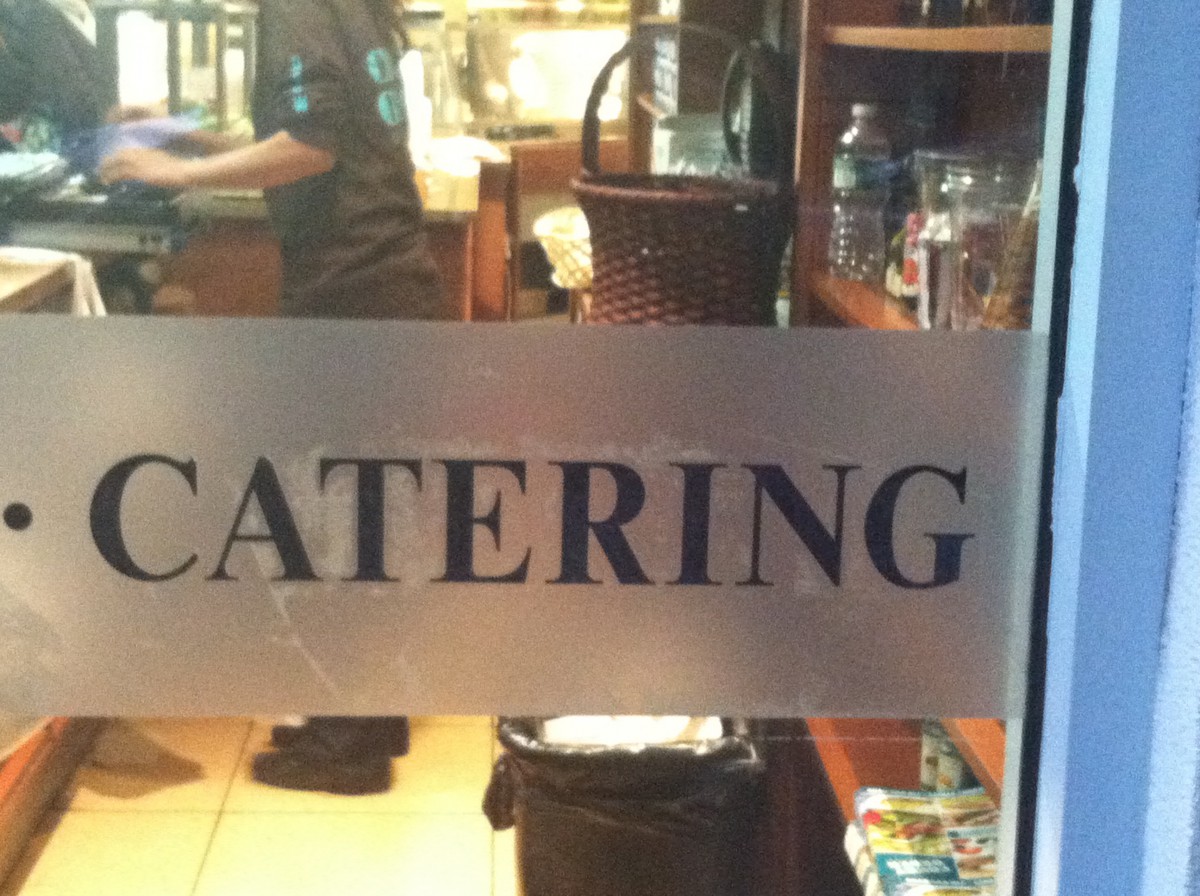
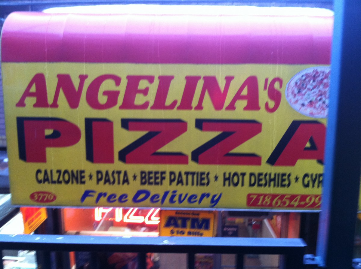
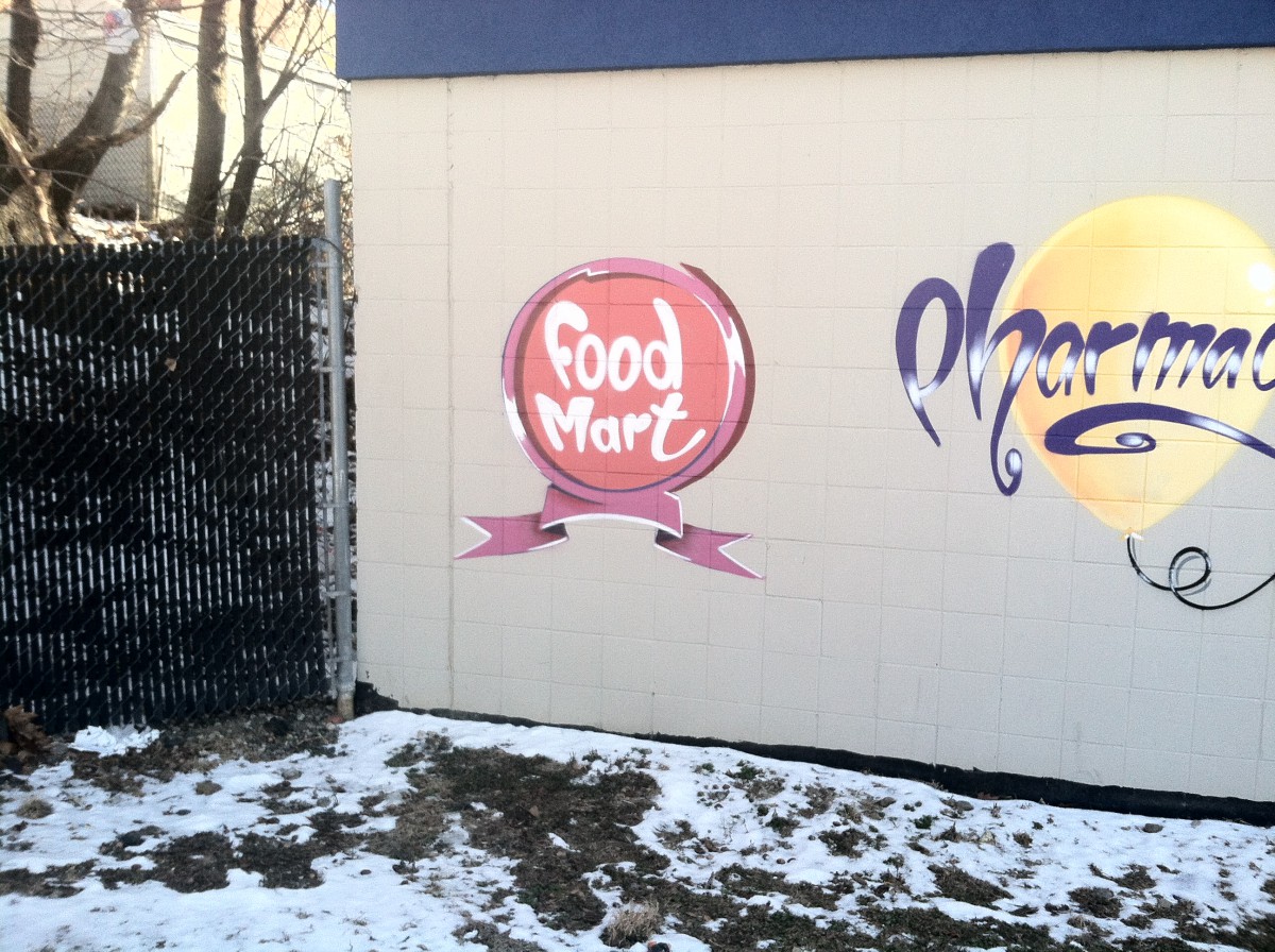
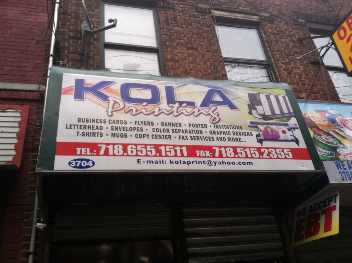
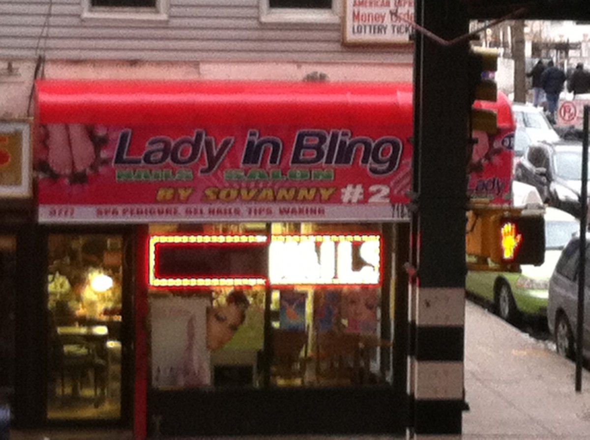
In this world there are all types of typography some that are colorful and unique and that are dull and boring but thought theses types of typography we learn many things about what the typography is trying to say. In my neighborhood I have many examples of typography and it is thought these that I have learned many new things about my neighborhood. One thing is that my neighborhood is very dull do to the fact much of the typography in my neighborhood is not very creative most of it is just bold face word with colors in them and seem to require no thought at all. The second thing that the typography of my neighborhood has told me is that my neighborhood is very simple it is not fancy and simply tells people what they are and what they do I got this from the typography because the type is arranged in a simple manor going from top to bottom and many time attaching picture show have they have. Finally the typography of my neighbor hood tells me its is busy because even thought my neighborhoods typography is not creative it does seem to catch the attention of the person passing by with its bright and dark colors and the shadowing that is used behind each lettering the word and even thought some of them are not very thought out they seem to do there job by attracting the passer by to step into or try what they are doing. I have learned that the typography is my neighborhood could tell me almost anything I wanted to know about my neighborhood and I have taken to heart every lesson I gained even thought my neighborhood is not the best at making typography it is still a great place to live.
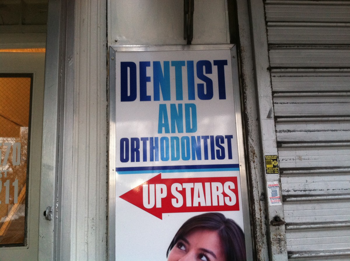
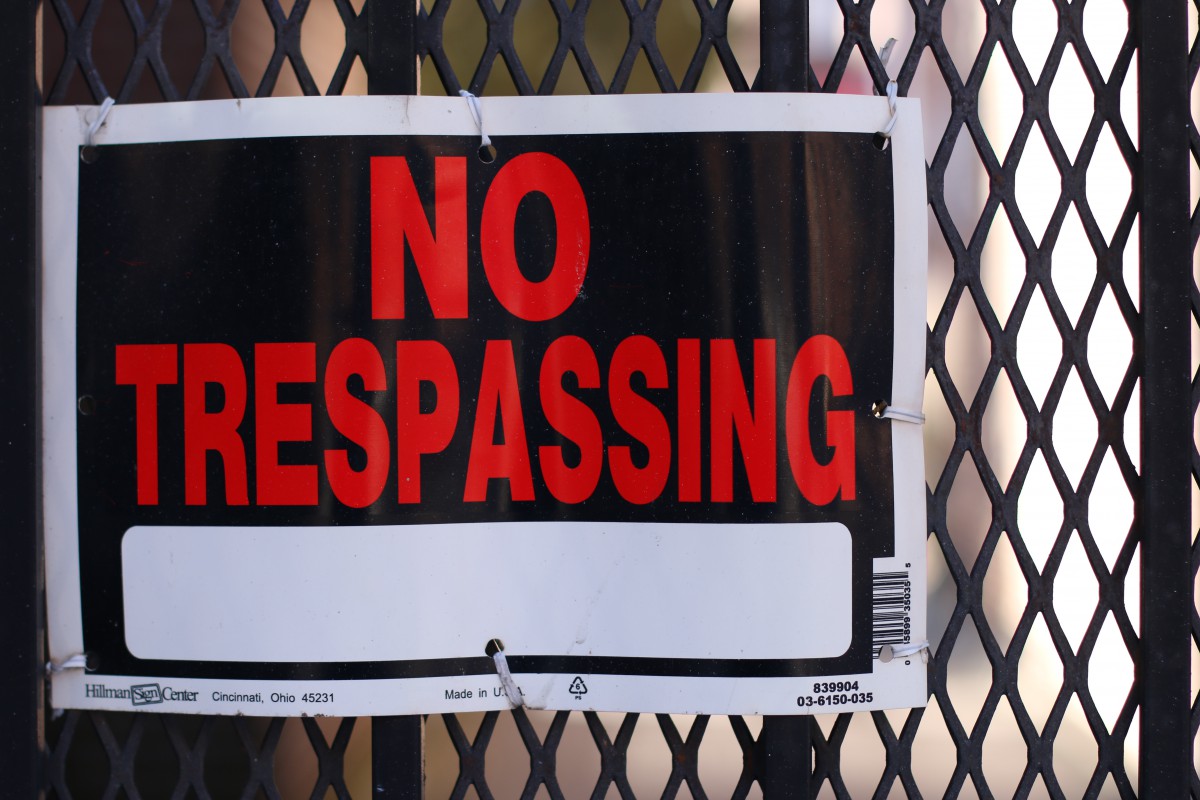
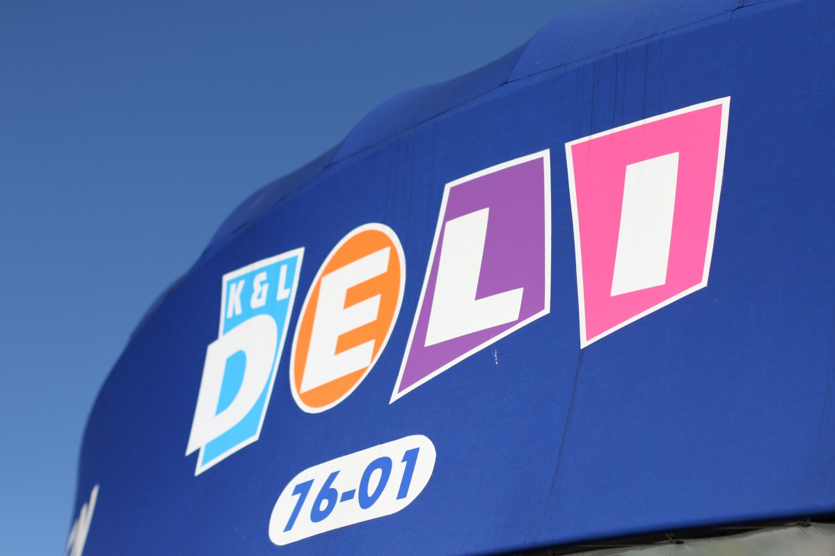

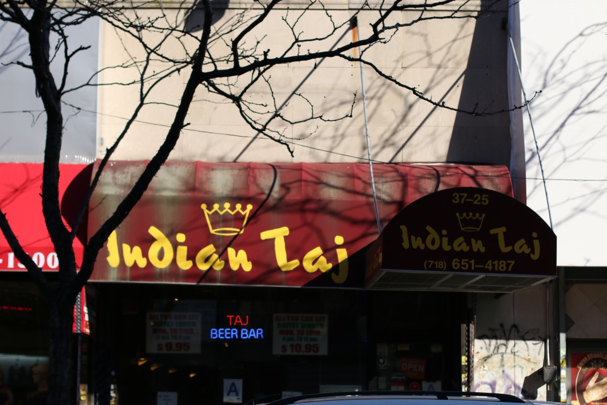
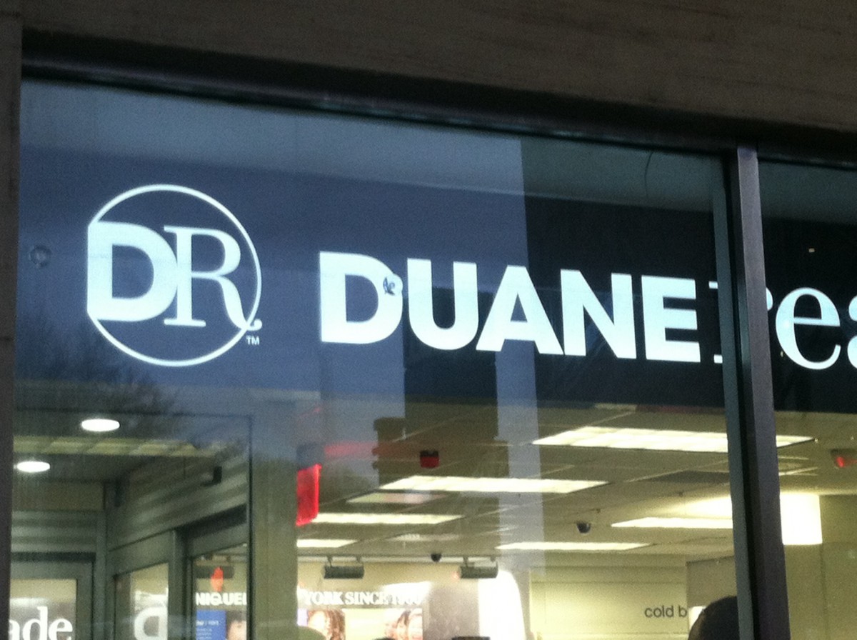
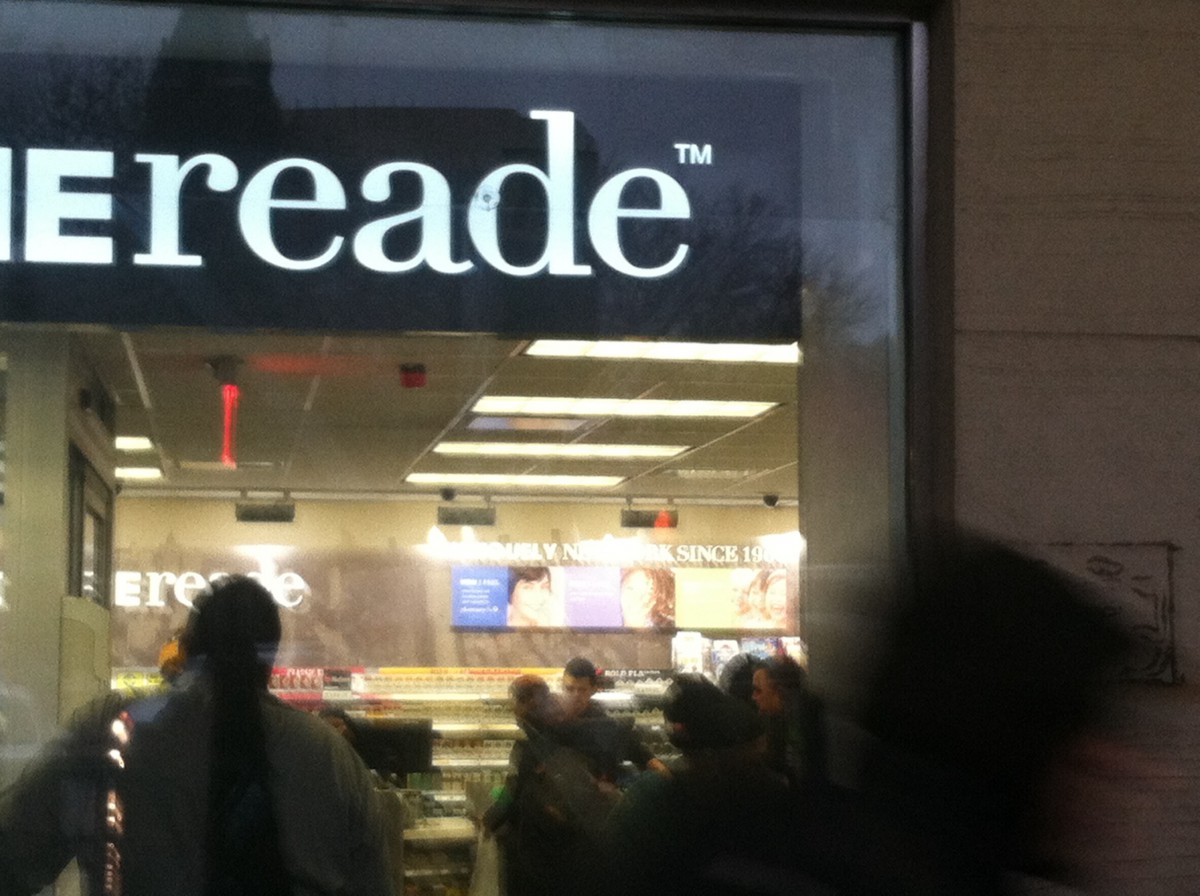
Jackson Heights is a diverse neighborhood in Queens. I could consider Jackson Height a small melting pot of a variety of many different cultures from Eastern Europe to Asia. Typography is everywhere you go walking out to school or work. In Little India, most stores and restaurant has stylized type fonts plastered in front of the door. 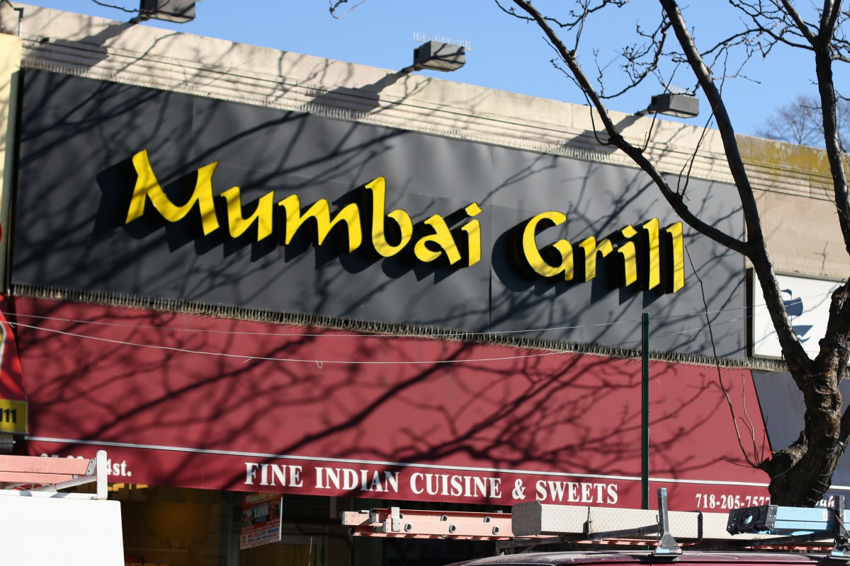 These fonts are stylized where it replicates the Hindi letters while still be able to read in English. My local deli and supermarkets are the most noticeable that stands out from the other nearby businesses because of the use of bright colors and using large bold fonts. Graffiti is fairly uncommon, well at least the part of the neighborhood I’m currently living. There is nothing else much to say about my neighborhood besides being bland and clean on the most part of the neighborhood. Some mom and pop stores I’ve walked by everyday use those generic white fonts found on the computer (eg. Comic Sans, TImes New Roman.). Jackson Heights is not a boring neighborhood to be around, it’s just not the kind of place you find anything artistic or appealing.
The OpenLab is an open-source, digital platform designed to support teaching and learning at City Tech (New York City College of Technology), and to promote student and faculty engagement in the intellectual and social life of the college community.

