This typeface is olds style for many reasons, first of all there are more wedge shaped serifs.Also,they have greater contrast between thick& thin strokes. The last thing I want to mention in this photo is the heavily bracketed or curved serifs
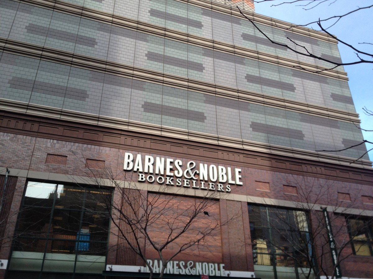
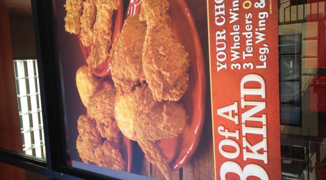
This is a sans serif typeface. I notice how the name is without any serifs.There is low contrast between thin &thick areas. In this photo I see serifs , this shows me it is a Egyptian (slab- serifs).
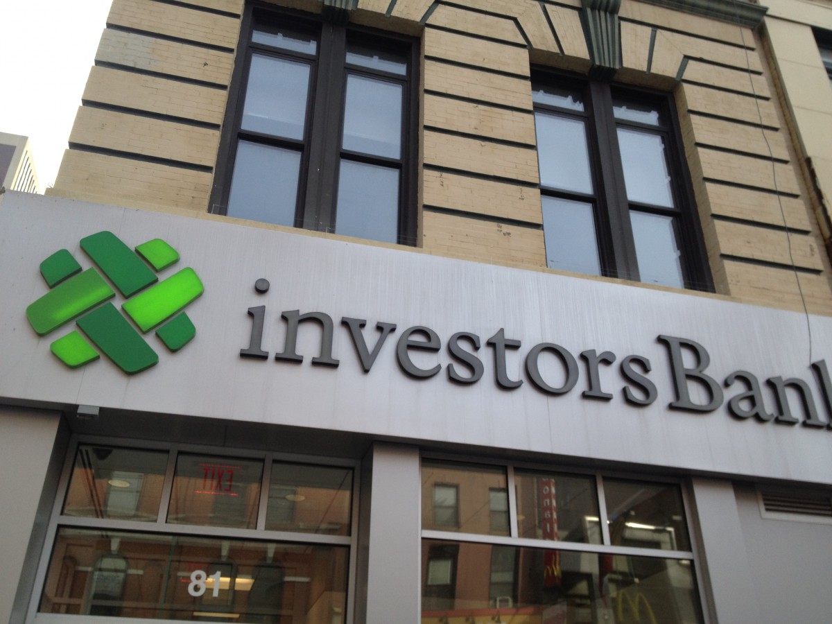
This picture has a Transitional typeface. The contract between thin and thick strokes are increased and the serifs are more sculpted
My neighborhood is in a business area. I took some advertising photos that I see everyday . Each of them has different logo from the others. They were written in different kind of types that shows the purpose they are trying to present. Some letters in the pictures used old style typeface , other advertising uses Egyptian tape face ,and other kind like Modern or Sans Serif.
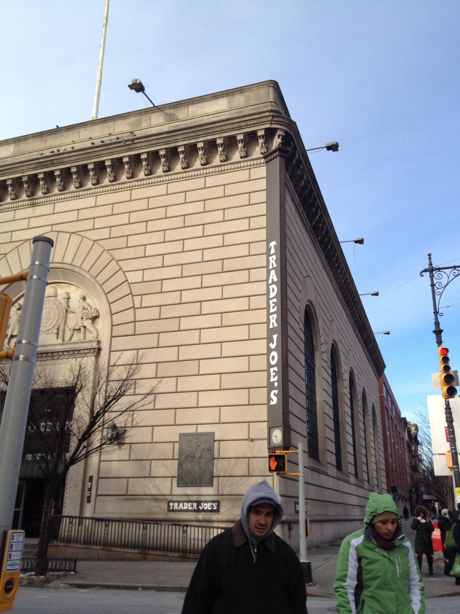

![IMG_2007[1]](https://openlab.citytech.cuny.edu/brownadv1167sp2014/files/2014/02/IMG_20071.jpg) ,
,![IMG_2019[1]](https://openlab.citytech.cuny.edu/brownadv1167sp2014/files/2014/02/IMG_201911.jpg)
![IMG_2015[1]](https://openlab.citytech.cuny.edu/brownadv1167sp2014/files/2014/02/IMG_20151.jpg)

