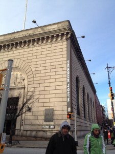
Five Families of type pictures.

It has  wedge sharped serifs,more upright serifs ,and greater contrast between thin&thick stroks
This typeface is olds style for many reasons, first of all  there are more wedge shaped serifs.Also,they have greater contrast between thick& thin strokes. The last thing I want to mention in this photo is the heavily bracketed or curved serifs

IMG_1930

This is a sans serif typeface. I notice how the name is without any serifs.There is low contrast between thin &thick areas. In this photo I see serifs , this shows me it is a Egyptian (slab- serifs).IMG_1934

This picture has a Transitional typeface.  The contract between thin and thick strokes are increased and the serifs are more sculpted

Leave a Reply

Your email address will not be published. Required fields are marked *