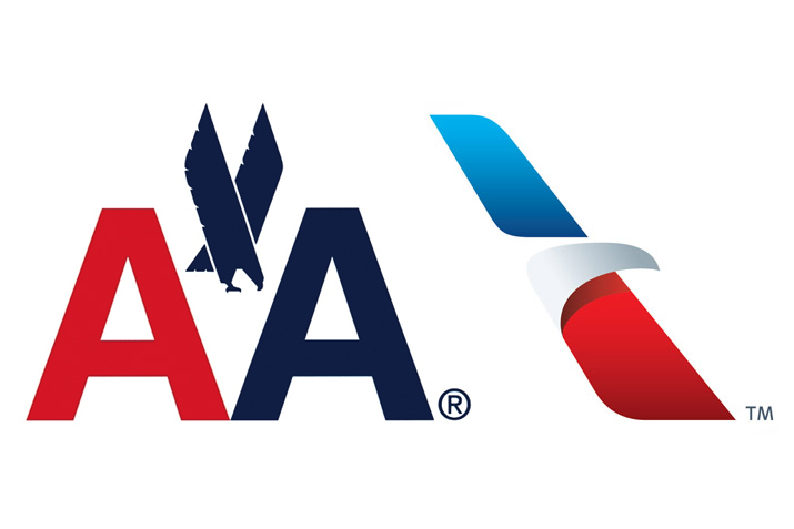
Old-New Photo Courtesy of DesignShack
http://designshack.net/wp-content/uploads/amairlines-0.jpg
Its safe to say the world is different from what it was 50 or so years ago. A computer around that time, was the size of an airplane. Radio and television commercials for products ran 1 minute 45 seconds. Now everyone has a computer on their person and the average advertising slot is 30 seconds unless its for a new experimental miracle drug in which near death side effects outweigh the benefits. Another thing that has changed, is the branding and rebranding with old and new companies. Let’s remember that the brand or appearance of a product is as important as the product itself. Where does a long running aerial human transport company such as American Airlines fit in here?
The recently changed logo from American Airlines dates back to 1968. The human existence is in constant evolution. Some companies notice this and translate that truth into an homage to the people in form of a complimenting revamp in consumer goods. The original eagle graphic accompanying the company’s initial has been switched for a 3 dimensional eagle beak integrated with wings that emulate the wings of a plane. We have a uniformed “outside the box” view of things nowadays where we can see whats not there and all agree.
This change like this could be risky, and expensive but this is an example of technological advancements and changes calling for restyling. The new fleet is made of a material that wouldn’t mesh well with silver. I’m sure the engineers and designers had a field day with this. Most major brands change their look every 10 years or so and still manage to thrive. I don’t see a change like this hurting the American Airlines brand. If anything, it will succeed to express the ever changing state of America and the rest of the world that it helps us to see.

