Who said illustration was a lost art?
Society Of Illustrators
I thought my field trip days were behind me. Fortunately, I was wrong. Shortly after drawing class, a rendezvous had been set up at the Society of Illustrators. At first, i thought it would be a guided tour but to my surprise and relief, a perouse was set out. Welcomed with open space, the walls displayed different types of paintings and illustrations.
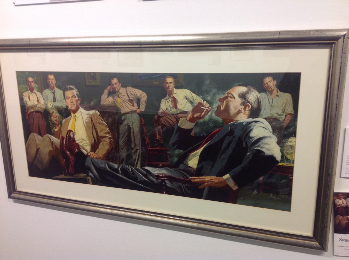
The first thing I noticed walking into this gallery was an illustration, which was donated by the artist Earl Mayan that put me in a noir-like trance . It’s called, “Sunset Kid” I’m in a room full of suits making chatter while choking on secondhand smoke. A varnished tempera on Whatman board was Earl’s approach for what was to be piece for the Saturday Evening Post, 1952. I like the balance of intense coolness in this picture. The story to accompany this is “Swindler’s Luck” by Ben Hecht. Despite the heated smug look on the gentlemen to the rights’ face, cool colors steal the show. What I find powerful about this illustration is the light bouncing of the leather shoes (you know they’re leather) and the smoke throughout the room. Smoke in sight has a shelf life. That much visible smoke in a drawn room would make even the viewer choke. It sure made me gag a little.
A few steps into the corner of the gallery I found myself at the feet of a priest in red going for his crotch. Tim O’Brien drew this cover illustration for Der Spiegel back in 2010. The robe color is perfect. There’s nothing hotter than red and to call this cover heated, would be an understatement to describe the subject matter revolving around the title of this piece. The article was called, “The Hypocrites: The Catholic Church and Sex”. This oil painted masterpiece was dressed upon a gessoed board. It was also donated by the artist himself.
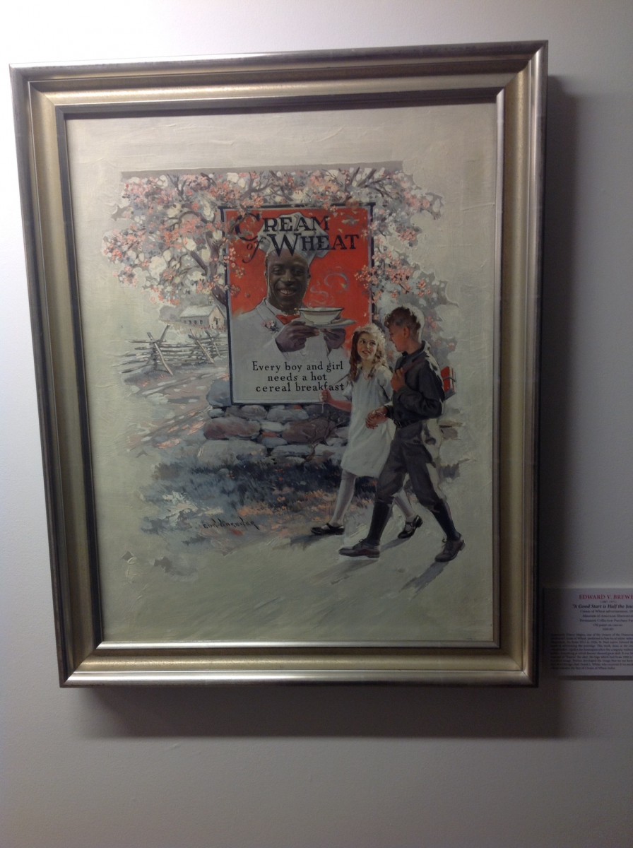
A classic oil on canvas composition was the medium for many ads but this one especially hits home. Entitled, “A Good Start is Half the Journey”, we’re presented with a Cream of Wheat farina advertisement. I loved this piece because I ate farina the same morning of the day I saw this. A timeless inexpensive product that helps jump start your day with wheat filled hotness. My brothers and I use to call it, “breakfast for the soul”. Usually, people go up in arms when they learn of historical compensation. In this case, a $5 payday for a photo op for hot cereal in the ’30s wasn’t so bad. I find this advertisement to be rich in design as well as color. You (the viewer) are suppose to shiver when looking upon the 2 children walking through the cold. I did and the colors in the box containing the the face of Chicago chef Frank White center the warmth with minimal effort. I personally feel like they may have added some weight on the chef to give off that feeling on satisfied appetite. Edward V. Brewer drew this up in 1926 after Emery Mapes suggested the idea. Mapes worked for the company responsible for producing the farina. None the less, Emery conceptualized the ad while Edward doodled away. As a guy who loves his farina, this Illustration takes the number 2 spot in this lineup. A victory by gracious familiarity. Commerce is up but illustrations are at an all time low these days.

-Sewell

