-
Recent Posts
Recent Comments
- Ariel Nunez on Ariel-Nunez_Final Project
- Andrea J Johnson on Post_3_Jose Campoverde
- Andrea J Johnson on POST 3-ARIEL_NUNEZ
- Andrea J Johnson on POST 8-DISPLAY-ARIEL_NUNEZ
- Vali on FINAL_POST_VALI_CHOIBEKOV_EDITED
Archives
Categories
- People (292)
- Annella Hollsborough (13)
- Anthony Clemente (21)
- Ariel Nunez (6)
- Brayan Roman (16)
- Cindy Alonzo (22)
- David Wu (19)
- Haimonti Paul (19)
- Harold Morales (19)
- Jose Campoverde (19)
- Jose Mego (18)
- Kadeen Daniel (18)
- Luisa Diaz (17)
- Nita Velasquez (19)
- Sandesh Pawaroo (16)
- Sung Jin Park (15)
- Vali Choibekov (16)
- Vicente Gorgonio (19)
- Posts – Project 1 (106)
- Posts – Project 2 (174)
- Post 10_ADA Bathroom (15)
- Post 11_Reflected Ceiling Plans (13)
- Post 12_Final Presentation Project 2 (13)
- Post 1_Branding (15)
- Post 2_Store Concept & Logo (15)
- Post 3_Concept Model and Drawings (17)
- Post 4_Site Zoning Study (15)
- Post 5_Site Analysis and Interaction (14)
- Post 6_Program & Layout (15)
- Post 7_Plans/Sections/Elevations (15)
- Post 8_Display (16)
- Post 9_Materials (9)
- Uncategorized (30)
- People (292)
Meta
Post_3_Jose Campoverde
This entry was posted in Jose Campoverde, Post 3_Concept Model and Drawings. Bookmark the permalink.


Jose,
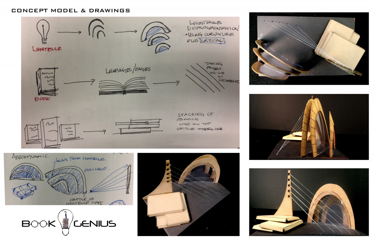
Great work, this is a really vibrant presentation of your concept model. I like how you’ve taken the book and used it in two different ways, as a whole object, stacked, and then as opened and abstracting the pages as segments/lines. I think you can also think of the light bulb in multiple ways, and beyond it’s formal/material aspects. The other aspect to think about, is how do the parts of the model you’ve built for the book and light bulb relate? Move full steam ahead in starting to incorporate your ideas from this into your store design and display design, and we’ll talk more at your next desk crit.