During my third and final shoot, everything went well. I had my models arrive on time, the set up was great and i already had poses ready for them to do to speed up my production. I had to rush and shoot 4 models though because of lack of time but overall i think i did well in executing the photo shoot. Last thing i needed to do now was work on the photoshop aspect of my project
Author Archives: Khyriel Palmer
Final Project Day 2
During the second shoot, I had help with the lighting and my models. Unfortunately, I forgot to take my images with me so I didn’t have anything to post for day 2. With that being said, I still feel as if i had a successful outcome even though i had to re-shoot the following week.
Final Project Day 1
Everything as set up perfectly when it was my turn to shoot with the first model. The second model lighting wasn’t as good. So next week i would work on that more. Lastly I plan on shooting Barrington and another outside model as more characters
Final Project Khyriel Palmer
Topic: My final project would be based on photo manipulation. From my knowledge, there aren’t many african american superheroes in the comic book world. I plan on using african american models portraying known superheroes from the X-men universe. So this could be a mixture of a public service announcement and a narrative.
Subject Matter: I plan on using Matthew as Night crawler, Barrington as Collsus, Mikhail as Cyclops and Rodney and Agotha (both outside models) as Gambit and Jubilie. Each of them would be posing in a way that would help showcase their powers to help viewers understand who they are with a quick glance.
Style: I’m not quite sure what kind of style I plan on using but my shots will be bust length.
Lighting: The lighting will vary depending on the character.
Props: For Nightcrwaler, there wouldnt be any props. Jubilie the props would be glasses bubblegum and gloves. Cyclops would just be shades, and gambit would be cards. Everyone clothes would be a modern version of the character.
Khyriel Palmer_Reading Response 5
In the poem “she being Brand” by e.e. cummings, he describes driving this new car as if he was having sex for the first time. Explaining how lost and confused he was because he was a new driver. You notice that when he states, “I went right to it flooded-the-carburetor cranked her up, slipped the clutch (and then somehow got into reverse she kicked what the hell) next minute i was back in the neutral tried and slo-wly; bare,ly nudg. ing.” But in the end he got the hang of it all and you can tell he is eager to go for another drive.
In the poem “Coming Home, Detroit, 1968” by Phillip Levine, he describes driving a car through his hometown Detroit during a racial riot. The tone from it is serious and you notice that when he states, “The charred faces, the eyes boarded up, the rubble of innards, the cry of wet smoke hanging in your throat, the twisted river stopped at the color of iron.”
Cummings has a unique format when he wrote his poem while Levine has a normal format for his poem. Cummings was more sexual while Levine has a more serious tone throughout his poem.
Khyriel Palmer_Susan Sontag and Plato’s Cave
After watching Plato’s Cave, I felt that its meaning was to show people that photography could help show you a world that you may never experience. So you can always make up your own assumption. But you wont know how it will be until you experience it for yourself.
In Susan Sontag’s, she uses the metaphor of Plato’s cave to describe the role of photography in contemporary life by explaining how there are so many images out there that photography has grown to the point where there are rules and guidelines to it. There are so many categories out there that it is to the point where almost every picture taken is unique. Also she states that thanks to pictures, we have a slight understanding of the things that we never ventured off to experience. Such as going to Japan, many of us never have been there but thanks to the photographs taken, we have an understanding of how it would be to travel there. But you still wont know the full experience until you do so.
Khyriel Palmer_Differentiation
She is arguing about the fact that when ever you see a Chanel perfume ad (or any perfume ad for that matter) is always displaying a feminine figure. Like those who would be in a dress or classy famous person. Simply letting the fan base of the model help sale the product. Her argument is that not every ad has to be feminine, just cause its geared towards women doesn’t mean that it has to be classy. For example, “its position in a system of signs where it signifies flawless French beauty, which makes it useful as a piece of linguistic currency o sell Chanel.” The other ad has another famous person in a karate uniform showcasing a similar product. They used this technique to appeal to the more typical feminine style connected with modeling.
I agree with her argument because i believe that you cant just use one based standard way or selling/ advertising a product. Granted those ways may work most of the time, but to fully grasp the attention of every consumer, you sometimes need to think outside of the box.
Khyriel Palmer: Advertising Campaign Analysis
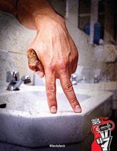
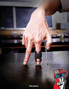
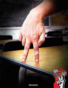
Phillip Roston did a campaign on Tech Deck the finger skateboards using hands in a standing position with very few props. I feel like the message in this campaign is that playing with Tech Decks aren’t just for kids. Its a serious toy for people of any age. Just like how anyone can skateboard if they want. This ad campaign is trying to sell a lifestyle that you can take anywhere sine skateboards cant be used in anywhere but the streets and skate parks. They are not limiting the product to just any specific age rang either. Whoever has a passion for it is welcomed. As someone who enjoys the sport, I’m sure i would actually buy the product because it is speaking to my demographic. All three of these images are at eye level with the viewer. Each photograph was taken with direct lighting with a very faint shallow space. The High contrast in these images helps display that this is a toy based upon a serious lifestyle of dedication to get better. It is also has a soft focus with an emphasized texture that looks similar to the marks on a used skateboard that grinds often. These images also feel balanced equally, none of them feel heavier than the other. I believe that these images are mirrors. They display trial and error of skateboarding as well as the image people depict about it. You can notice that from the bandage on the finger that is standing on the desk. Then there is a finger which has a brace on it. Which it probably got from landing a trick the wrong way. And lastly the one is different from those two because it just has a tattoo. It could be a symbol meaning that they endure pain which is true. Overall this piece is a mirror because the hands represent people who love skateboarding. I’m pretty sure if you ever tried skateboarding you would be able to relate to this campaign.
Mirror & Windows_Khyriel Palmer
I believe that Szarkowski’s Mirrors and Windows thesis is based on comparing your life to someone else’s. The mirror is just a reflection of who you are and or who you are trying to become. It’s like an inside view on the way that you view the world. I also see it as being a creative individual. Windows are the opposite, it displays the way that the world sees you. Broadcasting what is the norm. Showing what is expected based on what we have come to accept in society today.
In the Crewdson image, i see this one as a mirror, because its something that you don’t see very often. The mother is proof of that because she in a state of either shock or disgust thanks to the grocery bag on the floor next to her. This image has a High Contrast thanks to it being taken at night time. Its sharp overall with very light depth of field. It is has a heavier balance than the other photo thanks to the suburban background. The subject is also side lit from the way the car lights and the street light shine on her.
In Winogrand image, i see this as a window because this is what most people except to see in a normal middle class family. Nothing here is out of the ordinary its basic in a way. This photo has full scale tone and contrast in the background and also in the garage. It is also soft focus because the whole image isn’t sharp. The child has direct light shining on her thats why she pops out of the garage while the boy in the back has directional diffused light on him.


