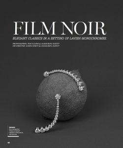
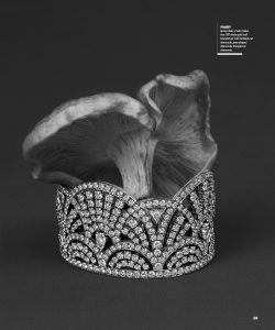
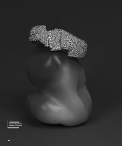
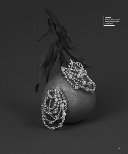
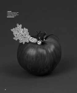
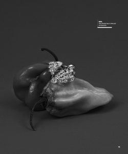
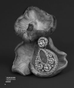
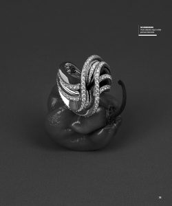
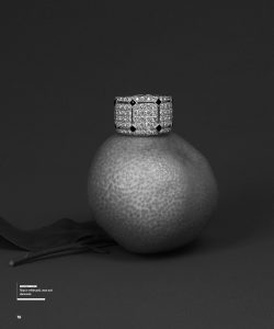
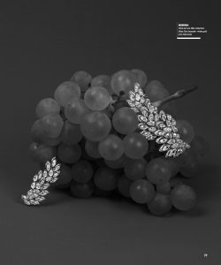
This week I designed the jewelry pages “FILM NOIR” from the top luxury jewelry companies. I enjoyed designing these pages, because I like black & white pictures, they are very stylish. I decided to use white text, it creates a nice contrast and makes the text stand out more.
Mr. Greg Concha (my supervisor) told me to make sure pictures work together. For few hours I was changing/switching them around until I liked the placement. When I gave it to Greg , he accepted it as it is (see pictures below),. The best part was I didn’t have to change anything this time, it means a lot to me!
Right now I can design much faster than in the beginning. Slowly I see some improvements which make me happy and want me to work even harder.
