
Museum Of The City Of New York is a history and art museum in NYC. It is very nicely designed from the entrance to the stairwells. The entire museum is using typography everywhere, most of it is San Serif.
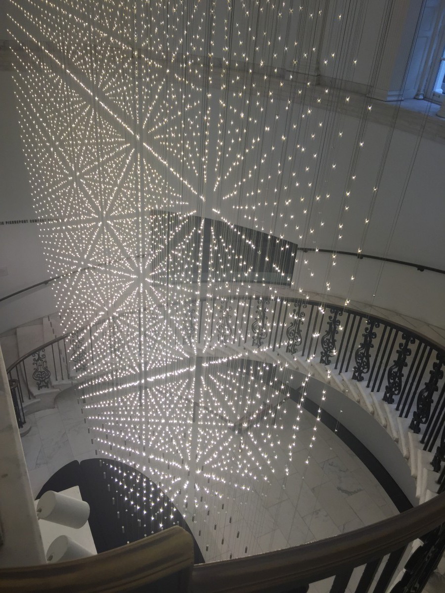 On the first floor there is a huge centerpiece of led light installation “Starlight” that catches the visitors’ eyes in the central lobby. It is a three-dimensional pattern that changes from a different perspective views. The installation was made to excite the visitors by walking upstairs and simultaneously watch the change of the light sculpture. It changes from simple dot lights into the star shapes.
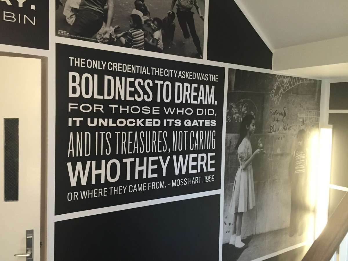 The stairwell is one of my favorite places. I really like the quotations and historical photographs, they work very well together. The quotations are nicely designed to fill the entire space. In simple words it is just a tower that has interior of words and images. The typeface is Titling Gothic, it appears in many different weights but it is always all caps and justified. The black and white color design gives a nice sense of original New York.
 This is another my favorite “EYE-BEE-M” designed by Paul Rand for IBM (International Business Machines) in 1981. This is not the official logo. This poster shows illustrations of eye, bee and m. It’s know as a rebus that uses pictures to represents the letters. Paul Rand is one of the most famous graphic designers. He created the original logo for IBM. In this poster only the letter M remains from the original logo. It has Serif typeface and the letter is broken down in 8 line. I really like how the eye, bee and m work together. Firstly, I like it because of the color, how eye and bee have the similar color tones in common and how the bee and M have horizontal black lines. Secondly, I like it because of the sizes, they all are aligned to each other. In general this creates very nice and very strong design!

