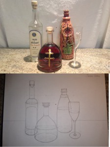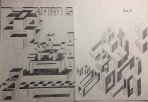
Drawing of three bottles using 2-point perspective. (Spring/2014)  Complex parallel design boxes in 3D (Spring/2014)
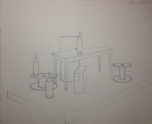
 2-point perspective drawing of a complex objects (Spring/2014)
My reflection:
1) This drawing of three bottles and one glass was difficult for me because it requires good perspective. It was also difficult to find the right proportions of these objects and the relative angles. I chose to draw a group of bottles and glass with different highs and widths. Finding the eye level was also an obstacle for me, only practicing and will to draw helped me to overcome it. I drew the eye level below the two bottles. Once I got the idea, drawing became easier. I used the knowledge I got in class to make my drawing more realistic by using ellipses symmetrically and round at the ends. Also a challenging part was to draw the bottoms, I had to make them as round as I could.
In my opinion I got successes in observation, making the right proportions, etc… The good thing is to keep in mind all the rules, when your eye is uncertain.
2) This was one of my favorite drawings because I had to use my own imagination, which I like the most. In these drawings, I created a complex design of boxes, building-like forms, and many other forms that can be created with this parallel system. I had to be creative to make the design good. I sought to make them look good to they eye, and played with sizes and shapes variation to make them 3-dimensional.
Once I understood the idea of these drawings, I didn’t feel any challenges and I got successes in them.
3) This drawing was challenging for me because I had to find the correct location and sizes of the objects. These complex objects are composed of numerous geometric forms. And also I had to retain all guidelines and invisibles, and work on the placement on the page for strong composition. To do it, I made a window with my hands to figure out the best sizes and positions for the objects so the whole page would be used. For clarity, I used light lines for guidelines, light dotted lines for invisible edges, and hard lines for the visible details.


