Hello everyone and welcome to my ePortfolio!
My name is Yara Govorova! On this site I post my works that are done in my courses at City Tech !!!Learning Blog Archives
-
Recent Posts
February 2025 M T W T F S S 1 2 3 4 5 6 7 8 9 10 11 12 13 14 15 16 17 18 19 20 21 22 23 24 25 26 27 28 Categories
Typography is Everywhere!
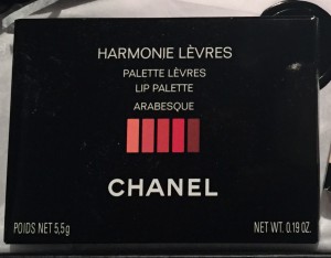
The picture #1 shows an example of Sans Serif typeface. This typeface is one that does not have the small projecting features called serifs at the end of letters. Sans-serif fonts became the most prevalent for display of text on computer screens.
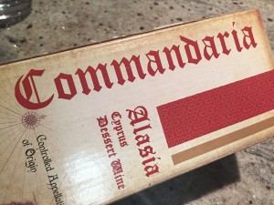
The picture #2 shows an example of Blackletter. Also known as Gothic typeface. This typeface sometimes called Old English.
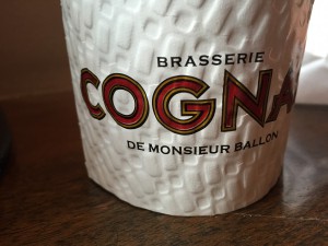
The picture #3 shows an example of San Serif where it says COGNA and the other types have round serifs, they are small decorative pieces on the ends of each character.
Posted in Coursework
Leave a comment
ADV1100, FALL 2014
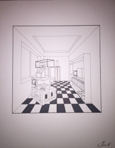
1) This project was very challenging because it required proper perspective technique to illustrate a three- dimensional space on a flat surface. In addition the perspective required, and used, was a mix of one- point and of two- point perspective. The room, window, and bookshelf have a single vanishing point, but the object in the middle has 2 vanishing points.
I enjoyed doing this challenging project because it helped me improve my ability to draw with relatively complex perspectives.
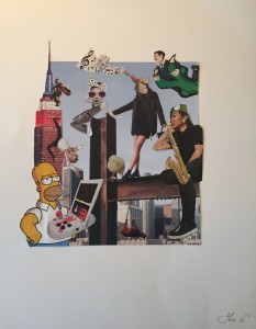
2) This collage project wasn’t challenging at all; however it was very interesting and exiting because I had to use my imagination for the idea of composition. I used a lot images from different magazines that I liked for my collage.
3) This is my favorite project because I had to draw the same image three ways: realistic, abstract or logo-like. It was my first time drawing a realistic animal, so it took some time to make it look good. I concentrated more on shading for better effect and I also tried new techniques for me (how to draw the animal’s hair).
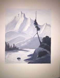
4) This project was challenging because it was hard to mix and to find the right color of paint. To create this landscape I had to use variation of colors in order to create the illusion of depth, for example mountains that are located in the back and the tree that is in the front.
I’m happy with my painting because I got the results I wanted!
Posted in Coursework
Leave a comment
