https://docs.google.com/presentation/d/1lfQpZV42ZfcmbcAAfAdB8AHiYd8U1hsHwIuvnqrlE1E/edit#slide=id.p
Author Archives: ssyan07
Ethics Response: AIGA and Shepard Fairey
After reading the AIGA Design and Business Ethics Handbook, I have realized that business ethics and integrity are the primary keys to success. Business ethics is not just a concept or theme that should be limited to the boundaries of a company. Besides, it is based on the spirit of respect for clients, designers, audiences, and even surrounding.
In the chapter of the client guide to design, which emphasizes that seekers need to understand the situation with the company if they want to join before hiring in order to provide the best design to the company. Before I applied for the job in one of the offices for Institutional Effectiveness at Brooklyn College, I did research and got the information on their website to understand their culture and branding. I think that might be a comfort zone for me because of a position that is related to the creative field. While I join their team, I have learned the office’s design direction, the designs they may like, and culture which helps me to struggle out more ideas for this company. In this process, we need to be informed of the client’s demands that are conducive to gain recognition from clients. In addition, the guide also mentions that the design brief plays an important role for designers because of the clarity it provides designers to understand more about the client’s goals and objectives for the project. During the work, my supervisor will clearly explain the demands of clients which improve the efficiency of collaboration between the two parties.
Copyrightable is an important part of intellectual property, and it is an indispensable legal system in the development of modern society. Anyone who infringes upon that right must be legally responsible for this behavior. As a designer, if you are representing a corporation or institution, this behavior which the corporation involved suffers to its reputation. As I am working at Brooklyn College, I will search for other designer’s work which explores my brainstorm to develop my work instead of stealing other designer’s design ideas because this is the most common respect for the designers and their works. The AIGA Design and Business Ethics Handbook that makes me learn a lot after I read.
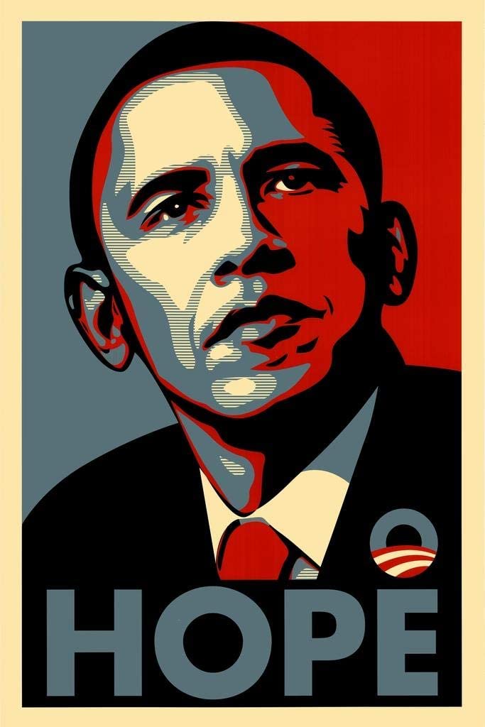
Barack Obama was officially announced as the new president of the United States on January 20, 2009. The most impressive poster at that time was the work “HOPE” by street artist Shepard Fairey. He reinterpreted the portrait of Obama in Pop style, with the word “hope” written below. He used Photoshop and Illustrator to make significant revisions of this photography, and finally created the hope poster. This work became the most important propaganda tool in this election. However, commentators began to speculate on the source of photos used by Fairey as a reference. In fact, the source of the photographs was taken by Garcia at the Darfur event and he transmitted to “The Associated Press” (AP). Later, the AP contacted Fairey ’s office and demanded. After reading this article, I have learned that copyrightable strengthens the protection of the owner and clarifies the relationship between the designer and the user. In particular, copyrightable is to protect the legal rights of copyright owners when these works are infringed. As I am working at Brooklyn College, the awareness of copyright has gradually increased. When we participate in a design project, our work, and ethics do not allow us to steal other people’s designs, which is illegal and influences careers in the future.
Twelfth Journal: Mentor
My supervisor Isana Leshchinskaya is my mentor and she helps me and other interns complete each project as much as possible. Every project we completed, she carefully checked it and told us where it should be fixed and gave her suggestions. After we fixed, she still checked it to make sure everything was perfect, and then sent it to our director. We all have to stay at home to continue our internship, she emails the assignments on time every Monday and Thursday amidst COVID-19 that make sure we keep the pathway of the intern. We text Isana when we have some questions about the project, and she responds to us as soon as possible. Almost at the end of the semester, she requires us to do the PowerPoint and present at the meeting which helps us practice for presentation and have time to prepare. I am very happy to meet her and become my mentor in the internship.
Eleventh Journal: Self Evaluate
As I am working at IE Office Brooklyn College which is a nice experience for me and I am thankful for this opportunity. Since I started working here on the first day, every project and challenge that taught me a lot. In addition, I am aware that communicating with team members is the most important part because we can share ideas and thoughts with each other that makes me find the path where I am.
Personally, I felt I have done all my best in each project. Also, I found that this experience has changed me in many ways because some skills in adobe illustrator I never used before like a splash ink tool, and I tried to view different videos and learned how to achieve this effect that develop my project. When I see the clients feel happy with the designs that push me hard working. In addition, working with others makes me find my way and improves my conversation skills as well as. I have benefited a lot from this opportunity and thankful that I have a chance to join their team.
Tenth Journal: Collaborative Project
We had a short meeting last Tuesday, and know that next week we start working with Angelica. At the meeting, Isana asked us what version we have for Indesign because Anglice doesn’t have the latest version. Therefore, Fengyi borrowed her Adobe account to Angelica that downloaded the latest version of Indesign. For this project, we should recreate the survey handbook. Angelica has to rewrite the contents of the handbook. FengYi and I did the little figures and icons last week. For now, we are working on developing all of the other figures in the handbook like charts, graphs, and questionnaires. In addition, Isana is going offline today after 12 pm for the rest of the week, thus, we should keep in touch with Angelica by self. After, Angelica emails us Brooklyn College have their own guideline of what their Brand publications entail, and mentions that she doesn’t have anyone of those for Brooklyn College fonts and she tried to find either a fitting replacement or any of these actual fonts and download it. I sent a link to her and let her know how to find those fonts and activities, so she doesn’t need to spend much time finding those fonts.
On Thursday, we keep working with a survey book, Fengyi and I are trying to make the same layout they did before for the book because Isana told us that the layout was mostly the same. The original file we received was a pdf file that cannot be converted into an InDesign file, therefore the text cannot edit. So we should step by step to recreate each text box that can be edited. Finally, we completed the first draft of a survey book. From this project, I have learned that teamwork would be the best solution when we struggle out with something.
Blue Exhibition at Nassau County Museum of Art
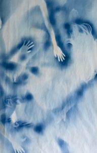
The painting below from the Nassau Museum of Art’s Virtual Exhibit “Blue” caught my attention was HanQin’s work which is called “Ethereal Evolution 1”. I think that would be a nice work because she uses cyanotype enough in a fascinating way. As you can see, the outline of the hands and silky hair is sharply described, while the shape of the body seems like snow was melting. Also, the hand in the middle, which is mostly highlighted with cyanotype that is in sharp contrast with the other hands in the painting. I think that this is the key to the work’s attraction and which makes me feel like I am one of the people dancing in this painting.
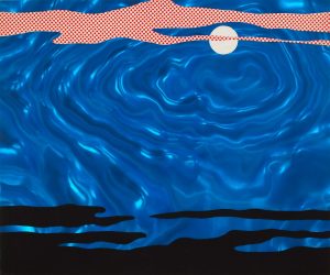
Another piece of artwork also from Exhibit “Bule”, the style of painting was totally different. Roy Lichtenstein is one of the foremost pop artists and he brings his works to display in the Nassau County Museum of Art. This piece of painting is part of the “Roy Lichtenstein: Between Sea and Sky”, it captures the shade of sky and sea and mainly uses blue color as a primary color. The shade of the surface of the sea rippled gently which seems like the feeling in your heart. And the soul of this painting was the wave in front of the moon, and he uses the dots as elements that stand out in his style of painting. See the image below.
The Huxley Guida to Switzerland, which was created by Christopher Winter, I think that would be a nice piece too. The artist uses different colors of blue that make the image a nice match. The position of the two persons with close eyes facing down the mountain, it looks like they have the sense to feel they are really standing there. Also, two persons with a short hair cut that looks like the same person, and the person with a pink dress which is another aspect of the mind of the person on the left side. After that, I have researched the artworks related to this artist display in another gallery, called “Edelman Arts”. And I have found that other pieces are also attractive.
AIGA Webinar
Today, I joined the AIGA webinar and the event started at 2:30 pm. The webinar is AIGA and IIT Institute of Design created a resource hub that helps people who are seeking jobs amidst COVID-19. This webinar is available for everyone, whether you’re a job seeker, freelance designer, educator, student, business owner, or a creative looking for inspiration. The professional members of hub which provide their tips for job seekers, job search strategy recommendations, and information about how companies are working through recruiting at this time.
Diane Domeyer who is Executive Director of The Creative Group, and gave tips to the designers when seeking a job. She mentions that designers should be thinking about where the opportunities are, and keep a consumer mindset like how that experience you have and what companies or industries you are doing well. I totally agree with what she said because we should find our suitable position that develops our value in that way. From this webinar, I learned a lot and was happy to join it.
Ninth Journal: IRDA logo
After a few weeks, we got feedback for the logo, they picked my IRDA logo, but there should be a change to the logo.
For this logo:
Sana said it should remove the arrow. Instead, put a white trend line above the bars. The line should be similar to the gray line here, but white and above the bars:
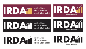
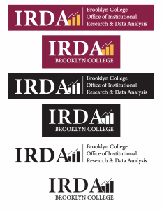
Also, Isana told us all of the logos should come with the black and white version, which is black letters, white background; white letters, black background. And Brooklyn College above “Office of…” on the long logo version; Brooklyn College below the letters in the short version.
After I fixed, Isana told me that when the figures are black and white, the “A” seems to be melting into the bar, and outline the part of the letter “A” that is overlapping the bar so that it is clear where the letter ends.
The final draft of the IRDA logo:
Eighth Journal: Distance working
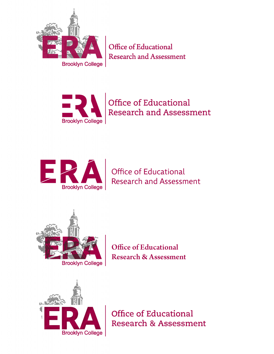
Brooklyn College is closed because of Coronavirus disease, therefore my internship switched to online for the remainder of this semester. So for this week, my supervisor sent us instructions via email and shared the Dropbox file that ensured all of the work should be uploaded there. Today’s assignment is to design the logo for the office, which is called “Office of Educational Research and Assessment” or “ERA” for short. They would like two versions of the logo, one with the full name, one with the short acronym. Moreover, they would like to see 5 versions for each of those, and the long name and short name of the logo should come in pairs, so 5 themes, total is 10 logos. Later, Isana has a link under the email, and let us look at the City Tech Assessment website (AIRE) for an idea of the logo style they like, but make sure to use Brooklyn College imagery or colors as inspiration instead of City Tech.
Below was the example of AIRE logo
And below was my designs of ERA logo
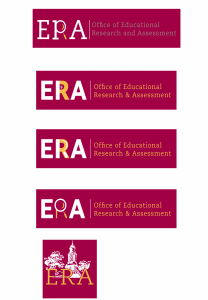
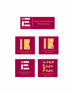
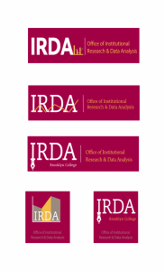
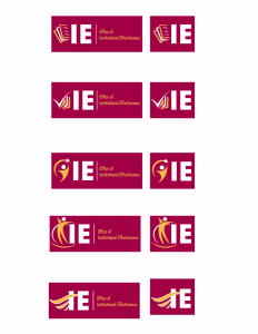
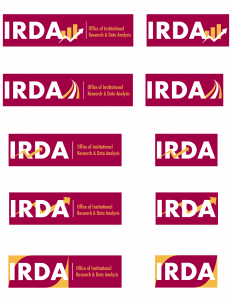
In the next week, we continue working logos Monday and Thursday. My supervisor would like to see five more versions of the ERA logo. In addition, we still need to design 10 logos for the Office of Institutional Research and Data Analysis (IRDA) and 10 logos for the Office of Institutional Effectiveness (IE). The three offices are related to each other, so there should be some similarities in the logos. Also, Isana showed an example for us to explore more ideas. The example list below:
Therefore, based on the example and I used the background in my logo designs.
On Thursday, we got feedback for logos, they picked the first one of ERA and IRDA and based on these ideas to develop 5 logos for each one, and IE still needed to work. After that, we got a meeting at 2:00 – 3:00. There were 13 participants and we discussed each other, I think that would be a great experience to learn how to have communication with others.
There was the second draft of the IE and IRDA logos:
App Review 2: No Waste

I got a senior project class this spring semester, my project is to create a platform which helps our urban communities to waste less and end hunger. Therefore, I downloaded a different app about food management to find inspiration. No Waste is one of the applications that attract my attention.
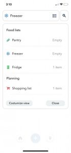
No Waste which is a platform for people to reduce food waste, get an overview of food items and expiration dates from their freezer, fridge, or even a pantry. This is a simple and clean layout that makes it easy to use.
As you can select different categories that you want to add food items to the list, when you tap the plus button in the small container pops up which includes enter food to the list that you select, scan barcodes, and scan receipt.
Once I tap enter food and there show previous food I add before, below have a suggested list that you can select, also you can type the food item name that you want to add. After completing one of those, you can modify the expiration date, quantity, and set amount. Lastly, tap “add”, however, the food item will automatically be put in your category.
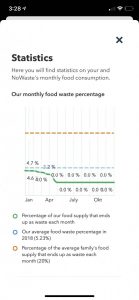
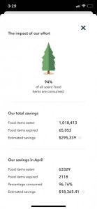
In the other section, when you tap the small house button on the bottom and a statistic that shows the community’s food is eaten or expired. As you tap “Our effort in numbers”, you can keep track of your food waste by deleting if your food is eaten or expired. Also, you can follow your monthly or community’s food waste and saving.
This is a great app to help people to waste less, and make our environment change better. I am happy to download this app that helps me to organize my food better and waste less.

