After a few weeks, we got feedback for the logo, they picked my IRDA logo, but there should be a change to the logo.
For this logo:
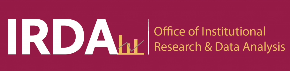
![]()
Sana said it should remove the arrow. Instead, put a white trend line above the bars. The line should be similar to the gray line here, but white and above the bars:
Also, Isana told us all of the logos should come with the black and white version, which is black letters, white background; white letters, black background. And Brooklyn College above “Office of…” on the long logo version; Brooklyn College below the letters in the short version.
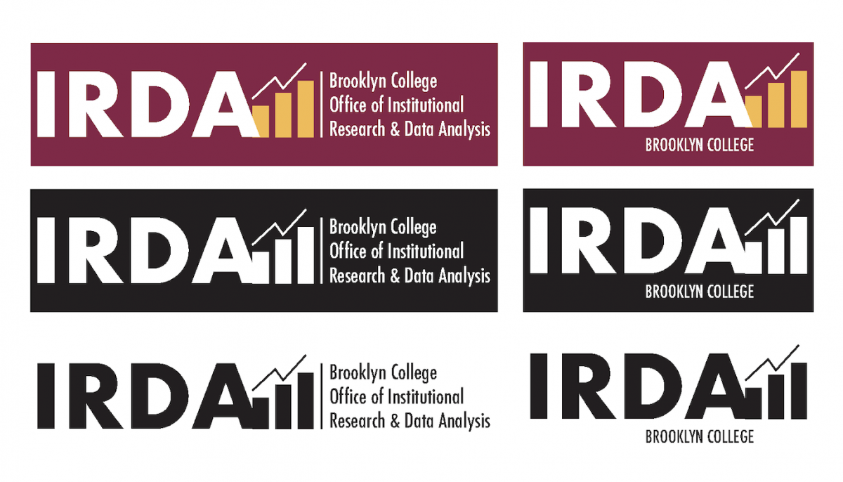
After I fixed, Isana told me that when the figures are black and white, the “A” seems to be melting into the bar, and outline the part of the letter “A” that is overlapping the bar so that it is clear where the letter ends.
The final draft of the IRDA logo:
![]()

