Visual Quote

page3

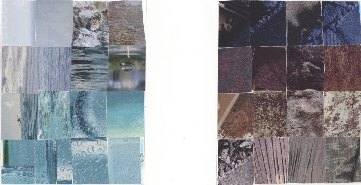
PS: The jpg image it loses the resolution and you can click on the “page3″ link to see the large size image.

This quote is from a famous designer Neville Brody, ” Its focus wasn’t on  the written word but how the word was written.” In this poster, I used the pencils for the background because it matches with the quote. For the design of the quote, I used one typeface but mix with different font family and font sizes to shows the contrast. And this really representing the quote, “Its focus wasn’t on the written word but how the word was written.” In addition, for the large word “DESIGN” there are two typefaces, san serif, and slab serif. The whole ideas in the poster are to shows the contrast just on the font weights, style, and size.

TEXTURE

TEXTURE

The texture project is the most difficult one for me. There are a lot texture in a magazine, but the difficult part is selected a collection and place together. It can’t be too similar, but it has the similar style or tone. For this project, my cutting skill is very weak, and need more improvement.  And I feel like the textures are not collaborative together, they are not working well together.

TEXTURE/FIGURE/GROUND

TEXTURE/FIGURE/GROUND

This is the most interesting project I had done in this course. For this project I used to go around ask people’s shoes’ bottoms. I very satisfied with the textures I got, they’re interesting and look nice. And I used a lot times to do this project, the most times is for put in collected the textures.

The 50/50 black and white part are look good in the scan file. You can define the texture in the 50/50 black and white part. I think the top 2 rolls has too much texture, too much going on to compare the bottom 2 rolls. Look as the whole still ok.

LINE/MOVEMENT

Line/Movement

You can see the slow movement in this artwork, the thickness of the waves are slowly graduated. And the waves are curves on the same direction. In the beginning to started this project, I want to do something gradually on the curves and the thickness of the waves. The final result I got this image.

You can see there has two black colors, one is darker tone and one is like a grey tone. This is my mistake, because I had use two different black sharpies. One of the sharpies is like transparency, that’s why their have a grey tone.

Welcome!

This is the first post on your Learning Blog. Edit or delete it, then start blogging!

The ePortfolio is both a Learning Blog and an Academic Career Portfolio. Use the Learning Blog to document your learning experiences and class assignments each semester. As time goes by, add content to the Academics and Career sections to show your department, graduate institutions, or future employers how well prepared you are for your chosen career.

NOTE: Remember to add appropriate Categories and Tags to your posts. This will help your professors and other visitors find the content they are looking for. The Categories “Coursework” and “Field Trips” and the Tags “OpenLab” and “City Tech” have already been applied to this post. Feel free to make changes!