Category: Uncategorized
UFT
United Federation of Teachers is an organization predominantly made up of education and healthcare professionals, the UFT will strive for fair and competitive salaries, enhanced professionalism and improved working conditions. UFT is work for the community and they also educate the people in different apartments. Today we went to the UFT in downtown Manhattan and to explore more information about the printing press. As we learning Communication Design, we not only doing digital design, also the printing for us is very important.
One of the machines is print in poster-sized, which the paper is 11” by 17” and in color black and white. The other one is a newspaper type articles style printing machine. This machine used oil-based ink and produces a medium quality picture. Another one is a large Ryobi series printing machine.
You need the right materials for a correct printing machine. Sometimes the paper, ink, or based is very matter with the final product come out. Choose correct materials for the printing machine is very important otherwise will destroy your work.
Daily Life Video
Click on the video and download it to view the videodailydaily
Designer Research Paper
Research Paper on Neville Brody
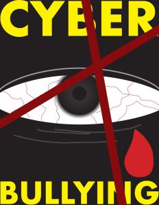
CYBER BULLYING
Logo/Research Paper
Click on the link
This is about the history of Amazon Logo, shows the changes and improvement of the company.
Visual Quote
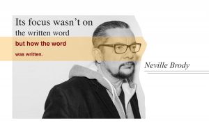
This design intention is to show hows the words looks different in a different typefaces, weights and color. As you can see each line have a little changes. The fonts size are change in each line and also the weights, the first two line have a same typeface but different weights and size to it. The bottom two lines are have a same fonts but different sizes to it. Also, I had added a image of the author into the poster.
Visual Quote
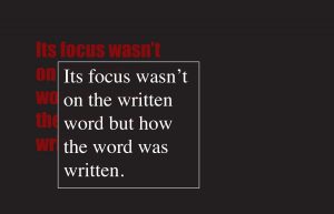
The intention of this design is to show how was different typeface will change the feeling of the word, as like the quote says “Its focus wasn’t on the written word but how the word was written.” The same quote but with different typefaces, font weights, and color. These makes a big different on how you feelings with the quote.
Visual Quote
PS: The jpg image it loses the resolution and you can click on the “page3″ link to see the large size image.
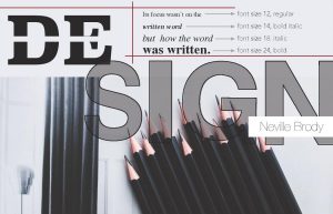
This quote is from a famous designer Neville Brody, ” Its focus wasn’t on the written word but how the word was written.” In this poster, I used the pencils for the background because it matches with the quote. For the design of the quote, I used one typeface but mix with different font family and font sizes to shows the contrast. And this really representing the quote, “Its focus wasn’t on the written word but how the word was written.” In addition, for the large word “DESIGN” there are two typefaces, san serif, and slab serif. The whole ideas in the poster are to shows the contrast just on the font weights, style, and size.
TEXTURE
TEXTURE
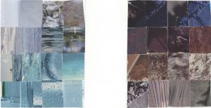
The texture project is the most difficult one for me. There are a lot texture in a magazine, but the difficult part is selected a collection and place together. It can’t be too similar, but it has the similar style or tone. For this project, my cutting skill is very weak, and need more improvement. And I feel like the textures are not collaborative together, they are not working well together.

