Click on the link
This is about the history of Amazon Logo, shows the changes and improvement of the company.
Think outside your comfort-zone.
Click on the link
This is about the history of Amazon Logo, shows the changes and improvement of the company.
This design intention is to show hows the words looks different in a different typefaces, weights and color. As you can see each line have a little changes. The fonts size are change in each line and also the weights, the first two line have a same typeface but different weights and size to it. The bottom two lines are have a same fonts but different sizes to it. Also, I had added a image of the author into the poster.

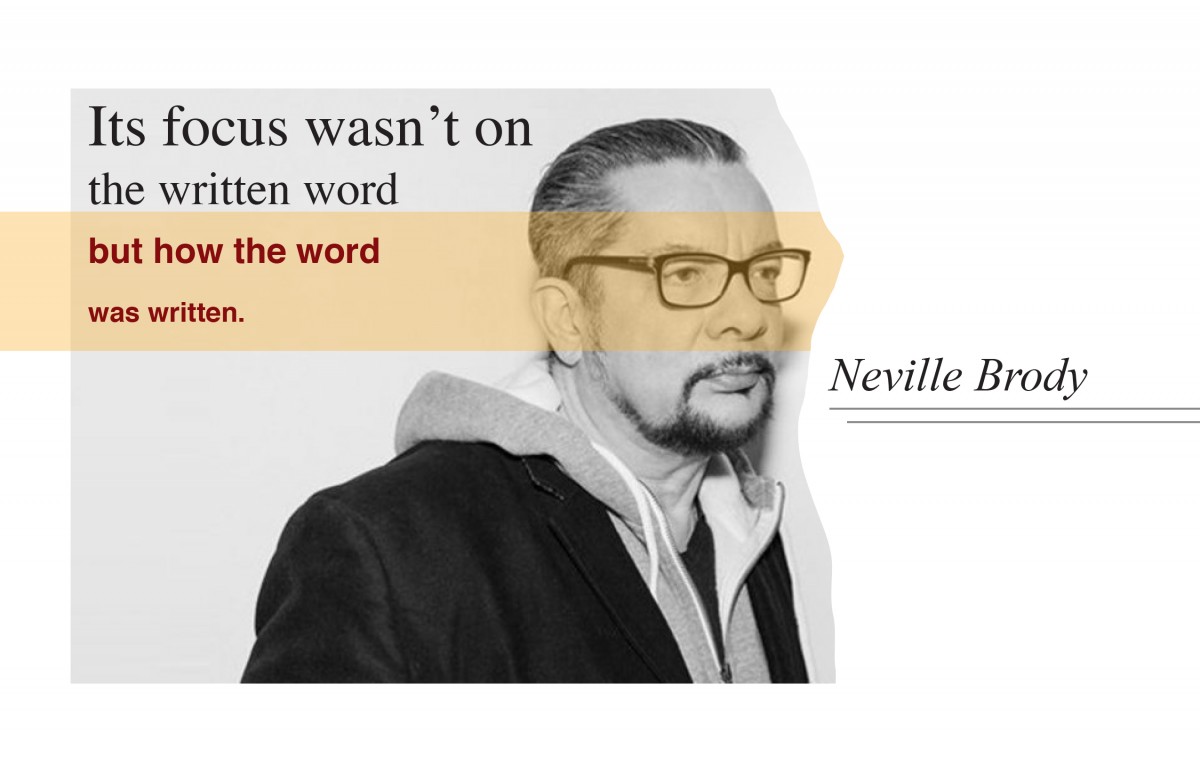
The intention of this design is to show how was different typeface will change the feeling of the word, as like the quote says “Its focus wasn’t on the written word but how the word was written.” The same quote but with different typefaces, font weights, and color. These makes a big different on how you feelings with the quote.
“Never give up easily, otherwise regret yourself.”I love graphic design and I want to be a graphic designer in the future. In my junior years of high school, I had discovered that I really interesting and passionating about graphic design, so I had study graphic design in 10th grade. I never stop to study graphic design and never change my goal to be a professional graphic designer. My idol in the graphic design industry is Neville Brody, I want to be like him that successful and have a big influence on the society and design industry. His works are very inspired me, and teach me to be bold and think out of space when you design, do not lock yourself in the “design rules” or give yourself a particular style to follow. My goal is to be an international profession graphic designer, and my works are all over the world. In the journey of been a graphic designer, I had involved in the different competition, art shows, and designer’s symposiums. Never stop to chase my goal.
![]()
XL – Xiaoling
PS: The jpg image it loses the resolution and you can click on the “page3″ link to see the large size image.
This quote is from a famous designer Neville Brody, ” Its focus wasn’t on the written word but how the word was written.” In this poster, I used the pencils for the background because it matches with the quote. For the design of the quote, I used one typeface but mix with different font family and font sizes to shows the contrast. And this really representing the quote, “Its focus wasn’t on the written word but how the word was written.” In addition, for the large word “DESIGN” there are two typefaces, san serif, and slab serif. The whole ideas in the poster are to shows the contrast just on the font weights, style, and size.
The OpenLab is an open-source, digital platform designed to support teaching and learning at City Tech (New York City College of Technology), and to promote student and faculty engagement in the intellectual and social life of the college community.


