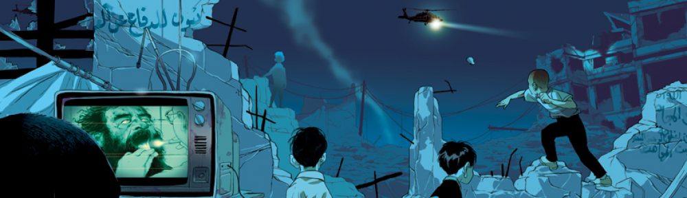
https://drive.google.com/open?id=152YMKZ3T35jORaDEe1DlvfWYHx9Sg0pd
Open Lab keeps limiting the file size I can upload to 12KB, I had to upload to my Google Drive again.
https://drive.google.com/open?id=152YMKZ3T35jORaDEe1DlvfWYHx9Sg0pd
Open Lab keeps limiting the file size I can upload to 12KB, I had to upload to my Google Drive again.
https://openlab.citytech.cuny.edu/yuxinyang-eportfolio/2019/03/25/four-sketchbook-pages-of-drawing-from-reference-related-to-imagery-used-in-poster-illustration/
Hi Professor,
Like everybody else, I’m having trouble uploading my sketches. I post them on my portfolio and the link is going to be below.
Half the Students should hang their 3 concept sketches on the black board for critique. The second half of the class will hang after to allow for space.
On a post it note write:
Each student should read each about each project and then examine all of the designs. Using chalk each student may make 3 marks for each project. They can have no opinion: 1 make under each sketch. They can put 2 marks on their favorite and 1 on their next favorite, or they can really love a sketch and put all 3 marks under each.
Discuss the projects and why students felt the way they did. Designers should go with the one they / the instructor likes the best but class feedback should be considered too.
Students should share the drawing challenges they had, (for example having to draw hands ) and the turtorial / advice they researched to help them.
DUE NEXT WEEK:
Hi Professor,
For some reason I can’t upload any images, it states thats the image is too large when I’ve been cropping the photo and taking the pictures with my phone. So here is a link to my eportfolio.
https://openlab.citytech.cuny.edu/jchung-eportfolio/introduction-to-illustration-comd-3313/sketch-book-drawings-practice-and-3-concepts/
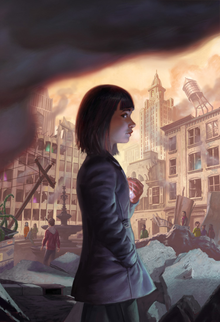
Little Apocalypse is a book by Katherine Sparrow and published by HarperCollins on March 12th, 2019 -today- and is about a girl who, though she’s never encountered anything really strange in her life, finds herself at the helm of a fight against monsters who recently caused a large earthquake in her city. The cover art was done by Eric Deschamps, who is described on the “About” section of his website as “both a sci-fi/fantasy illustrator and a video game concept artist”. Along with HarperCollins he has also worked with Blizzard Entertainment, Bloomsbury Children’s Books, and Paizo Publishing.
What drew me to this piece were the many colors being used, they were bright and eye-catching yet soft and there were often blends as one went into the other, the artstyle mirrored the imaginative world that was being presented in the book very well judging by the summary. This no doubt is telling of his “process” or how he actually goes about making the art, though he doesn’t have a piece detailing how specifically the art for Little Apocalypse was made, he does tell about his many card illustrations and of most recent, an illustration for Magic The Gathering which I will be using as an example.
He was given an “action” which detailed the image they wanted commissioned, a sizeable paragraph detailed enough that the artist would draw a specific scene but not so much detailing specific ways to draw it, it reads in one area “Gideon is sweaty and gritting his teeth in determination.” So we can see that the “action” is giving the narrative and tone but leaving the artistic expression of this up to the artist, Dechamps then sends back a sketch, in the blog post it seems to only be one, and the critique was that it was too far away -they wanted to see more of a certain character- so he sent back another sketch a little more cropped out which was approved. Already shaded, the final was made and colorized.
This differs however, from some other work he’s done. In some book illustrations we can very clearly see that the artist Deschamps is working not only on art, but also lettering. For Simon Thorn and the Wolf’s Den we can see sketches sent which clearly have word art already positioned and incorporated into the art itself, this differs greatly from Little Apocalypse where he only sent the art with negative space for Graphic Designers to work in, and this probably has to do with the specific contracts and word he’s hired, Simon Thorn was written by Aimee Carter and published by Bloomsbury USA Children’s, which might very well pay the artist more for more work, whereas HarperCollins the publisher of Little Apocalypse, might leave more to the hands of their internal departments.
What this then reveals is that given the games, cardgames, and books he’s worked on as well as the differences in his work, Deschamps being freelance, keeps him on his toes work wise, some work is more intense then others, and different publishers are more lenient then others, Magic: The Gathering, sent an Action script because they knew exactly what they wanted, Bloomsbury did not and Deschamps had to send multiple different sketches to him, not only is this much more intensive but this also stretches his mind not only in illustration but also in Graphic Design, and if he did not have these skills he’d lose out on money and connections.
What we can also see from his sketches is that they are pieces of art on their own, not messy lines and ill-shapen circles, they’re their own pieces of art, fully shaded with everything clear and fully presentable. As a designer my sketches can be very messy, going from idea to idea to figure out where text might go, or how a document will be oriented, but this is a much different kind of sketch, it is dedicated and precise because it’s not for ideation purposes rather it is for presentation purposes. This leaves no doubt in my mind that there is much more work not being shown, this art has to be strong and cannot be accompanied by much explanation, since as a job from a larger company this has to be presented by someone with none of these skills, to people who judge at face value whether they like it or not.
Each one for Bloomsbury was very different as well, one is a side profile of a boy’s head which is pretty surgical and kind of creepy, another shows the same boy just before a doorway, and the final, the accepted one, showed him at the gates of a large mansion with ghostly figures far off. This shows that in his process they are linked by subject matter but the entire composition is thrown out for the next piece, which again, takes mental focus and time.
Throughout the rest of the blog you see similar themes which continually impress me, sketches so different and yet so complete, action scripts and his interpretation and so on. It reveals to me the heavy mental side of illustration and the amount that a publisher can lean on the illustrator, as well as the differences between clients and the importance of a varied yet focused set of skills to accomplish different things for different people and for different industries.
As a book illustration, I’m willing to bet that he had to send in many different kinds of covers for HarperCollins and perhaps there was a Nondisclosure agreement explaining it’s absence from his blog, or maybe that has to do with it being a museum piece, I’m not sure, either way it seems like the publishing industry tends to have a lot more ideation then the more focused game companies, he probably had to send them in then get one approved and then move onto the coloring which would then get sent to their internal team. This is strengthened by the fact that his work on Fablehaven: Grip of the Shadow Plague by Brandon Mull, a book published by Shadow Mountain, also lacks an Action and contains multiple sketches.
All in all this leads to a greater appreciation of the art and the industries that illustrators work in, knowing that there is a lot that goes and does not go on behind the scenes, and especially adds weight to the importance and skill needed to be a freelancer working with different clients, tones, and people, for the best result.
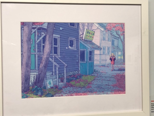
This artwork by Marjorie Alone I really enjoyed because of how the colors brought my attention. The way the colors are being used which are the pastel colors that bring this artwork more depth. It is from a story/comic called Sheets in this piece the character name Marjorie feels alone or in this case a ghost; she takes care of her parents laundry business. Another character name Wendell, a young ghost is trying to navigate his afterlife and figure out if his place is there or back to living among the life of the living.
The steps or tools being used was using graphite and then transferring it digitally. She started using pencil then using the strokes to create a back shadow as purple being the main color then adding the pastels being seen. Her illustrations of the character’s faces had so many emotions and was understanding to know what they are feeling or thinking. The detail is accurate because of how it is scattered around which makes it unique. The color palettes that were used in the graphic novel were blue and purple tones which fitted the story well.
Overall, this piece was unique and had a good storyline that explained her struggles through a story and how it was overcame. For expressing her work by using the colors to bring it to life made it more interesting to bring the readers in.
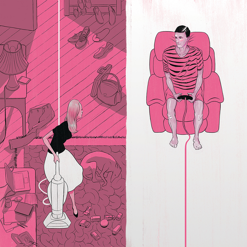
Ryan Garcia’s PRIORITIZING FREE TIME is 4X4 size editorial single image using Digital, Ink, Gouache. Directed by Bryan Gee. The client is the Globe & Mail. It’s about Editorial illustration to accompany an article about the work/life balance many couples face in the 21st century.
Ryan Garcia is an editorial and commercial illustrator from Toronto, Canada. His work is best known for The New York Times, WIRED, Scientific American, and The Wall Street.
I found particularly interesting in Ryan Garcia’s PRIORITIZING FREE TIME because I think it’s very easy to make the connection with our-self in this drawing. When I see this drawing it makes me think of gender role and gender stereotypes in this society. In the old days, women can’t have a job, and they had no rights,they can only rely on men at home (father and brothers). After marriage, they depended on their husbands for the living. They could only be full-time wives. In nowadays, women have to have the ability to effectively manage a household while juggling a demanding career. It becomes a new problem for a couple or family to face and it’s hard to balance the workload with men at home.
The color of using most pink and white strick me as very interesting. I’m curious about why did the artist using pink and white in the drawing instead of another color, like blue or purple. And why does the background on the women is pink and it’s not on her, and the mare is wearing pink and the black ground is white. Does it related to gender stereotypes?

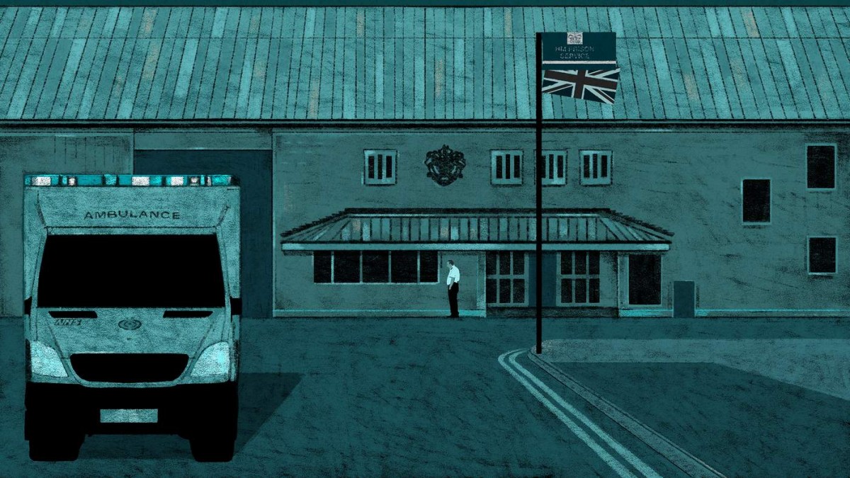
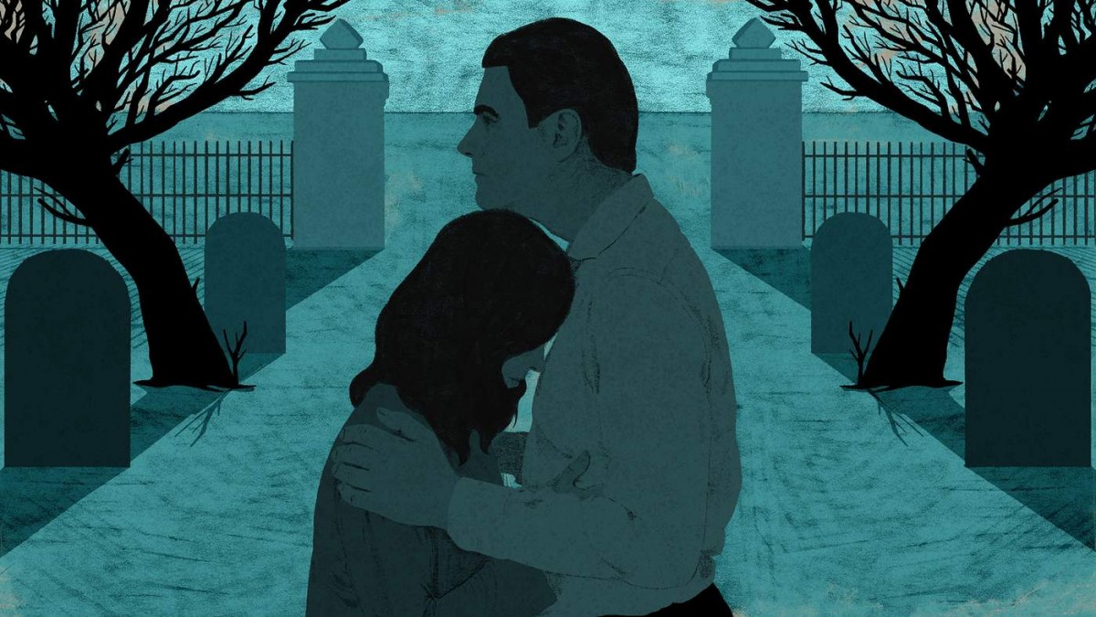
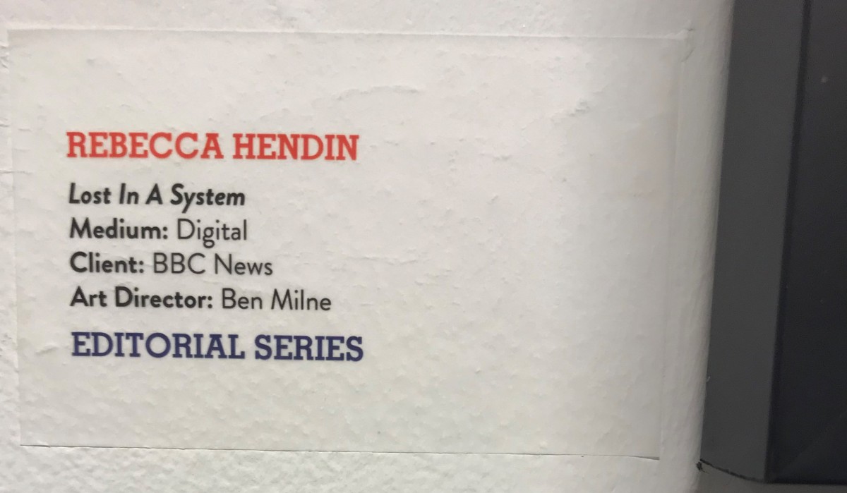
These works by Rebecca Hendin were done for an editorial series under BBC. “Lost In A System’ is about a drug crisis in UK prisons, and how a son of two parents were startled in post cannabis personalities and growing mental health issues. It’s a grim story and the artist of the editorial, Rebecca Hendin, reflects the concepts using the appropriate color schemes and texture.
The monotone color of teal gives just enough personality to imitate specific shadow colors. The usage of color aside from grayscale is what gives a bit more life to the artwork. Grayscale in itself is an uninteresting, and newspaper like colortone. To at least set a hue gives it more ways to take it than just a sad story. Even while there is a teal tone, it’s not impossible to distinguish what colors are what. The Union Jack flag can still be seen to have a red tone, even under a sea of its counterpart color.
Material wise, the granularity and scratches combined cover the flat surfaces of color, giving texture to the work. Line strokes are varied or non existent to determine distance of the object, which gives varied indication of what shade the object is.
Overall, these pieces are accompanied by grittiness and grain by the stroke, but it works to express the tonality of the work, as well as make good non-simplified detail which is very fit for an online posting. The colortone is right for the expression of the story too.
How to Break Up With Your Phone by Miguel Portan
From the moment I saw this piece it caught my eye. It’s not very much to it and it’s straight to the point but is it so relatable. It is digital art with sort of a paint based look by Miguel Portan. Which I believe make it into the New York Times. It displays a person trying to disconnect from their phone but some parts of the person’s face is still glued to the phone causing the face to look irregular and elongated. The image doesn’t have much shading or details. It’s very simplistic with very few colors but a certain kind of texture to the coloring making them pop. The movement in this piece is very well constructed as I find my eyes shifting from the person’s face to the phone and then back. The negative space in the piece and the contrasts between the red shirt and green background makes for a very eye pleasing visual, I think it gives the image unity. For me the two focal points is the person’s face and the phone.
I really think this piece works because I automatically connected with it on a personal level. As the name implies how to break up with your phone is self explanatory towards the image. Even without knowing the title of this piece I believe anybody would have been able put that connection together. As it is known, we live in a technology based society were phones and computers are everything, so I find myself and people of my generation glued to their phones. We live on our phones and it’s hard to go days or even hours without it. This piece reminds me of that problem and relays the relatable message very well. Personally I have been finding ways to spend less time on my phone even though it plays a big role in the improvement and evolution of portable technology, that has greatly improved our lives to an extent. Cell phones are very innovative devices constantly improving, but the daily connections and unlimited amount of time the average young adult spends on their phone is unhealthy and it distracts them from reality. There’s but so much you could take from the virtual world or media/internet. At the end of the day, reality and living life is what’s most important, the outside connections, communication and experiences are what’s really going to make an impact and become memorable. So I have a heavily support this piece and its deeper meaning of breaking the cycle of being glued to your phone.
As far as the other work by this artist go they are all simplistic and unique, and they happened to be digital art as well. Some of them even have similar topics like social media, web browsing, data files and others. From that I could see that this artist is very well interested in the virtual world and technology, whether that’s showing the negative side of it or just shining a light on the subject.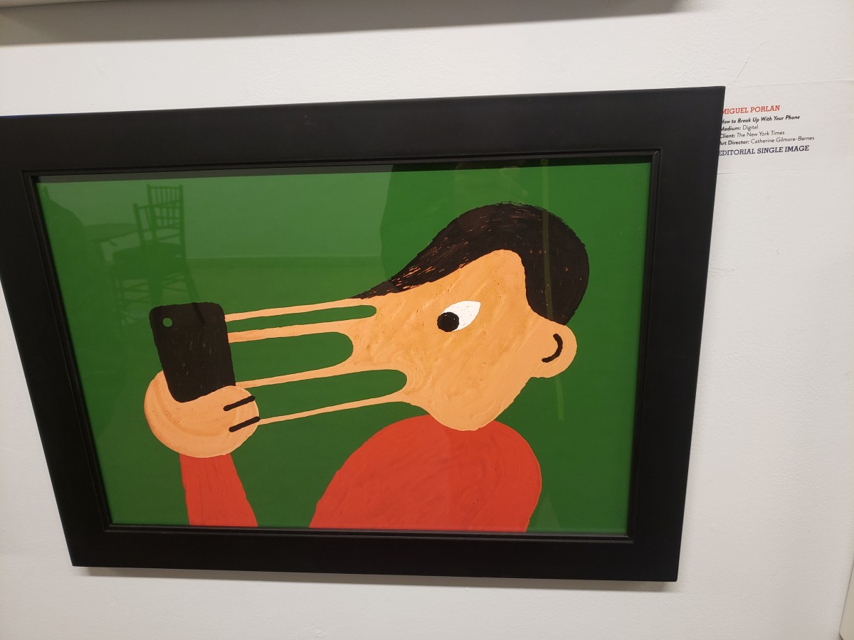
The OpenLab is an open-source, digital platform designed to support teaching and learning at City Tech (New York City College of Technology), and to promote student and faculty engagement in the intellectual and social life of the college community.

