Reading on Value Response

I feel that this illustration has a strong use of value tones and organization. The artist is Echiro Oda the manganka for One Piece. The way he uses vale on this panel in particular is how he makes it look so intense. The darks on his pants, face, and arms make the grey emphasize how big his body is and the whites on the background and his breath also add to the intensity. You focus on his body because its grey but the gradual increase in darkness makes this picture a geat example of value.

Reading on Value

READ: the following 2 posts on VALUE:

Composition Basics: Value Structure -By Dan dos Santos

http://muddycolors.blogspot.com/2012/08/composition-basics-value-structure.html

We will be using this technique to create digital value roughs in class next week.

Value & Composition – David Palumbo

http://muddycolors.blogspot.com/2014/07/using-shape-and-value-for-better.html


DO: After reading this post, choose an illustration which you feel makes strong use of value structures and tonal organization. Share it along with a few sentences about why you chose it, who the artist is, and how the artist uses value, on our OPEN LAB page.

TAG your post DISCUSSION.

Discussion

The intension of my design is to corporate the name of the beer with the ingredients, allowing people to have a sneak peak of the ingredients without looking through the list.


The design that I chose was from Kaiju! Beer because their label are using the name of the brand, Kaiju which means monster in Japanese to create all the design. Similar to my design, they corporates the name within the design along with hops and wheat as an elements.

Week 2 – Beer Design

Many of the current designs are somewhat plain, which isn’t necessarily a bad thing, but according to the article there are so many beers competing for attention. I believe my label design would bring new perspective to the brand in terms of strange and surreal. The intention of my label is to use surreal elements combined with more grounded ideas and to have them juxtapose.

I really like this illustration because there’s a bit of humor and it is something supernatural. Things that appear abnormal quickly draws my attention and I think this is something I would consider buying if I were looking for beer.


This design for Brooklyn Brewery’s Defender is quite eye-catching. It’s not very often that you would see comic book style drawings on a beer label and it definitely stands out against other types of illustrations such as the one above. It is still a bit plain and the guy’s face is blocked by brand which would lead me to think it would be better to feature the brand on his chest like many superhero characters.

Discussion – Week 02

Vanessa Ramirez

Article: How Next Level Design is Driving the Beer World by Veronica Mewees

After reading this article:

  1. consider how YOUR label design is a visual calling card for the product.   Write a few sentences describing the intention of your label.
  2. find a label design which uses illustration in a manner you find interesting, eye-catching and inspirational. 

(1) The name of beverage that I am designing is “Punishment'” created by the Arrogant Brewery. I want to create a label that gives you the first taste of the beer but not makes it boring for the consumer by letting them know everything about the product. This beer contains a variety of chili pepper, it is the special ingredient that no one knows unless they try it.

(2) I choose these illustrations from Partizan Brewery because they keep in mind the main message that represents the brewery’s identity and incorporates the beer’s name.

Yuko Shimizu on developing a unique visual vocabulary

This short excerpt from Yuko Shimizu‘s blog post considers the importance of developing a unique visual vocabulary. After reading this article, consider how you can use your sketchbook as a tool to developing your own visual vocabulary. What kind of things are you interested in drawing? What visuals might become important visual signatures for you?  Write a few sentences considering these things.

Post your thoughts on this along with your Sketchbook Pages.


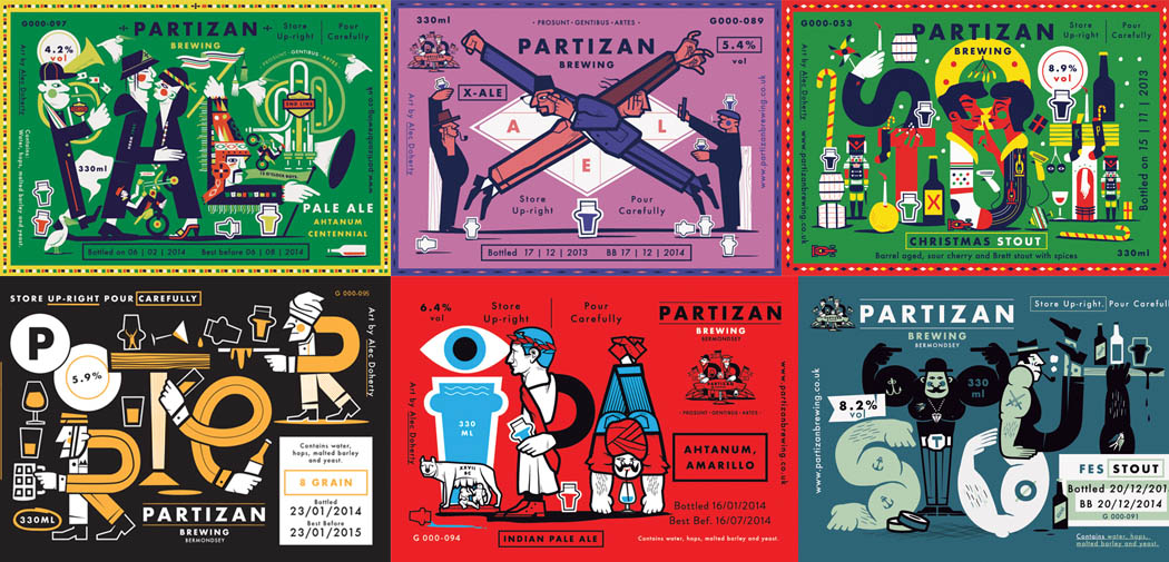
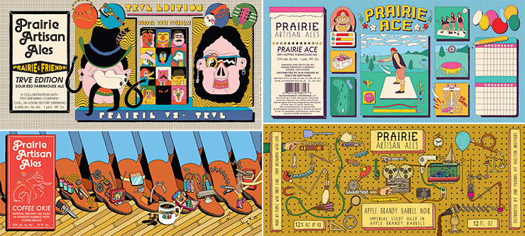
“ I believe many of you who are reading my blog are aspiring illustrators. If you are, here is something you may want to remember, or to work on, if your art school instructors haven’t taught you already: we have to be remembered by something we are good at, so when a prospective client sees a topic that needs to be illustrated, they know who to call.


The most obvious themes prospective clients think of in connection with my work are Japanese or Chinese themes. I am Japanese, but I had also studied Cantonese for three years, and I have strong interest in Chinese culture. And people somehow see that in my work. There are other themes, like sexy girls, action and sports, comic-book look, snow, and water and underwater themes.”

How Next Level Design is Driving the Beer World

This Article by Veronica Meewes for the online design magazine PUNCH, explores the “new generation of eye catching label design” with a close up on five example breweries and the inspiration behind the labels that have become “ their visual calling card.”

After reading this article, consider how YOUR label design is a visual calling card for the product.   Write a few sentences describing the intention of your label.

Lastly, find a label design which uses illustration in a manner you find interesting, eye catching and inspirational.  POST the designs along with your comments on them for in class  DISCUSSION next week.  Tag as discussion.