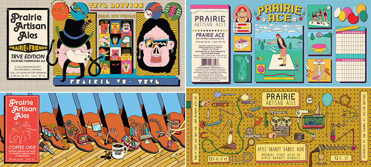
This Article by Veronica Meewes for the online design magazine PUNCH, explores the “new generation of eye catching label design” with a close up on five example breweries and the inspiration behind the labels that have become “ their visual calling card.”
After reading this article, consider how YOUR label design is a visual calling card for the product. Write a few sentences describing the intention of your label.
Lastly, find a label design which uses illustration in a manner you find interesting, eye catching and inspirational. POST the designs along with your comments on them for in class DISCUSSION next week. Tag as discussion.


my label design’s intention is to draw in potential consumers with a design that is light hearted and uses aspects of the title f the company to do so.
https://i.pinimg.com/736x/d0/75/a5/d075a5323ee53bc62686e7acd3dabc9d–bottle-packaging-beer-labels.jpg
This beer bottle label is interesting to me because being a bionic brew label the illustrator uses a x-ray style of a rabbit with an electric bolt behind it. Bionic means part mechanical so the symbolism is expressed with the x ray and electricity
In an attempt to capture my label design as a visual calling card for the product I chose I wanted to emphasize the product’s name and the silliness that comes from it.
http://brewtallyinsane.com/wp-content/uploads/2015/04/OdellBrombeere.jpg
I like this beer label because the illustration is a kind of play on words with the name of the brewery. Gose is the wheat ale they brew with and the “brombeere” in the name sound like “bear” so have an illustration of the wheat forming a bear was creative to me.
I chose this label because it explains a lot of how the drink may be, by showing the action of the person. How he’s shooting while riding a horse. I make make a comparison to a hot sauce label how they could describe the hot and spiciness it is.
http://3.bp.blogspot.com/-0vWZK22g6Z0/UL6CxIww9lI/AAAAAAAAAEw/a7PMPjqCif4/s1600/western_final_flat.png
http://brewtallyinsane.com/wp-content/uploads/2015/04/OdellBrombeere.jpg
This illustration caught my eye cause of the color usage also how the name goes with the illustration A bear’s face with raspberry all over the him and some writing to describe the drink’s taste and it’s feeling.
In my label design the intention of my design is to emphasize the magic in the name magical and delicious. Magic is supposed to be something you want to do so I want the beer to be something you want to drink.
https://dribbble.com/shots/769626-West-Philly-Pilsner
I like this beer label because of the hilarity of the name. Its Just old fart in old english and it makes it funny. The design label also makes me look at it because of the bright orange and the look would make people pick it up.
For my label I just wanted something fun and to make people laugh and smile. curious to pick it up make people really think “is that a peach wearing clothes?”
https://www.instagram.com/p/BCVEUCCmGM2/
This design for tea caught my eye cause it’s simple but speaks to what tea is while giving you the idea of what the company is about. I enjoy designs that make you think about how creative they actually are.
My label design’s intention to emphasize on the terms “surprise party.” I wanted to take a different approach in how to surprise people by portraying a seductive element of surprise (considering that this is a wine label in mind). Giving use to the color of red, to symbolize loving and appealing quality to wine.
https://www.trendhunter.com/trends/wolfinspired
I like this beer label because, first and foremost, I LOVE wolves. And the illustration looks dope! The use of green, orange and black is unique and gives the beer popping and powerful impact.