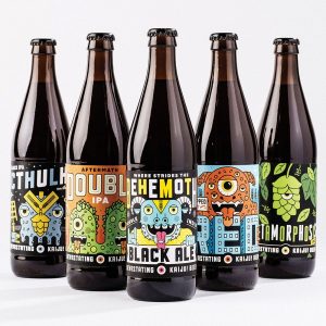
The intension of my design is to corporate the name of the beer with the ingredients, allowing people to have a sneak peak of the ingredients without looking through the list.
The design that I chose was from Kaiju! Beer because their label are using the name of the brand, Kaiju which means monster in Japanese to create all the design. Similar to my design, they corporates the name within the design along with hops and wheat as an elements.


