Many of the current designs are somewhat plain, which isn’t necessarily a bad thing, but according to the article there are so many beers competing for attention. I believe my label design would bring new perspective to the brand in terms of strange and surreal. The intention of my label is to use surreal elements combined with more grounded ideas and to have them juxtapose.
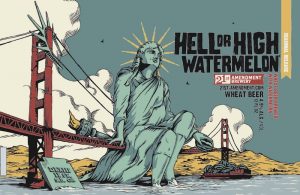 I really like this illustration because there’s a bit of humor and it is something supernatural. Things that appear abnormal quickly draws my attention and I think this is something I would consider buying if I were looking for beer.
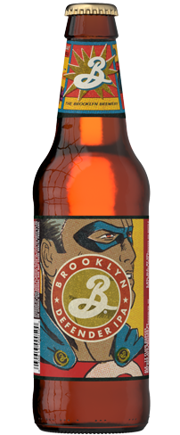
This design for Brooklyn Brewery’s Defender is quite eye-catching. It’s not very often that you would see comic book style drawings on a beer label and it definitely stands out against other types of illustrations such as the one above. It is still a bit plain and the guy’s face is blocked by brand which would lead me to think it would be better to feature the brand on his chest like many superhero characters.

